
One of the most fundamental dichotomies in logo design lies between angular and straight design elements and those that are rounded and curvilinear. While the former suggest qualities of precision, strength, and solidity, the latter are associated with softness, friendliness, and nature.
In recent years, it has been argued that more rounded forms have come into vogue in logo design. Identity guru Tony Spaeth noted in 2006 that “soft, shaded, rounded, and multicolor marks, enabled by technology, are in fashion.” In a 2009 Brandweek piece, Todd Wasserman wrote that “as the economy gets uglier, logos are getting prettier. The stolid angular look of visual trademarks like IBM’s and Bank of America are being supplanted by ones that sport softer, more approachable fonts, multiple colors and natural, child-like symbols.” The article quoted adman Cal McAllister, who said that “when you see a logo that’s boxy and the edges are hard and sharp, and the company just laid off 10,000 people, you get mad at them. But if it’s a watercolory rounded logo, you feel kind of sorry for them.”
Percentage of US logos with angular and rounded design elements
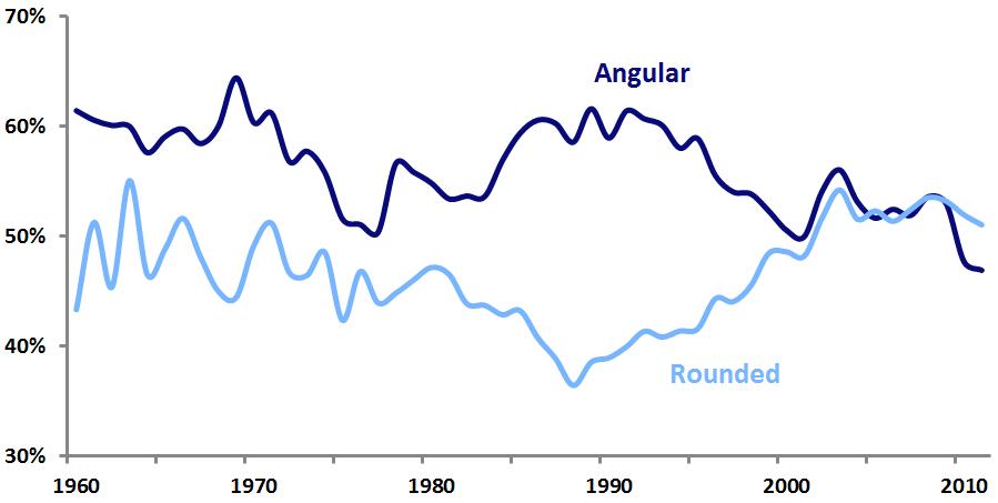
Analysis of United States Patent and Trademark Office data confirms that the perceptions of this logo design trend are correct. Historically, US logos have been more likely to contain angular elements than rounded elements. This was most evident in 1989, when 62 percent of new logos featured angular elements, while only 39 percent had rounded elements. But throughout the 1990s and early 2000s, rounded logo design elements steadily increased in popularity, while angular ones dropped off. Finally, in 2005, rounded elements gained the upper hand. Perhaps part of the reason for the hostile reaction to 2007’s unveiling of the jagged London 2012 mark was that it stood in utter contrast to the prevalent trend of roundedness.
Logo design trends such as this one are not easily explained. As previous Emblemetric analysis has shown, circles had become more popular than rectangles. And it is likely that as many high-tech companies sought to move away from images of cold technical perfection toward those of more humanity and relatability, they abandoned their hard-edged logos for more rounded forms. Apple was certainly a pioneer in this regard, and the onslaught of logos containing swooshes in the late-1990s dot-com boom showed that tech companies were no longer afraid of curves.
Prevalence of angular and rounded logos, by industry
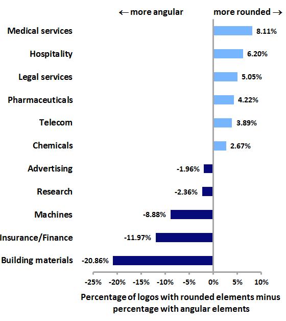
Further analysis shows that the roundedness and angularity of logos varies widely by industry. More human-centered industries like medical services and hospitality are the most likely to feature rounded logo design elements, while more technical industries like insurance, finance, and building materials exhibit the most angular logos.
Will this logo design trend swing back the other way, toward angularity? Perhaps as the worldwide economy recovers, consumers will feel less of a need for the comfort of rounded, huggable marks and more of a desire for logos with confident, aggressive lines and sharp edges. But for now, curviness rules.