Color has become an even more important aspect of logo design in today’s web-based world. How has color been used in US logo design over the past several decades? Analysis of United States Patent and Trademark Office data can provide some answers.
Use of Color in US Logos
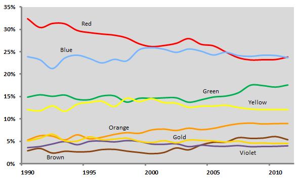
The graph above shows the relative share of color use in US logos over the last two decades (logos that did not contain these colors, or that did not feature color at all, were omitted from the analysis). The vertical axis indicates the percentage of logos filed for trademark registration in a given year that contained each color; these percentages add up to 100 percent for each year.
A few trends stand out here. Red, which was by far the most popular color used in logos in the 1990’s, has been caught by blue; they now are used about equally. Green has seen a modest rise in use, most likely due to increased environmental consciousness in American society. And orange has enjoyed a slight increase in popularity.
“Trendiness” of Color Use in US Logos
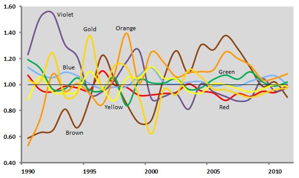
Another way to address this issue is to analyze the colors used not just in new logos, but in logos that have “died” (i.e., trademarks that have been abandoned, canceled, or expired). The graph above provides a measure of trendiness by combining color data from new logos with color data from dying logos.
The graph’s vertical axis represents a ratio of the share of color use in new logos in a given year to the share of color use in dying logos from that year. So if red accounts for 20 percent of the use of color in new logos in a year and 20 percent of the use of color in dying logos in that year, its ratio is 1, meaning that it is not at all trendy in a positive or negative way. However, if blue were used 80 percent of the time in new logos and just 40 percent of the time in dying logos, its ratio would be 2, meaning that it would be a very “hot” color for that year. Likewise, if green were used just 20 percent of the time in new logos and 60 percent of the time in dying logos, its ratio would be 0.33, making it quite “cold.”
With this in mind, we can see that violet was a trendy color in US logos for much of the 1990’s, before cooling off in the last decade. Orange, brown, and green have been hot in recent years, while red has languished somewhat. Over the last three years, the lines on the graph converge around the middle, suggesting that no color is particularly hot or cold.
Use of Color in US Logos by Industry
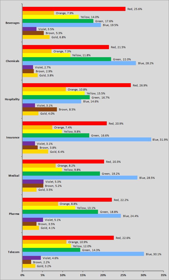
Color use in logos can also be addressed in terms of particular industries. The graph above shows the relative use across time of eight colors in the logos of seven selected industries (again, these shares sum to 100 percent).
While there are not drastic differences in color use across these industries, some results are notable. Red is used most often in the logos of the beverage and hospitality industries, and least often in insurance and medical services. Blue is used most in telecom and insurance, and least in hospitality marks. Green appears most often in chemicals and least often in telecommunications.


