

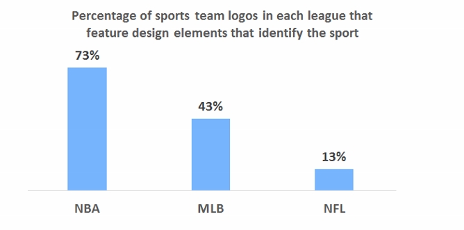
On Monday, the Milwaukee Bucks of the National Basketball Association unveiled a new logo. Like the team’s old emblem, it is a depiction of a fierce stag, but the new mark contains an image of a basketball, cleverly hidden in the negative space of the antlers. By switching from a logo without a basketball to a mark with one, the Bucks have joined 21 other NBA teams with basketballs in their primary logos. Seventy-three percent of NBA teams’ symbols now include basketballs.

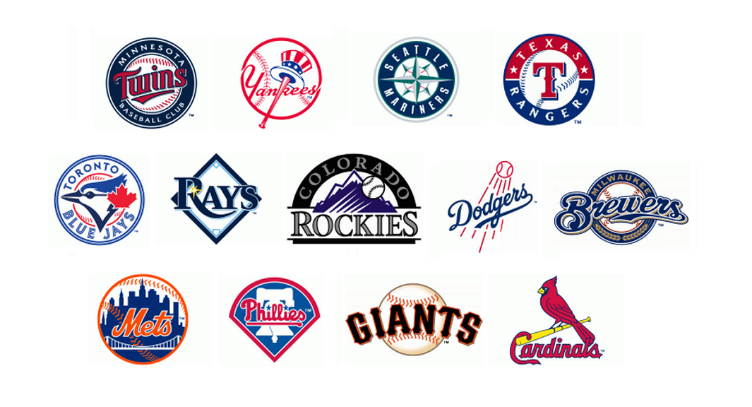
By contrast, only 13 Major League Baseball teams, or 43 percent of the total, have baseballs or other imagery inherent to the sport in their logos.
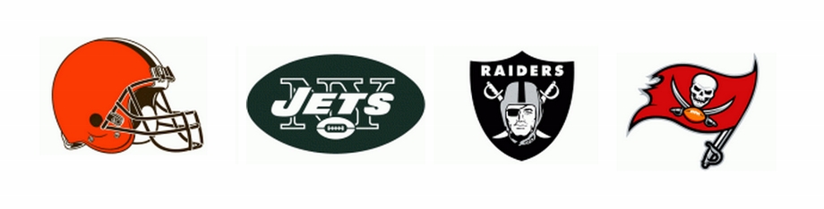
And just four National Football League team logos, or 13 percent, feature footballs or football-related imagery.
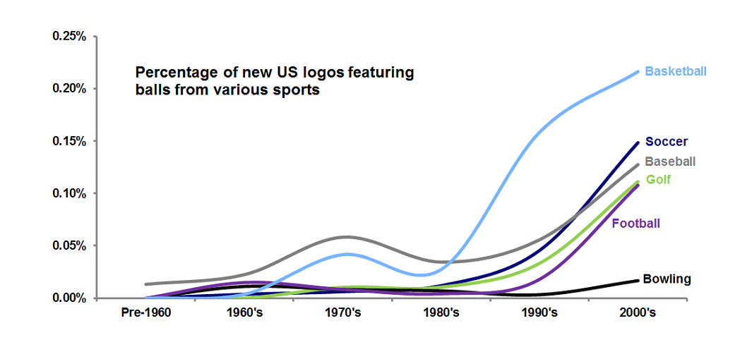
Why the discrepancy between the leagues? One might speculate that spherical basketballs and baseballs make for more visually pleasing design elements than oblong footballs. Analysis of data from the United States Patent and Trademark Office shows that while all sorts of sports balls have become more common in American logo design over the years, round basketballs, soccer balls, baseballs, and even golf balls are more common than footballs in logos.
 But there may be more going on here. It is useful to consider Rutgers University sociologist Karen A. Cerulo’s 1995 book, Identity Designs: The Sights and Sounds of a Nation, which included a quantitative analysis of national flag designs. Cerulo found that the flags of powerful “core” nations (such as those of Russia, Italy, and Germany, below left) tend to have simpler designs, while the flags of less-powerful, lesser-known “peripheral” countries (like those of Mongolia, Fiji, and the Marshall Islands, below right) are often more elaborate and embellished in their designs. There are exceptions, of course. The U.S. flag’s design is one of the world’s most elaborate, but when it was created, the country was still unquestionably “peripheral.”
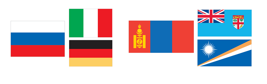
Core nations are so widely recognized that their flags need not say much specific about them, in the same way that well-known companies like Nike and Starbucks are able to drop their names from their logos and be known simply by their symbols. Peripheral nations, however, must use their flags to communicate detailed information about themselves to a world audience that is likely unfamiliar with them.
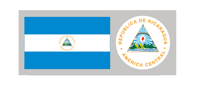
Consider the flag of Nicaragua. While its basic design of three horizontal bands is similar to the flags of many core nations, the national coat of arms in the center includes text spelling out the country’s name and geographic location, as well as depictions of symbolic elements like a rainbow, five volcanoes, an ocean, and a Phrygian cap. The busyness of the design screams “peripheral nation.”
The NBA was once very much a “peripheral” U.S. sports league, far less popular than the country’s “national pastime,” baseball. Indeed, in designing its new logo in 1970, the NBA, in an attempt to boost its legitimacy, was reduced to mimicking Major League Baseball’s one-year-old silhouetted batter logo. Unlike baseball, though, the NBA felt the need to include its initials in its logo, in much the same way that Nicaragua needed to write its name on its flag.

Today, football is the most popular sport in the U.S., and few NFL teams are inclined to include footballs in their logos. They don’t need to, because the public knows that they are football teams; there’s no reason to spell it out. As a consequence, NFL logos are among the most striking and visually powerful in sports. They don’t get bogged down in communicating something like, “Hey, we’re a football team,” just like Germany’s flag doesn’t need to use symbolism to say, “Hey, we’re a country in Europe, we make nice cars, maybe you’ve heard of us?”
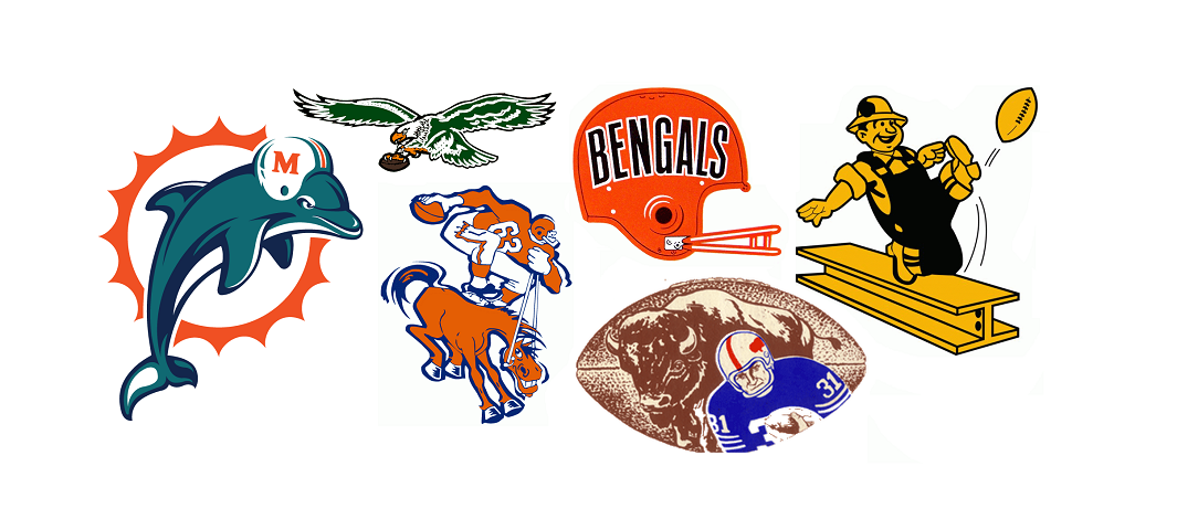
It wasn’t always this way though: a look back in NFL history shows that before football was king, many NFL teams featured football-related imagery in their marks.
Major League Baseball, knocked from its perch by football, features more team logos with design elements related to its sport than does the NFL. The NBA, though, is absolutely overrun with basketballed logos. Some, such as those of the Los Angeles Lakers, Los Angeles Clippers, New York Knicks, and Detroit Pistons, are little more than generic depictions of basketballs. It is as if a refrigerator manufacturer decided to use a picture of a fridge as its logo; it’s hard to imagine a less evocative, less distinctive, or more boring visual symbol.
The irony is that the NBA is no longer peripheral; it has become quite popular not just in the United States, but worldwide. There’s no need any more for it to use the design strategy of a second-rate organization. When it comes to logo design, the NBA should drop the ball and seek to build stronger visual identities for its teams.