
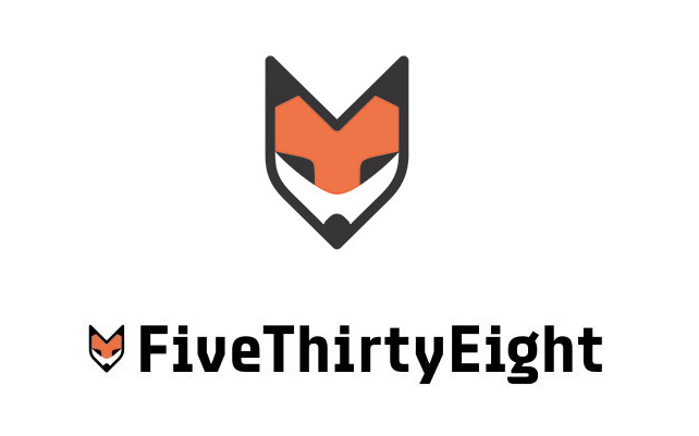
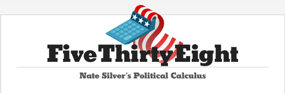
The new incarnation of Nate Silver’s FiveThirtyEight website made its ESPN-affiliated debut last week, to the delight of data nerds everywhere, including here at Emblemetric. The site promises to expand FiveThirtyEight’s data journalism beyond politics and into the worlds of sport, economics, and popular culture. With the new website came a new logo, a stylized fox head, known in house as “Fox No. 9,” that Silver says is intended to be emblematic of FiveThirtyEight’s pluralistic approach, as expressed in the old saying “the fox knows many things, but the hedgehog knows one big thing.” While the choice of a fox seems somewhat curious given that one of the biggest hedgehogs in Silver’s sights is Fox News, and while some have questioned whether Silver got the fox/hedgehog analogy correct, the new fox logo represents a big step up from the one used during FiveThirtyEight’s New York Times days, a calculator spewing out an American flag:
The new logo, designed by Michael Meyers under the guidance of FiveThirtyEight creative director Kate Elazegui, is a handsome one, and has the added bonus of looking like a pencil, a tool that holds a nostalgic resonance for the nerd. Let’s turn the tables on FiveThirtyEight and subject Fox No. 9 to some quantitative analysis, using data on trademark design from the United States Patent and Trademark Office.
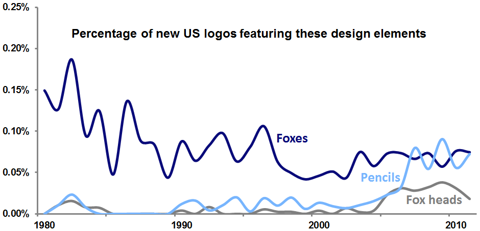
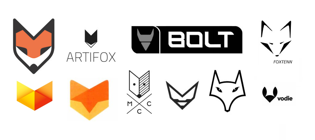
While the use of foxes in US logos has tailed off over the last several decades, fox heads in particular have enjoyed a bump in popularity recently, and logos featuring pencils are also in vogue. The fox head logo trend has resulted in a number of recent trademarks that seem to anticipate the look of Fox No. 9:
A deeper understanding of how FiveThirtyEight’s logo fits with recent trends can be gained by measuring the “trendiness” of particular design elements. This is done by calculating the share of an element’s use in new logos relative to the share of its use in dying logos. If a design element appears in the same percentage of new and dying logos, its ratio is 1, meaning that it is not at all trendy in a positive or negative way. However, if an element were used 80 percent of the time in new logos and just 40 percent of the time in dying logos, its ratio would be 2, meaning that it would be very “hot.” For the period 2005-2011, the trendiness measure for fox heads is 1.72; for pencils, it is 1.77. FiveThirtyEight seems to have hit upon a couple of very hot logo trends in its design.
Aside from the logo, an interesting choice in the new site’s branding was the decision to stick with the “FiveThirtyEight” name (which comes from the number of members of the US Electoral College) over the shorter “538,” which Silver occasionally uses (his new Twitter handle is @NateSilver538).
Since 1990, there have been almost 1.1 million wordmark logos filed as trademarks in the US. Of these, 3.3 percent have been wordmarks that are three characters in length, like 538, and 3.2 percent have been wordmarks that are fifteen characters long, like FiveThirtyEight. Of all of the post-1990 wordmarks, 44.1 percent have survived in use to the present day. Of the three-character wordmarks, 49.4 percent have survived, while only 42.1 percent of the fifteen-character wordmarks are still in use.
In sticking with its fifteen-character wordmark, FiveThirtyEight has thrown caution to the wind, disregarding the sort of quantitative insight that is its bread and butter. Here’s hoping the site will prosper nevertheless.