
Procter and Gamble, the world’s largest consumer packaged goods company, earlier this year quietly rolled out a new logo from Landor Associates. The lack of fanfare was understandable, given P&G’s history: the company unsuccessfully battled outlandish rumors that its century-old “Man in the Moon” logo was satanic, finally removing the mark from its packaging in 1985. Since 1991, the company has relied on basic “P&G” logotypes; the new logo puts the type in a circle of P&G’s traditional dark blue and recalls the old mark with a light blue crescent shape.
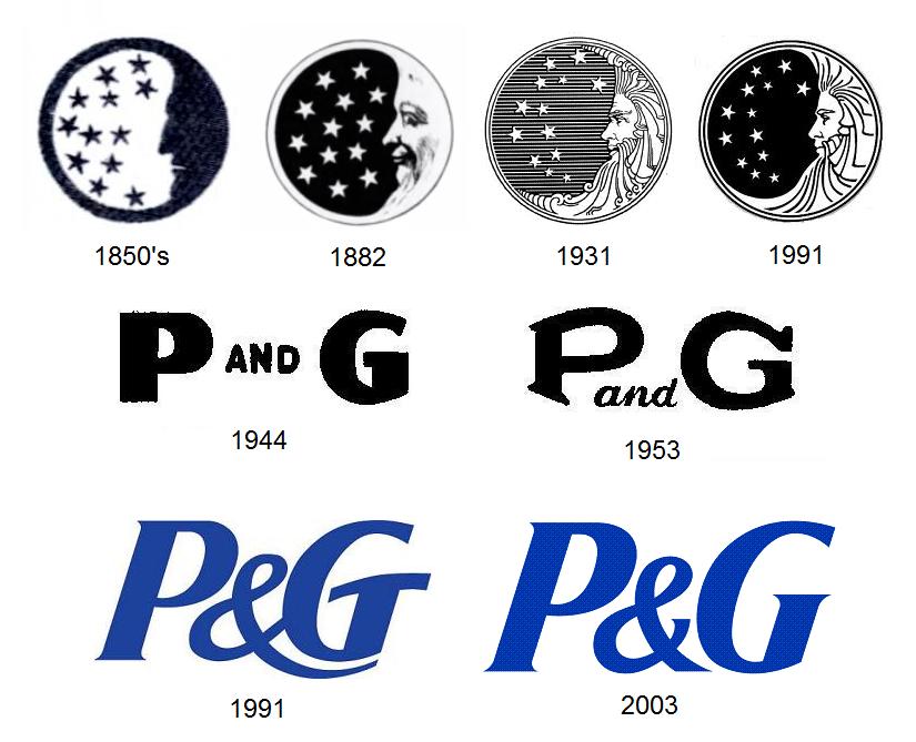
The old logo was not without its weaknesses. P&G had always had great success promoting its famous brands (Ivory soap, Tide detergent, Crest toothpaste, etc.) much more heavily than itself, so the Man in the Moon mark, appended at small size to obscure parts of the product packaging, was unfamiliar and meaningless to the consumer. It practically invited people to come up with an interpretation for it, and they did, to disastrous effect. (Ironically, P&G had briefly stopped using the symbol in the 1860’s, considering it “meaningless,” but quickly reconsidered when a merchant rejected as “not genuine” a shipment of candles that lacked the mark.)
The logo had been redesigned by sculptor Ernest Haswell in 1931 in an ornate style out of step with modern marks. As early as 1961, Modern Packaging magazine had called it “tiny, oddly out-of-date and almost unnoticed.” In 1991, corporate identity guru Tony Spaeth, citing its “visual weakness,” used it to illustrate the point that “sometimes the logo is indeed a problem, if not the problem” with corporate identity.
The new P&G logo represents part of the company’s effort to increase its profile. As Landor puts it in describing the mark, “For the first time, P&G is starting to talk to consumers as one company, not just as individual brands, in an effort to build awareness and trust.” Internally, the mark is cleverly being called the “New Phase” logo, in a reference to both the new awareness campaign and the phases of the moon (although, unfortunately, while the old Man in the Moon symbol depicted a waxing moon, one that is growing in size, the New Phase logo shows a waning moon that is fading into nothingness).
The most obvious change from the most recent logo to the New Phase mark is the switch from logotype alone to symbol with logotype. As we saw last year with Microsoft’s new logo, and with logos in general, such a switch is quite common today. Analysis of United States Patent and Trademark Office data on logos bears this out.
Percentage of new logos featuring logotypes and logotype/symbol combinations
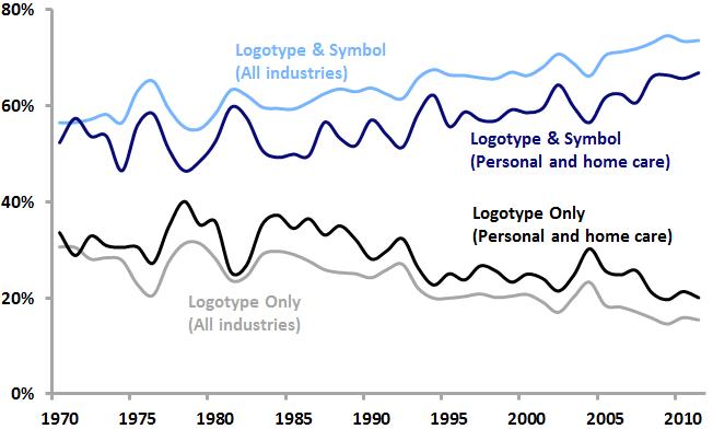
Among all US logos as well as logos within the personal care and home care industries that P&G is a part of, logotype/symbol combinations are increasing in popularity, while logotypes alone are becoming less common. P&G’s adoption of this new logotype/symbol combination is squarely in line with current logo design trends.
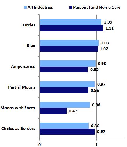
Percentage of new US logos featuring specific design elements
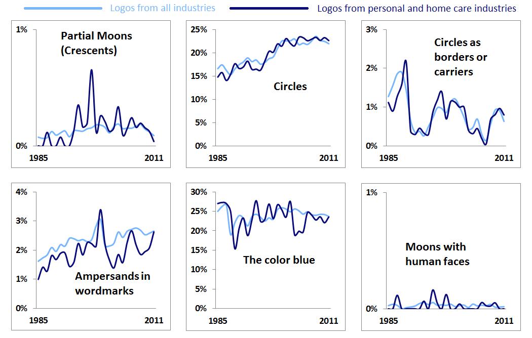
Looking at the individual elements that make up the New Phase identity, it appears that crescent moons and circles as borders or carriers are not particularly popular today either among logos as a whole or within the personal and home care industries (and Man in the Moon-style lunar faces are practically nonexistent). However, as noted here last year, circles are enjoying renewed popularity in logos and blue has equaled red as the color used most often in logos. The use of ampersands in wordmarks is on the rise as well (a trend that is often reflected in the graphic design world’s own logos).
We may extend our analysis by looking at the “trendiness” of the design elements associated with the new P&G logo, which can be measured as a ratio of the share of each element among new logos from the last five years to the share of each element among “dying” logos over the same period. Using such a measure, values above 1 indicate design elements that are relatively “hotter,” while values below 1 suggest “colder” design elements.
“Trendiness” of design elements, 2007-2011
The most prominent aspects of the New Phase logo, the circle and the color blue, are currently somewhat trendy, suggesting that P&G and Landor have created an identity that, while certainly not groundbreaking, is appropriate for a large, conservative company seeking a refreshed look. Indeed, the new logo is simple and attractive, works well in contemporary applications, and reflects P&G’s long history.
However, it may be that the logo’s nod to that history, in the form of the crescent moon, may be its biggest weakness. There was no great impetus to bring back the moon. Virtually no one outside of P&G held positive associations with the Man in the Moon logo; most of the the public was only aware of the mark due to the rumors that sank it in the 1980’s. Reintroducing the moon in the new mark not only might allow for the rekindling of those old rumors, it creates the possibility of new negative associations. Today, unfortunately, the crescent moon is seen by a certain number of Americans as symbolic of the Islamic religion that they foolishly fear and abhor.
The 2010 controversy surrounding the introduction of a new logo for the Department of Defense’s Missile Defense Agency illustrates the potential for graphic symbolism to spark anti-Muslim sentiment among the same types of people who fell for the P&G logo rumors in the 1980’s. Hopefully, Procter and Gamble will be able to avoid any such nonsense related to its new mark, but perhaps it might have been better to avoid such possibilities by simply starting fresh with a logo that ditched any historical baggage and steered clear of potential new controversies.