For Fast Company, Emblemetric’s James I. Bowie writes about the use of numbers in trademarks and numerals as logos:

For Fast Company, Emblemetric’s James I. Bowie writes about the use of numbers in trademarks and numerals as logos:

For Fast Company, Emblemetric’s James I. Bowie writes about logo design trends in the artificial intelligence industry;
The AI boom is creating a new logo trend: the swirling hexagon
For Fast Company, Emblemetric’s James I. Bowie writes about why logos tend to face right more than left:
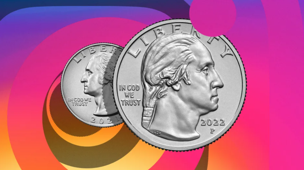
How a Small Change to U.S. Quarters Is Part of a Big Trend in Logo Design
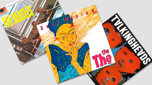
For Fast Company, Emblemetric’s James I. Bowie writes about the not-so-new trend of companies abandoning script logos:
Brands keep dumping their script logos. Which brand will be next?
For Fast Company, Emblemetric’s James I. Bowie reports that nine percent of capital A’s in US logos now lack crossbars:

For Fast Company, Emblemetric’s James I. Bowie writes about the design of cryptocurrency logos:
Here’s the Real Reason Why All of the Crypto Logos Look Alike

For Fast Company, Emblemetric’s James I. Bowie writes about the trend of putting logos in bold:
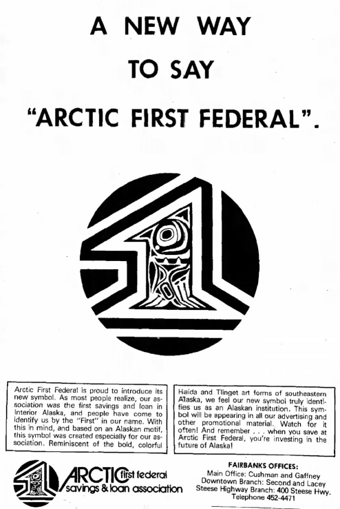
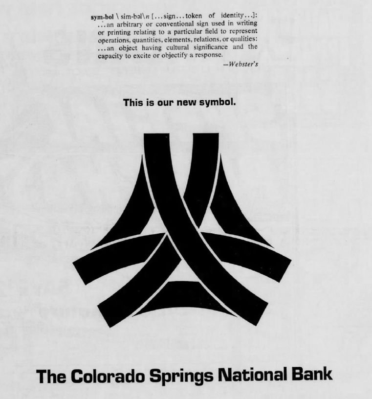
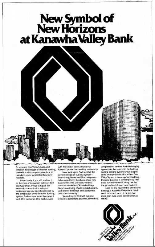
Emblemetric’s James I. Bowie has written an article for Marker about how US banks in the 1960s and 70s used newspaper ads to introduce their new abstract logos:
The Surprising Reason Why All Bank Logos Look the Same
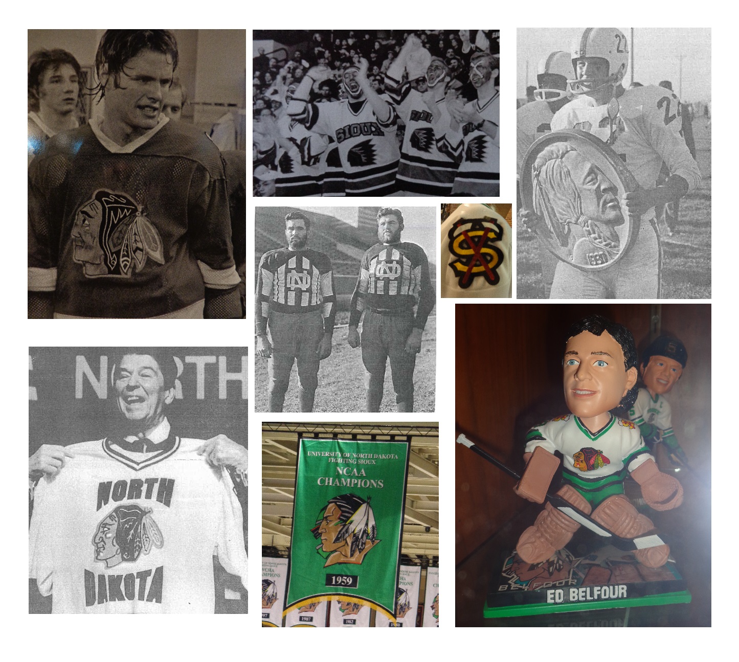
American colleges and universities have now largely abandoned Native American nicknames and logos that many find offensive. In 2012, following a battle that had lasted years, the University of North Dakota was forced to drop its “Fighting Sioux” nickname, which had been used by its athletic teams since 1930. Since then, the North Dakota teams have played without a nickname, something virtually unheard of in American sports. This year, having completed a two-year “cooling-off period,” the university will begin the process of selecting a new nickname. The old name, however, does not look like it will be forgotten quickly.
On a frigid Friday night in Grand Forks, North Dakota last November, I joined the throngs of UND hockey fans as they filed into the palatial Ralph Engelstad Arena to watch their team, a perennial college hockey powerhouse ranked number two in the nation, take on the seventh-ranked Miami University RedHawks from Oxford, Ohio, where I grew up.
“Let’s go, Sioux!” shouted one fan disembarking from a shuttle bus. “Who said that?” asked another, in mock indignation over the utterance of the banned name. “Everyone,” deadpanned a third.
And indeed, minutes later, when the public address announcer marked the arrival of the home team to the ice with, “Here comes the University of North Dakota…,” seemingly all 11,537 in attendance filled in the blank by bellowing “SIOUX!”
“The Ralph,” as the arena is known, is itself a monument to the Fighting Sioux nickname and logo. Engelstad, a former UND hockey player who made a fortune in the Las Vegas casino business, poured over $100 million into building the arena. During its construction in the late 1990’s, the controversy over the nickname flared up, and Engelstad threatened to withdraw his financial support if the nickname was changed.
As a safeguard against that possibility, Engelstad, before his death in 2002, had the Sioux logo emblazoned everywhere he could in the arena, making its removal cost-prohibitive. The “Quick Facts” section of the arena’s website goes so far as to point out that The Ralph contains “2,200 logos.” (My father, who taught Russian at Miami, told me that this reminded him of the story of Russia’s “Mad Czar,” Paul I, son of Catherine the Great, who, in a fit of insecurity, plastered his monogram all over his new castle, only to be assassinated forty days after he moved in.)
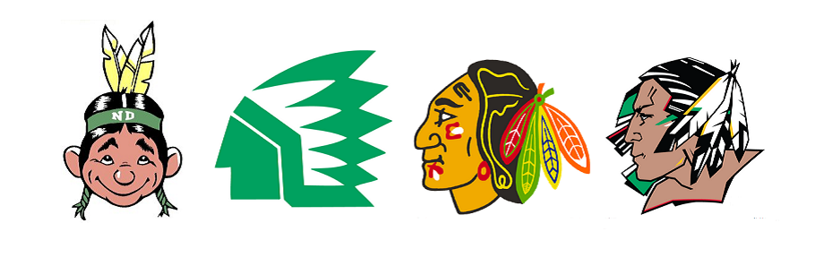 The logo, a depiction of a stoic Native American in profile, had itself been commissioned by Engelstad in 1999 to replace previous marks that UND had used, including a 1960’s Indian caricature, a 1976 abstract chief logo, and a version of the Chicago Blackhawks’ gently smiling Indian with multicolored feathers, borrowed with the permission of the National Hockey League team.
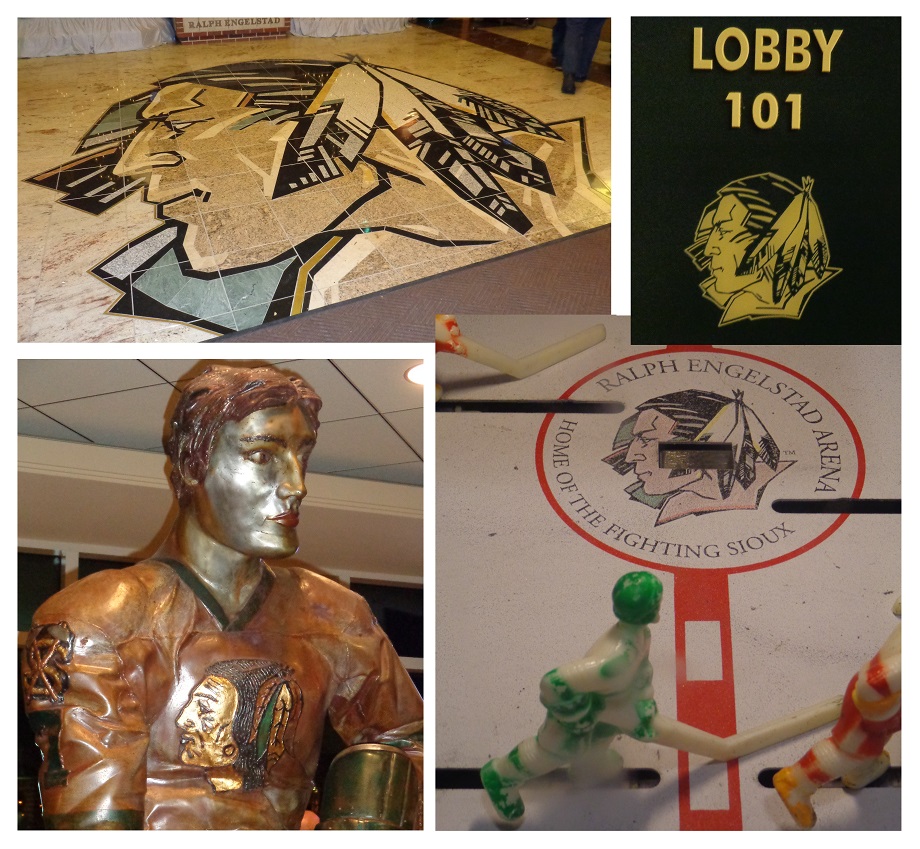
Before the game, I strolled around the arena. Sioux logos were, indeed, everywhere, from the granite floor to statues, from room number signs to the “center ice” of a bubble hockey game. Engelstad’s plan had worked; there were just too many logos to get rid of them all, and a 2012 agreement between the National Collegiate Athletics Association, which had forced the nickname ban, and the North Dakota Attorney General reversed a previous edict and allowed the logos to stay.
The nickname, too, was readily found in the arena, even though it could not officially pass anyone’s lips. Christmas shoppers crowded the “Sioux Shop,” a name that I suppose was an improvement over the “Sioux-venirs” moniker that the university had used in the past. Their purchases were in evidence around the arena, as the great majority of fans were decked out in team merchandise, much of it of the “Fighting Sioux” variety.
The atmosphere in the packed arena was electric, and the game was exciting, with the visitors pulling out a 3-2 victory. Miami, too, had been through a nickname change, as in 1997 the teams that I grew up rooting for as the Redskins became the RedHawks, complete with the characteristic nineties mid-word capitalization. That change had met far less resistance than what was being expressed at UND.
The Sioux nickname appeared to be heavily ingrained in the local culture, and it seemed that the outside pressure that had led to its removal only made UND fans more eager to hold onto it. In my hotel room that night, I noticed that the walls were not adorned with the generic artwork typical of such accommodations, but with historical photographs of UND hockey fans in Fighting Sioux gear.
The next day, I avoided the Grand Forks cold, walking from my hotel down a hallway to the adjacent Alerus Center, a convention facility that also serves as home to the UND football team. There I watched the Lumberjacks of Northern Arizona University, where I teach, face North Dakota on the gridiron. While the hockey game had matched two national powers, the football game was a meeting of teams from the relative small-time of the NCAA Division I Football Championship Subdivision, and there was far less excitement in the air.
The Alerus Center, while pleasant enough, had a sterile, sparse feel. It was a city-owned facility off of the UND campus, and there were certainly no Sioux logos to be seen; only an interlocking “ND” monogram served to represent the team. The UND supporters, as they had been at the hockey game, were eager to extend pleasantries to me as a fan of the visiting team, taking “Minnesota Nice” to the next level. The announced crowd of 5,916, which felt and sounded smaller than that, was treated to a hard-fought contest which the North Dakotans won with a last-second field goal, dashing NAU’s hopes for a Big Sky Conference championship.
Ironically, NAU football coach Jerome Souers, the only Native American head coach in Division I college football, is of Sioux descent, although he rejects the name as a French label imposed on his people and prefers to identify himself as Lakota. At an NAU forum about the Native American nickname controversy the week after the North Dakota game, he spoke eloquently about his opposition to the use of Native Americans as mascots. Hearing him served as confirmation to me that the UND name change was necessary, and that holdouts such as the Florida State University Seminoles, Washington Redskins, and Cleveland Indians would need to change as well.
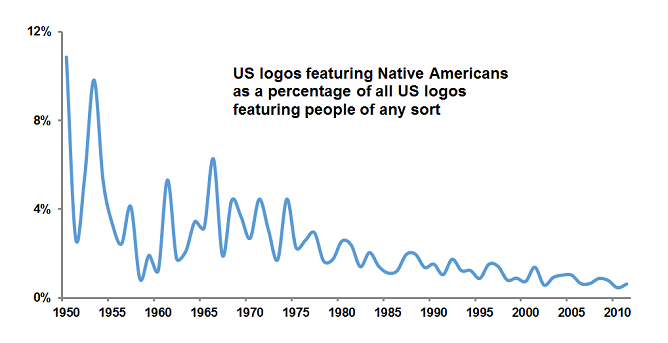
This conclusion seems in line with my analysis of data from the United States Patent and Trademark Office, which shows that the use of depictions of Native Americans in U.S. logos in general has been declining for decades.
What, then, will be next for North Dakota? The university has established a “Nickname and Logo Process Recommendation Task Force” which may in turn appoint yet another committee to help select a new name this year.
In my opinion, universities have not often done a good job of replacing Native American nicknames and logos. Fearful of controversy and hamstrung by committee decision-making processes, they have often selected names and marks that are bland, generic, uninspiring, and lacking in distinctiveness.
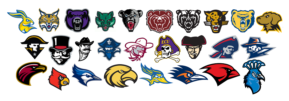
Birds are a typical choice. Of Division I schools that dropped Native American nicknames, 39 percent subsequently adopted a bird mascot. By comparison, among other Division I schools, only 15 percent have bird mascots.
Colors are also popular in post-Native American nicknames. Fully half feature some reference to color, compared with just seven percent of other schools’ nicknames.
Sometimes, birds and colors are combined, as in the case of the Miami RedHawks, Seattle Redhawks, Southeast Missouri State Redhawks, and Marquette Golden Eagles. UND would do well to avoid these clichés by selecting a name that is distinctive and memorable.
Logos can be very important to universities, and not just for their symbolic value; just ask the University of Texas, which makes over $10 million a year by licensing its Longhorn mark. In designing a new logo, North Dakota would be wise to avoid a visual trend that has been plaguing college sports in recent years: the “mean mascot” logo. While mascots have long been depicted in aggressive postures that imply competitiveness, college mascot logos of late have adopted a succession of dour grimaces and pained expressions that seem to suggest that athletic competition could never involve an ounce of fun.
And this parade of gruff forest creatures, pissed-off men in hats, and angry birds doesn’t just connote joylessness, but may also signify insignificance: while 54 percent of schools in the NCAA’s “Power 5” Conferences, the true “big-time” of college sports, have “mean mascot” logos, fully 73 percent of the other Division I universities, the more “small-time” schools, do. And 19 percent of the Power 5 have smiling “happy mascot” logos, compared to just 5 percent of the smaller schools. In some sense, a mean mascot may be a sign of being small-time; the more prominent college athletic programs are more likely to have the confidence to go with a less “intimidating,” more relatable, happy mascot.
I submit that if UND wishes to be perceived as a powerful sports program, it should avoid a logo with a cranky mascot and instead opt for one that suggests confidence, positivity, and fun.
The most fertile ground for creative, fun sports nicknames and logos currently exists around minor league baseball teams. These organizations, compared to universities, are relatively unencumbered by tradition and the need for solemnity. They seem to pick names and logos that will draw fans and sell t-shirts through attractive design and good humor.
The University of North Dakota faces a tough challenge in that so many of its fans seem unwilling to let go of the “Fighting Sioux” name. In addition, picking an official nickname by means of a committee presents issues of its own, as creative endeavors are not easily accomplished through bureaucratic processes. Even the term “official nickname” is an oxymoron; nicknames are inherently informal, and arose in the past in more organic ways.
I don’t think that there is an easy solution to UND’s quandary, but I would like to suggest one possibility: returning to the nickname that was replaced by “Fighting Sioux” in 1930, the Flickertails. A flickertail is a squirrel native to North Dakota and was seen by many at the university at the time as not tough enough to serve as a mascot. The same criticisms would probably be leveled today, but I would argue that insistence on a hyper-aggressive mascot is indicative of insecurity about being “small-time.” It’s worth considering that the college football national championship was just contested by the “Ducks” and the “Buckeyes.”
Flickertails would not only be a unique, memorable nickname, and would lend itself to a creative and fun logo treatment featuring a happy mascot, but it also has a basis in university history and tradition that would grant it a certain legitimacy. So, what do you say, North Dakota?
For Fast Company, Emblemetric’s James I. Bowie looks at the antiquated logo of $1 trillion chipmaker TSMC:
It’s one of the most valuable companies in the world, and its logo is baffling
For Fast Company, Emblemetric’s James I. Bowie presents a modest proposal to rebrand AI:
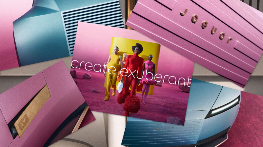
For Fast Company, Emblemetric’s James I. Bowie writes about how Jaguar has followed a trend of flat, thin, and round logos in the automotive industry as carmakers pivot toward electric vehicles:
Why Jaguar’s controversial new logo actually signals a big shift in car branding
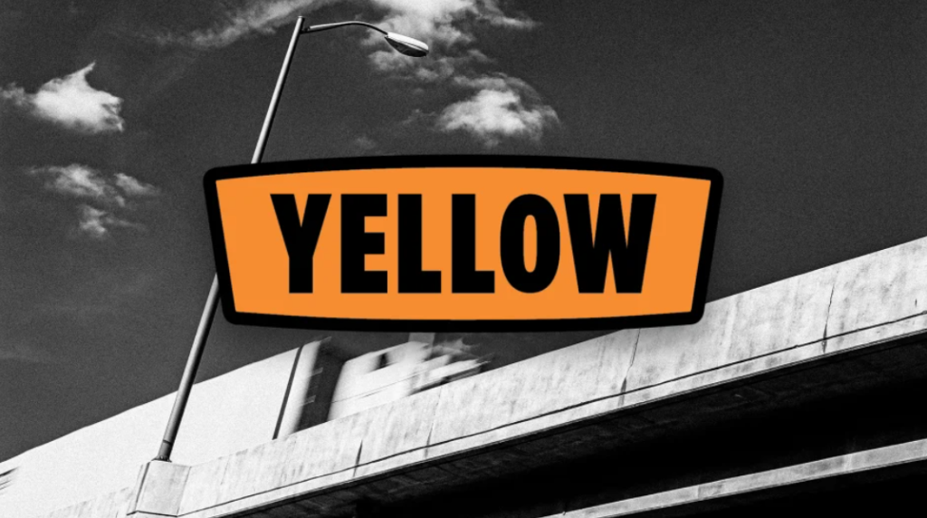
For Fast Company, Emblemetric’s James I. Bowie writes about the charm of the Yellow logo:
Yellow trucking may be shutting down, but its logo remains iconic
The Southeastern Conference, or SEC, has dominated America’s most popular college sport, football, in recent years, winning seven of the last eight national championships. It features fourteen members from across the football-mad South, including such traditional college football powerhouses as the Alabama Crimson Tide and the Georgia Bulldogs. On Thursday of this week, the SEC will parlay its on-field success into a lucrative television venture as the SEC Network, a cable channel operated under the aegis of ESPN, debuts.
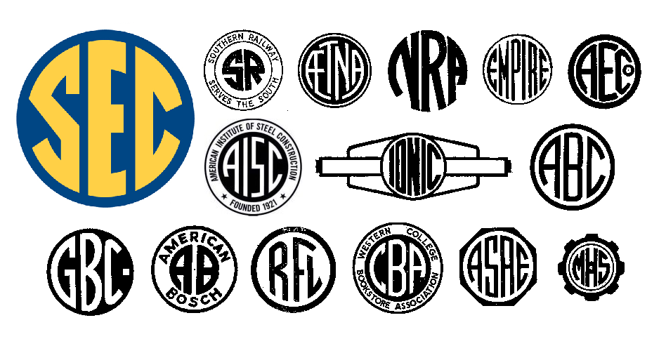
While the popularity of the SEC may be attributed primarily to its victories on the gridiron, the conference has also benefited from branding efforts that have resulted in a strong visual identity. Specifically, in 2007 the SEC began using, as part of a celebration of its 75th anniversary, a new logo featuring the conference initials confined within a circle. But in fact the logo was not exactly new; it was a variation of a mark used by the conference for years, a “pinwheel” with banners for each of the conference members emanating from the central circular monogram.
The old SEC “pinwheel” logo
This pinwheel logo dated to a time when branding efforts by college athletic conferences were not afforded much concern. Indeed, the SEC circle mark was generic, derived from a common monogramming technique that produced many company logos (see above), and is still in use today for monogrammed personal items.
In 1988, the SEC attempted to adopt a contemporary image, implementing a new logo with its initials in a somewhat futuristic typeface over a diamond-shaped background of stripes.
The SEC’s “Diamond” logo, in use 1988-2007
This “diamond” logo was used until 2007. Its replacement represented a realization by the SEC that its image and appeal were based not in the present, but in the past. Although college sports, and football in particular, have become multimillion dollar businesses, what differentiates them from professional sports is a stronger sense of passion and loyalty among their fans, and a great concern with the long-held traditions surrounding the teams and the universities they represent.
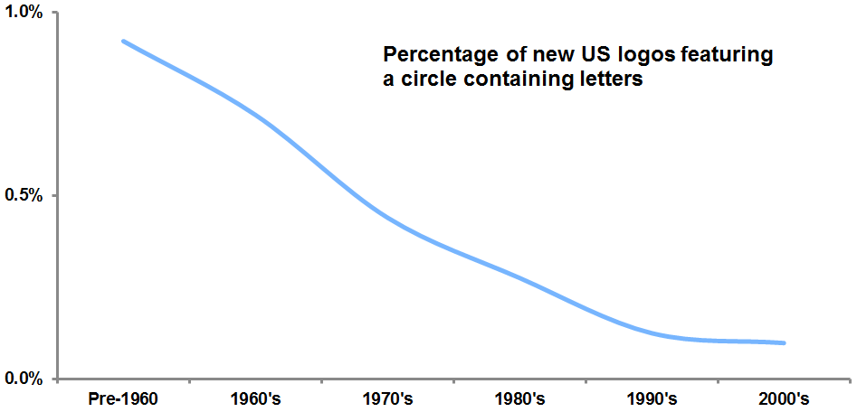
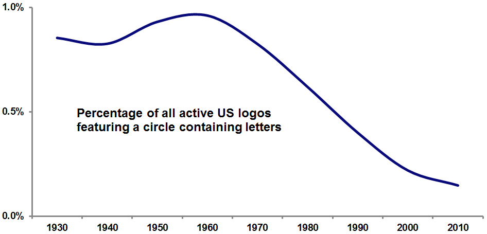
Analysis of logo design data from the United States Patent and Trademark Office clearly shows that the SEC logo is most closely associated with the period before 1960. US logos featuring a circle containing letters have fallen out of fashion since that time; in the most recent decade, they made up less than .01 percent of new marks.
The genius of SEC branding is that it wholeheartedly embraces a logo with such an antiquated style. Doing so allows the conference to project an image steeped in tradition, heritage, and authenticity, one that resonates with its fans, particularly in the South, where nostalgia for an idealized past remains strong. As the song says, “old times there are not forgotten.”
The logo might best be characterized as “antimodern,” rejecting as it does contemporary design trends in favor of datedness. The SEC is not the first organization to adopt such an antimodern logo: the All England Lawn Tennis Club’s Wimbledon Championships and NASA both abandoned modern-looking logos in favor of more dated-looking marks after concluding (rather bizarrely, in NASA’s case) that their images were better linked to the past than to the modern day.
Modern Wimbledon and NASA logos and their antimodern replacements.
The SEC logo has achieved distinctiveness in a roundabout fashion. At the time of its first use, the SEC pinwheel monogram would have appeared quite mundane, bearing a strong similarity to many other marks of its day. Today, however, the great majority of those similar monogram logos have died off, as shown in the graph below.
As a result, the resurrected SEC monogram is left with a quite distinct appearance, particularly in relation to its fellow collegiate athletic conferences, many of whose logos have in recent years taken on a similar hyper-italicized, pointy-serifed, futuristic look.
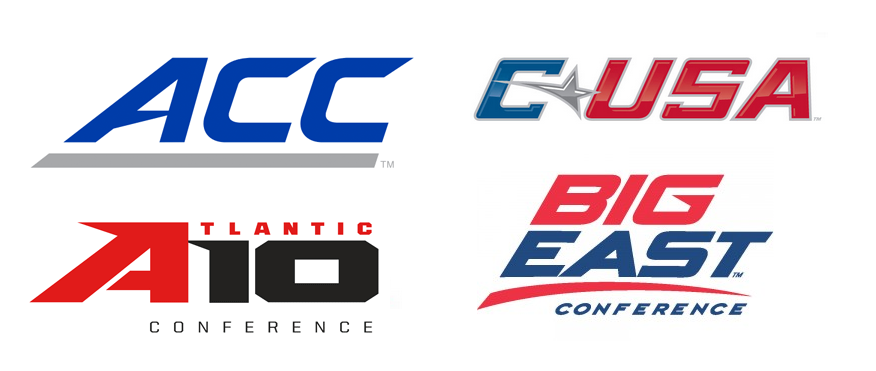
Contemporary college athletic conference logos
In fact, today the SEC logo bears less resemblance to the symbols of fellow American college sports conferences and more to the crests of many Brazilian soccer teams. These clubs likely adopted their emblems when the circular monogram style was in vogue and retained them ever since, avoiding the need for the type of antimodern about-face done by the SEC.
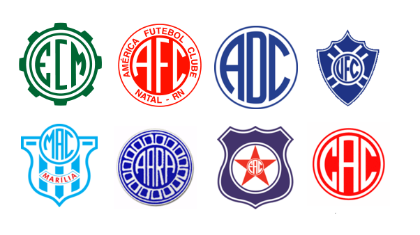
Brazilian soccer team crests
________________________________
Interested in reading more about college sports logos? Here is a history of the Texas Longhorn logo from Emblemetric’s James I. Bowie:
For Fast Company, Emblemetric’s James I. Bowie writes about Apple and Major League Soccer combining their logos in a bit of co-branding that is more inspired than what we usually see:
Apple’s cool Major League Soccer logo mash-ups are changing the rules of co-branding
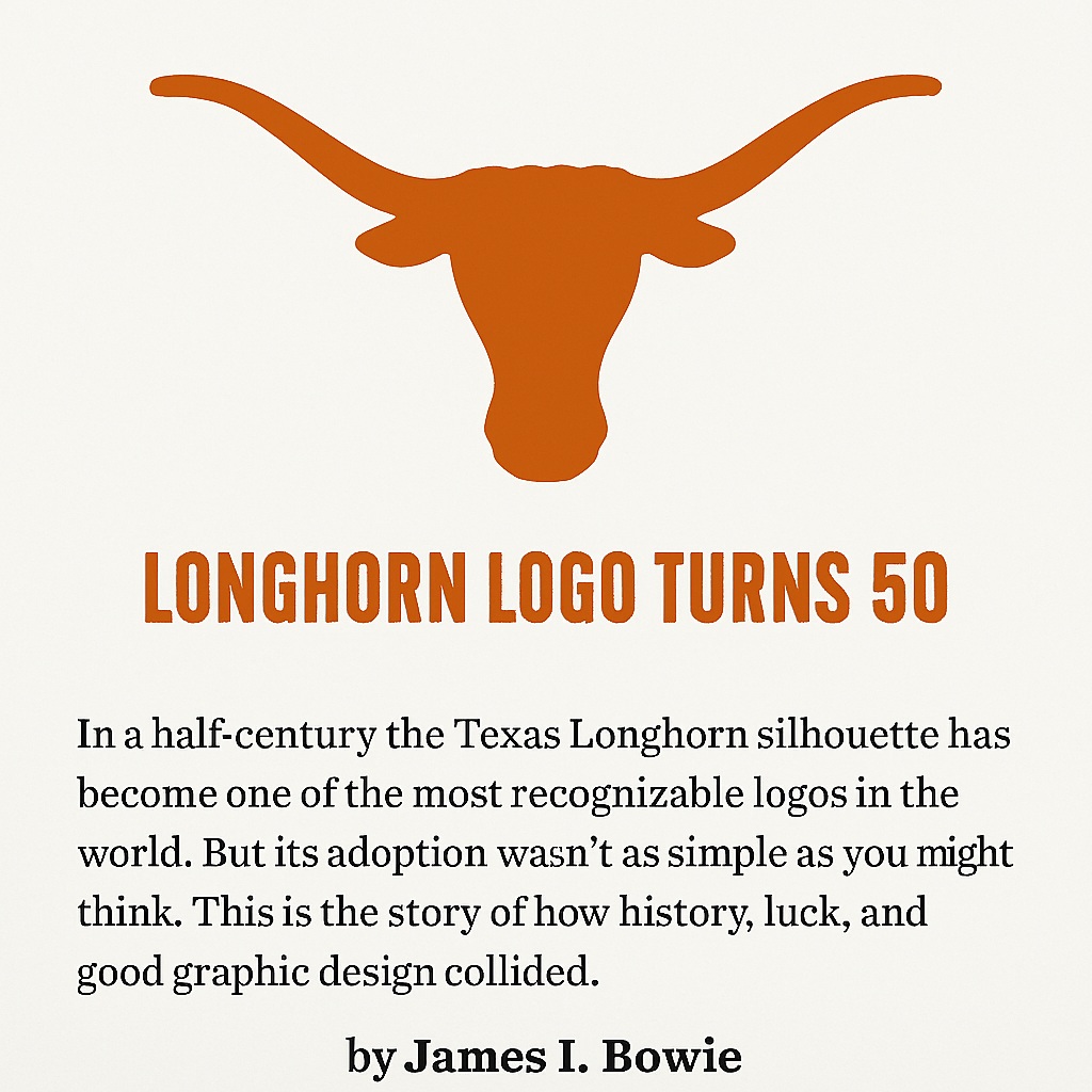
For The Alcalde, the University of Texas alumni magazine, Emblemetric’s James I. Bowie details the history of the Texas Longhorn logo:
On the occasion of Nike naming a shoe after Flagstaff, Arizona–the location of Emblemetric world headquarters–we take a look at the use of city names as trademarks in Fast Company:
When your town becomes a Nike brand
And here’s the list of the largest 100 U.S. cities, in order of the number of trademark applications featuring the city name by companies located elsewhere, per 100,000 residents:
1 Buffalo 763.80
2 Madison 431.67
3 Lincoln 390.49
4 Miami 356.64
5 Boston 344.89
6 Washington 322.10
7 Aurora 310.59
8 Detroit 208.93
9 Chesapeake 200.09
10 Atlanta 185.58
11 Phoenix 177.08
12 New Orleans 163.68
13 Orlando 158.38
14 Cleveland 143.11
15 Las Vegas 137.23
16 Mesa 129.39
17 St. Louis 127.06
18 Riverside 105.69
19 Richmond 104.69
20 Austin 102.36
21 Pittsburgh 100.25
22 San Francisco 99.14
23 Tampa 90.74
24 Nashville 86.95
25 Seattle 81.58
26 Reno 79.66
27 Chicago 78.55
28 Lexington KY 74.34
29 New York 72.62
30 Gilbert 69.35
31 Henderson 68.78
32 Garland 68.59
33 Baltimore 65.81
34 Irving 64.47
35 Memphis 64.17
36 Charlotte 62.88
37 Chandler 60.68
38 Kansas City 60.50
39 Cincinnati 58.82
40 Toledo 56.92
41 Milwaukee 56.47
42 Denver 56.38
43 Dallas 56.11
44 Laredo 53.57
45 Fremont 52.61
46 Scottsdale 49.51
47 Columbus 49.17
48 Oakland 44.90
49 Portland 43.77
50 Los Angeles 43.76
51 Durham 41.19
52 Philadelphia 39.34
53 San Diego 38.25
54 Arlington 34.89
55 Stockton 30.04
56 Houston 29.17
57 Irvine 28.61
58 Omaha 28.14
59 Minneapolis 27.99
60 Norfolk 26.85
61 St. Paul 26.33
62 El Paso 26.22
63 Honolulu 26.04
64 Glendale 26.00
65 St. Petersburg 25.04
66 Long Beach 24.70
67 Raleigh 23.84
68 Anchorage 22.37
69 Anaheim 21.44
70 Tulsa 21.36
71 Tucson 19.74
72 Boise 19.54
73 Sacramento 18.81
74 Newark 17.71
75 San Antonio 16.05
76 Louisville 15.57
77 Huntsville 15.52
78 Bakersfield 14.27
79 San Jose 14.03
80 Indianapolis 13.99
81 Jacksonville 11.97
82 Santa Ana 11.91
83 Fresno 11.36
84 Oklahoma City 10.96
85 Spokane 10.90
86 Wichita 10.86
87 Fort Wayne 10.37
88 Plano 9.99
89 Greensboro 9.59
90 Fort Worth 9.20
91 Corpus Christi 7.90
92 Albuquerque 7.50
93 Chula Vista 6.93
94 Lubbock 6.37
95 Virginia Beach 5.73
96 Colorado Springs 3.48
97 Winston-Salem 2.37
98 Jersey City 2.06
99 Port St. Lucie 0.82
100 North Las Vegas 0.70
For Fast Company, Emblemetric’s James I. Bowie writes about the popularity of logos featuring skulls:
For Fast Company, Emblemetric’s James I. Bowie writes about the dearth of logos featuring the outline of the continental United States:
Patriotism is out of style, at least when it comes to logo design
For Fast Company, Emblemetric’s James I. Bowie writes about the ability of a logo, any logo, to provide legitimacy to organizations of all sorts:
What FIFA’s new controversial logo reveals about the power of branding

For Fast Company, Emblemetric’s James I. Bowie writes about the Rorschach test that is the rumored new OpenAI logo:
Why concerns about OpenAI’s new logo are about more than design
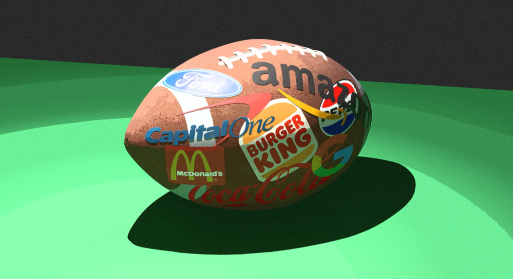
For Fast Company, Emblemetric’s James I. Bowie writes about the advertiser logos popping up on college football fields this season:
For Fast Company, Emblemetric’s James I. Bowie writes about Nvidia’s extremely mid-90s logo:
Nvidia’s quirky logo reveals just how much the company has changed
For Fast Company, Emblemetric’s James I. Bowie writes about logo nicknames:
Bombardier’s new logo is part of a growing trend: naming your logo
For Fast Company, Emblemetric’s James I. Bowie writes about how brands are using angles and tilts to hide “Easter eggs” in their logos:
The hidden meaning behind Bitcoin’s leaning logo is part of a growing trend in design
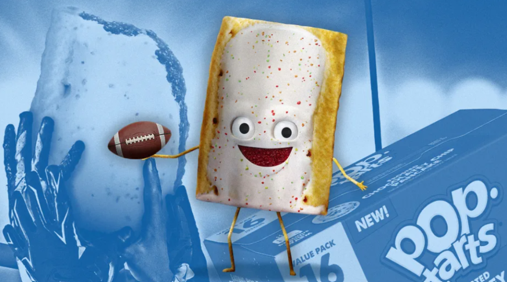
For Fast Company, Emblemetric’s James I. Bowie writes about today’s brand mascots:
New Pop-Tarts ‘edible mascot’ is part of a big trend in branding
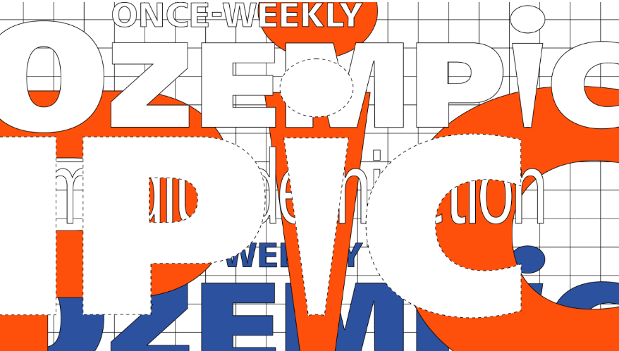
For Fast Company, Emblemetric’s James I. Bowie writes about how the Ozempic logo promotes off-label use for weight loss:
Why a hidden message in Ozempic’s logo represents a big shift in drug branding
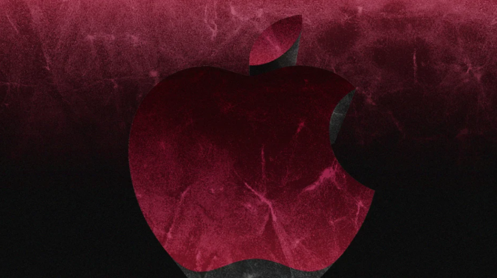
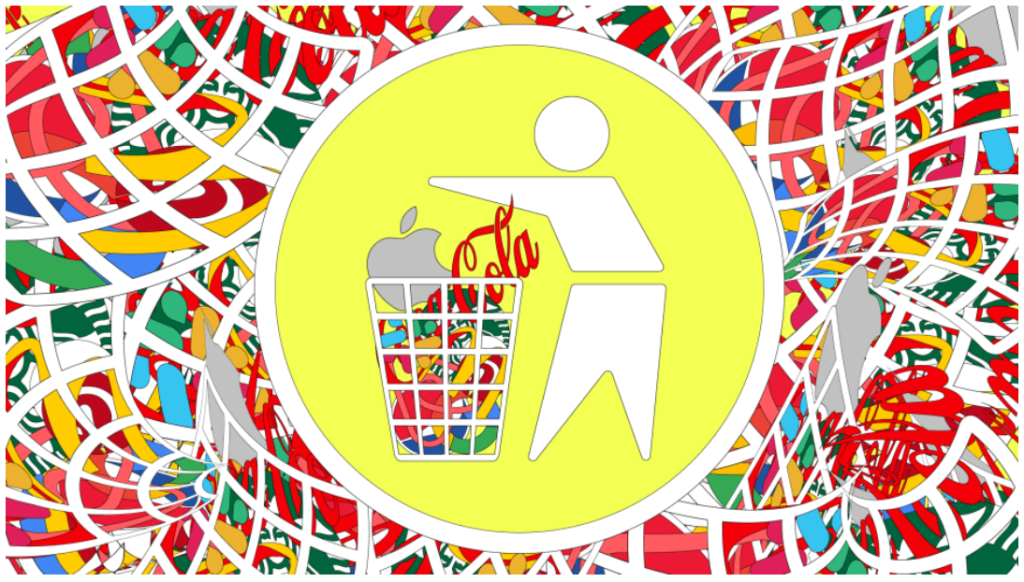
For Fast Company, Emblemetric’s James I. Bowie writes about the prevalence of apple logos in a world where Apple is the most valuable company:
Is Apple really a trademark bully? Here’s what the data says
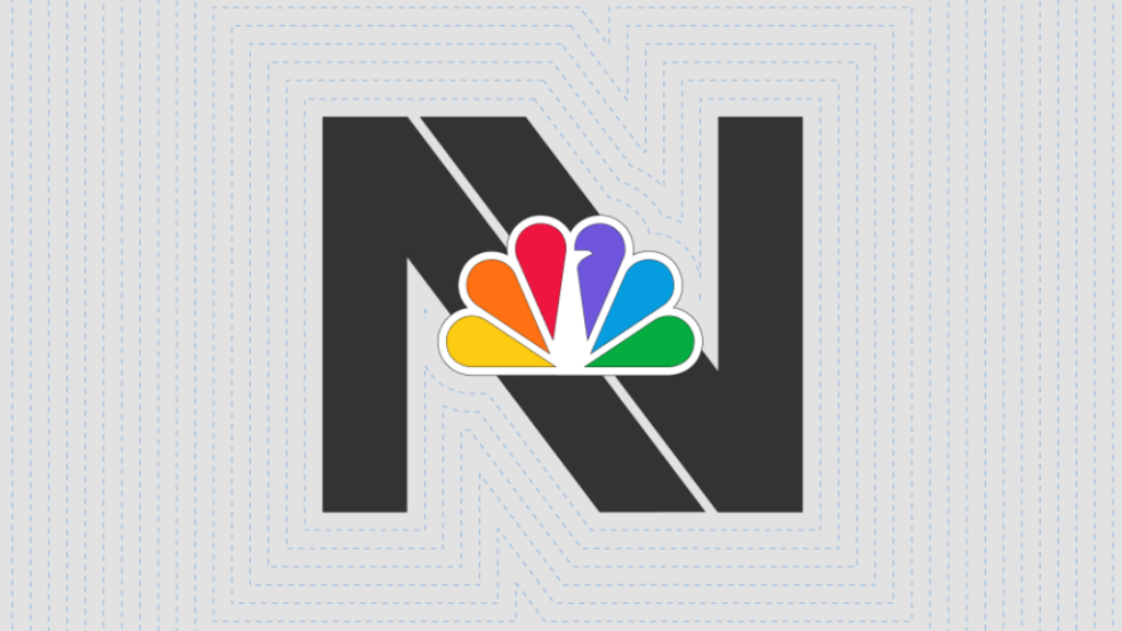
For Fast Company, Emblemetric’s James I. Bowie writes about the increasing use of single-letter monogram logos and their potential drawbacks:
NBC’s weird Nightly News branding reveals the challenges of single-letter logos
For Fast Company, Emblemetric’s James I. Bowie writes about the World Cup 26 branding, which emphasizes “FIFA” over the host nations:
FIFA’s 2026 World Cup logo is part of a confounding branding trend in sports
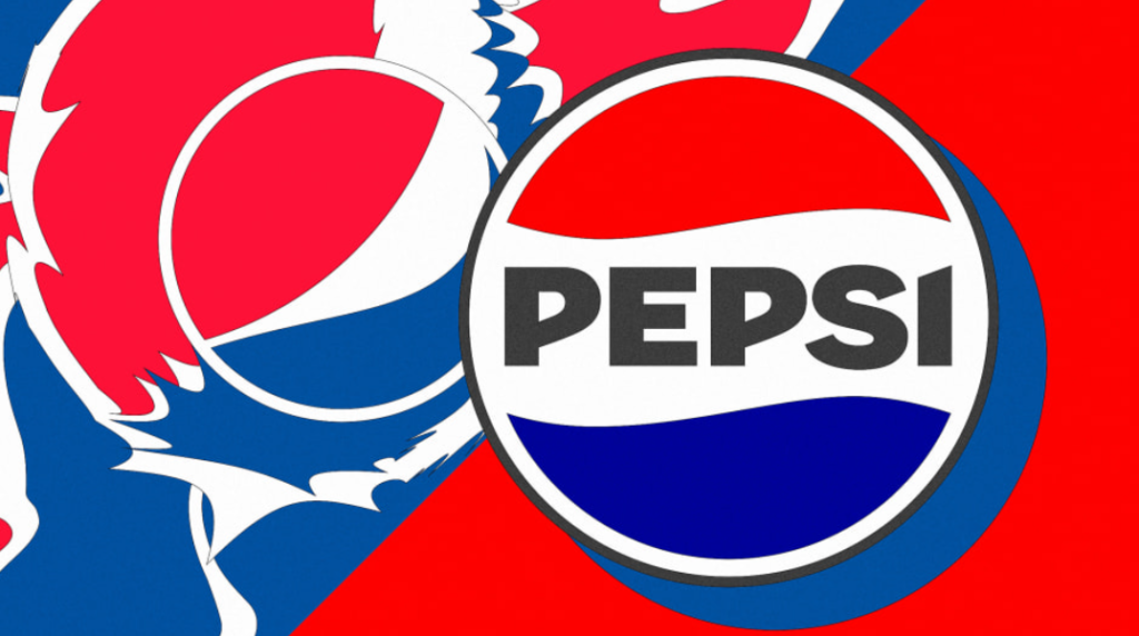
For Fast Company, Emblemetric’s James I. Bowie writes about Pepsi’s rebrand from a “weird” logo to a “normal” logo:
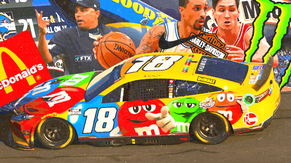
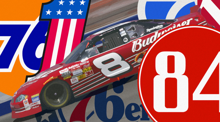
For Fast Company, which sounds like a NASCAR publication, but isn’t, Emblemetric’s James I. Bowie writes about how while the NBA, NHL, and MLB struggle with injecting advertising into their sports, NASCAR’s “billboards on wheels” are a feature, not a bug:
Sports ads are about to get more aggressive—here’s what they could learn from Nascar
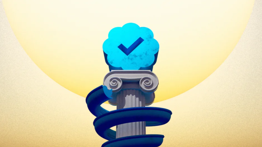
For Fast Company, Emblemetric’s James I. Bowie writes about the design of Twitter’s “blue check”:
Behind the design of Twitter’s blue check—and how it became a polarizing symbol
For Fast Company, Emblemetric’s James I. Bowie writes about how reports of the logo’s death are greatly exaggerated:
For Fast Company, Emblemetric’s James I. Bowie writes about how logo designs, just like baby names, cycle through trends:
Is your company logo a ‘Karen,’ a ‘Heather,’ or maybe even a ‘Brandon’?
For Fast Company, Emblemetric’s James I. Bowie writes about the branding power of the word “The”:
How 3 Little Letters Can Make a Big Difference in How We Think About Brands
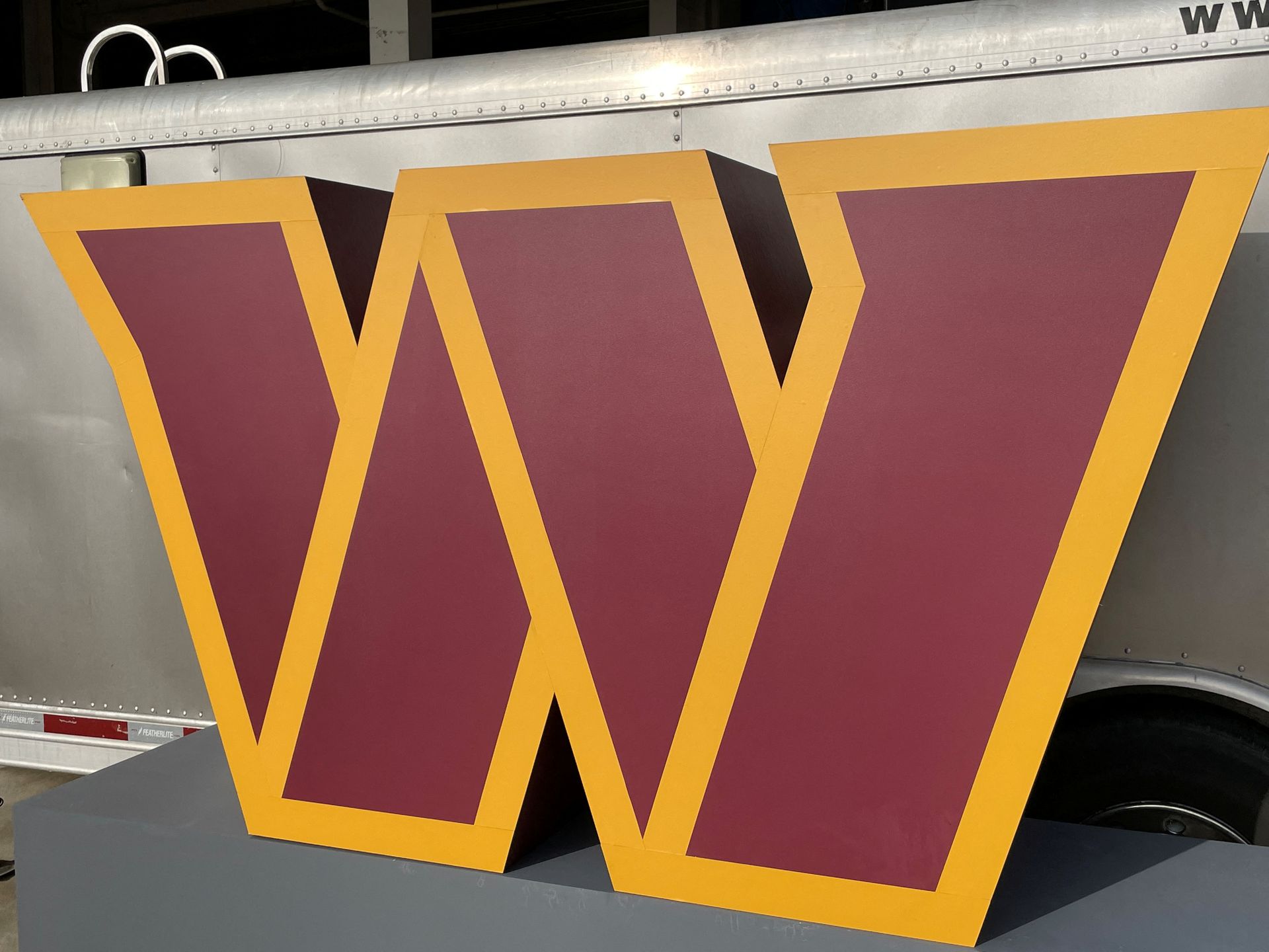
For Fast Company, Emblemetric’s James I. Bowie writes about why the Washington Commanders rebrand seems “minor league”:
Why the Washington Commanders Rebranding Is Way Too Much and Still Not Enough
For Marker, Emblemetric’s James I. Bowie writes about “blanding” and the history of brands and logos looking similar to one another:
Are Brands Really Turning Into Blands?
For Marker, Emblemetric’s James I. Bowie writes about the post-9/11 increase in the use of firearm imagery in American logos:

For Marker, Emblemetric’s James I. Bowie writes about the difficulty of designing an Olympic logo in an increasingly diverse world:
For Marker, Emblemetic’s James I. Bowie writes about how the new “name, image, and likeness” rules for college athletes are spurring them to start using personal logos:
For Marker, Emblemetic’s James I. Bowie writes about how Airbnb’s “Bélo” symbol overcame its dirty-minded detractors to embody the loopy logo trend:
How Airbnb’s Logo Brushed Off the Haters to Embody a Trend
For Marker, Emblemetric’s James I. Bowie writes about the use of area codes in trademarks and logos:
How the Boring Area Code Became a Hot Branding Commodity
For Fast Company, Emblemetric’s James I. Bowie writes about how Colonial Pipeline’s outdated branding was indicative of its vulnerability to cyberattack:
Colonial Pipeline’s branding is a disaster. That should’ve been a warning sign
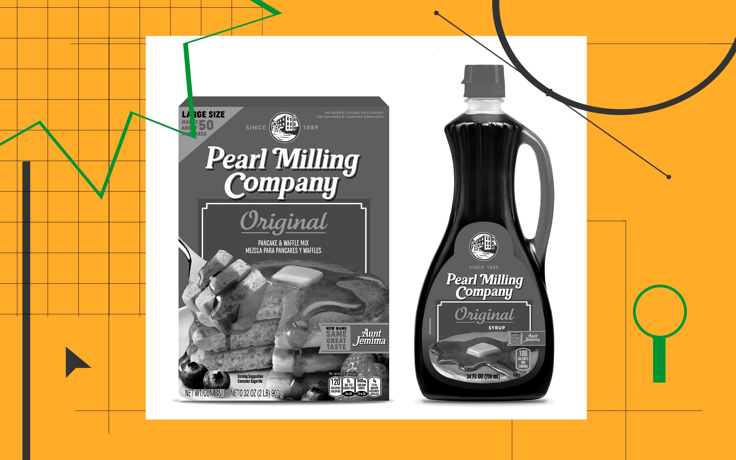
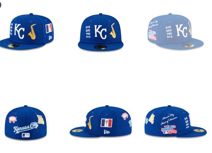
In Marker, Medium’s business publication, Emblemetric’s James I. Bowie writes about corporate America’s struggle to use depictions of people in its logos:
Replacing Aunt Jemima Is Just the Tip of the Iceberg
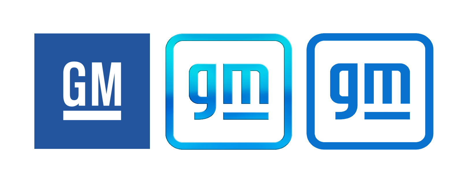
Emblemetric’s James I. Bowie on the new GM logo in Marker, Medium’s business publication:

Emblemetric’s James I. Bowie writes about Supreme and its multibillion-dollar logo for Marker, Medium’s business publication:
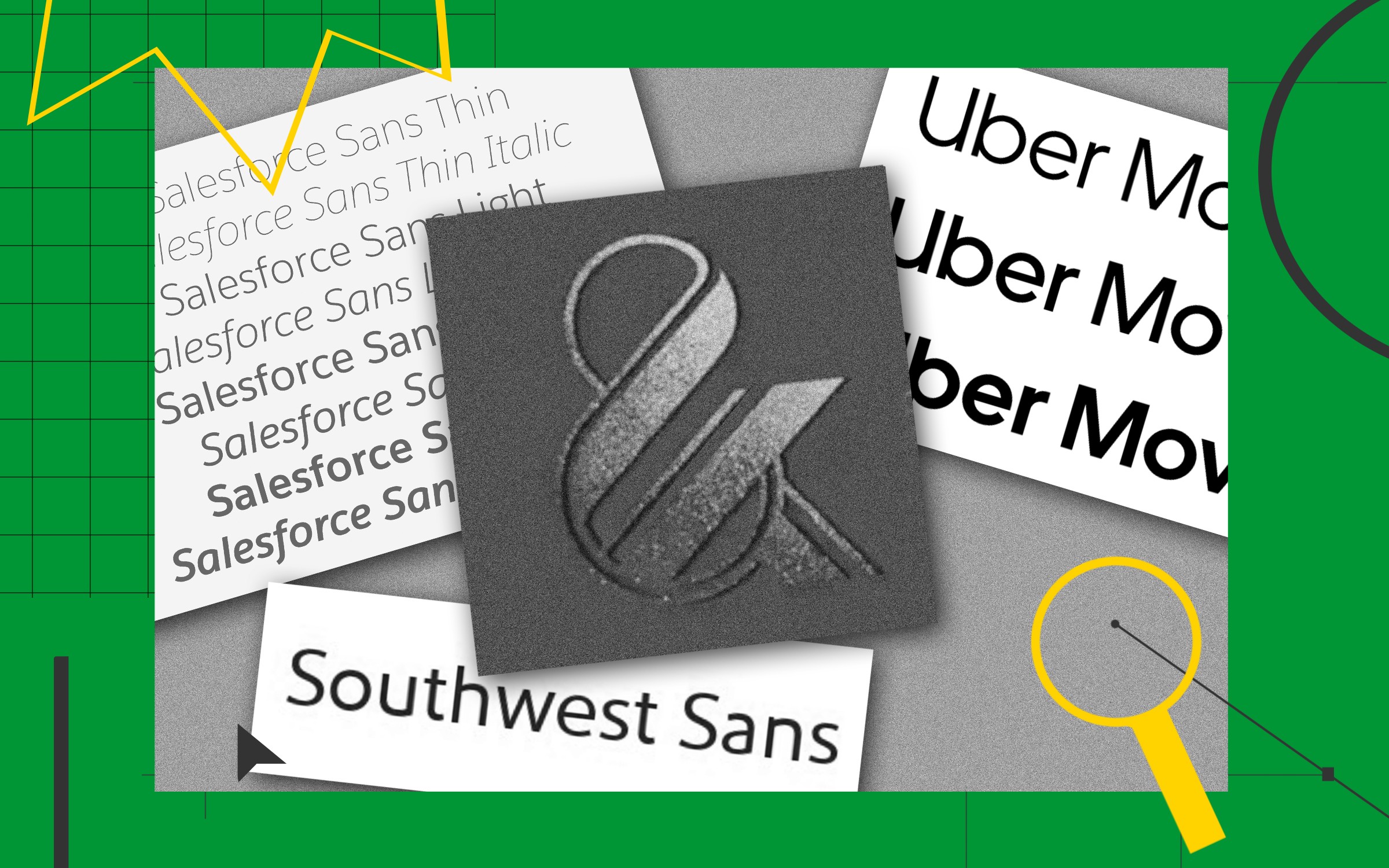
Emblemetric’s James I. Bowie writes about the phenomenon of bespoke typefaces for Marker, Medium’s business publication:
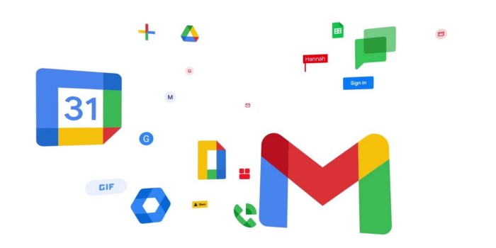
Emblemetric’s James I. Bowie writes about the Google Workspace rebrand, including the demise of the Gmail envelope, for Marker, Medium’s business publication:
Those New G-Suite Logos Everyone Hates? They’re Actually a Smart Idea
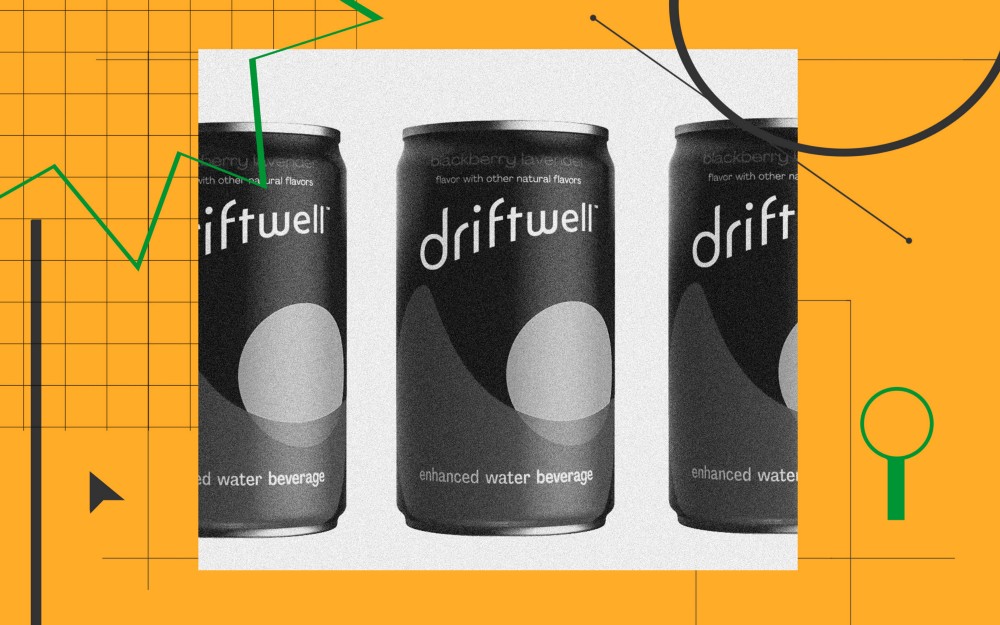
Emblemetric’s James I. Bowie writes about the branding of Driftwell, Pepsi’s new “enhanced water beverage,” for Marker, Medium’s business publication:
How Pepsi Got Suckered Into Every Hot Branding Trend
For Marker magazine, Emblemetric’s James I. Bowie has written about Spotify’s underwhelming branding:
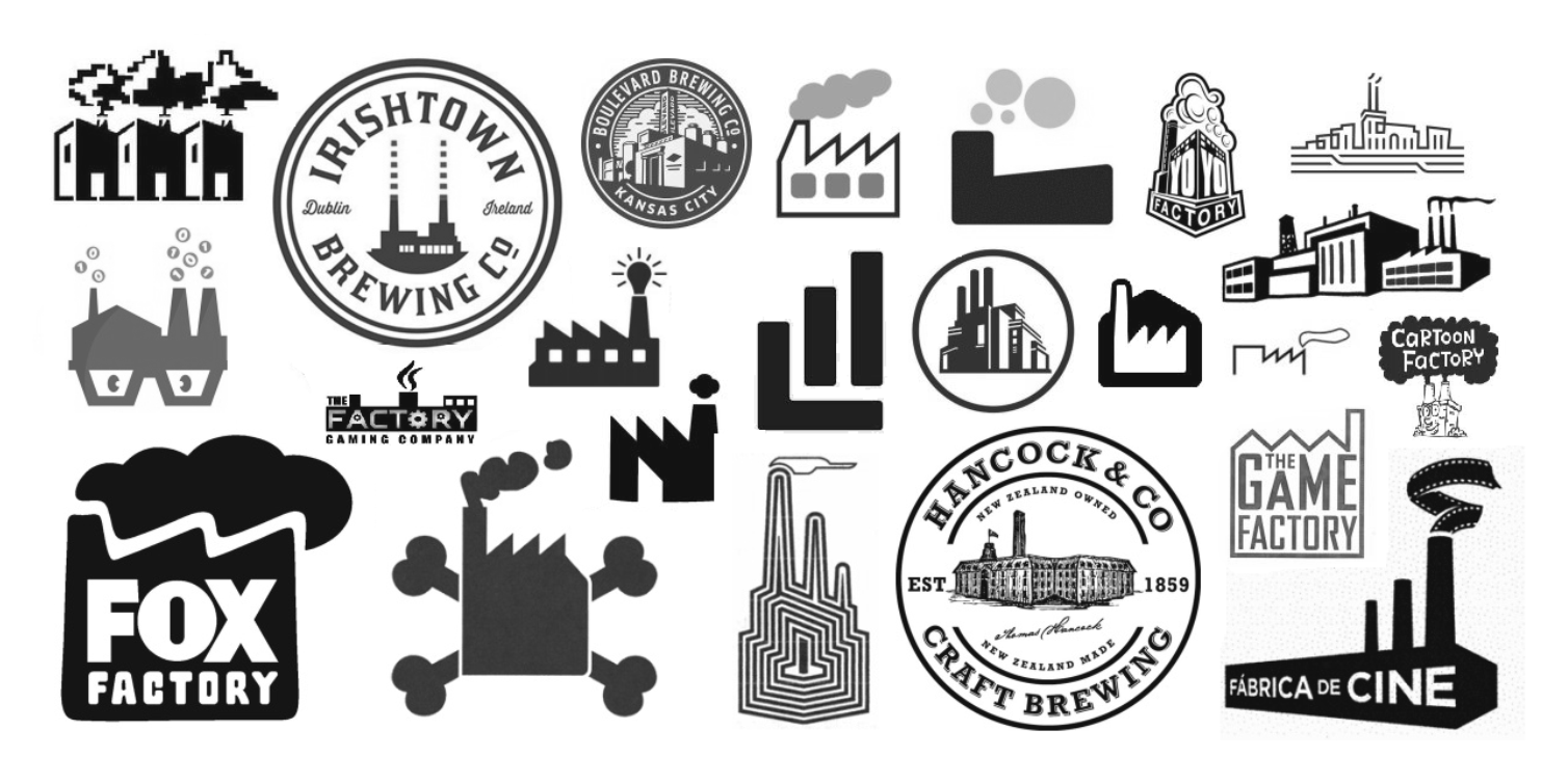
The annual celebration of Earth Day highlights an environmental consciousness that is becoming increasingly important as the threats associated with global warming rise. Yet American logo design has recently seen a resurgence of marks featuring smokestacks and factories which hearkens back to the earliest days of corporate symbolism in a rather environmentally unfriendly way. What’s behind this trend?
When companies first needed to express a visual identity to the public, the factory was a popular image to use. In his 1998 history of American business identity, Creating the Corporate Soul: The Rise of Public Relations and Corporate Imagery in American Big Business, Roland Marchand pointed out that “during the late nineteenth century and even later in some cases, as industries rapidly expanded, the factory image made good sense as a merchandising and public relations vehicle. Impressive and often romanticized, it assured customers that they were dealing with a stable, competent firm.” It had been noted that “these depictions [of factories] sought to hearten executives and impress viewers by displaying billows of (productive) black smoke spouting from a multitude of chimneys.” Marchand reported that “corporations selling products as varied as yeast, razor blades, fertilizer, and underwear all greeted the public with pictures of the factory.”
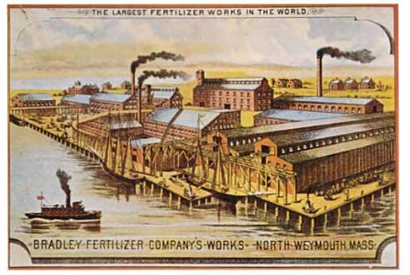
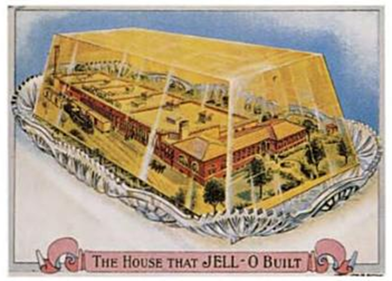
Late nineteenth-century trade cards depicting factories (Marchand, 1998)
The factory with smokestacks cliché in logo design persisted into the 1970s. Designer Jerry Herring’s 1975 pamphlet “Stock Trade Marks,” which satirized the lookalike logos of the time, asked the tongue-in-cheek question, “Dear corporation president, public relations director, or agency art buyer: Are you in need of a dynamic new image to replace the smoking smoke stacks you or your client is now using as a trade mark?”
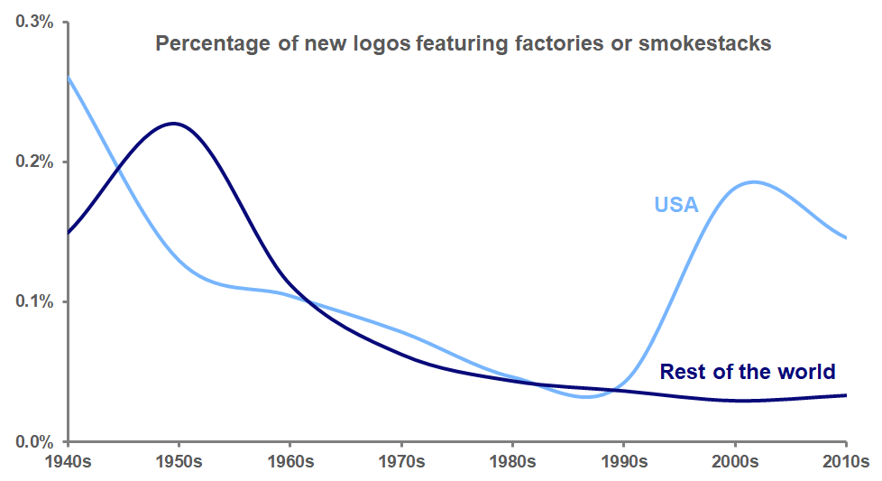
Analysis of data from the United States Patent and Trademark Office and the World Intellectual Property Organization, though, shows that by the seventies, the factory smokestack logo was on its way out, before reaching its nadir in the 1990s. But over the past two decades, these logos have rebounded to become more common again in the United States, although not in the rest of the world. American designers seem to revel in the graphic possibilities of the factory’s wafting smoke and distinctive sawtooth roof.
The popularity of these new smoky logos appears to be explainable in two ways. First, many of these marks use detailed, realistic depictions of factories to convey a sense of nostalgic authenticity, particularly for businesses with a hipster appeal, such as craft breweries. This attempt to invoke “old-timeyness” can also be seen in the use of logo design elements such as crossed objects, mustaches, and establishment dates.
Second, many of these new logos depict the factory in an abstract way, one that is figurative rather than literal. These logos often represent companies that don’t actually have factories; it’s just that the idea that their particular product (movies, games, cartoons) might be manufactured in a factory is whimsical and amusing.
But why would companies take the risk of offending the environmentally-sensitive public with these factory and smokestack images? As the Environmental Protection Agency data in the graph below shows, industrial emissions of carbon monoxide, a major greenhouse gas, have declined dramatically in the U.S. since 1970 as stricter environmental regulations have been put in place and industrial manufacturing has moved overseas.
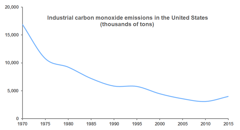
There are simply fewer smoky factories in the U.S. than there used to be. It may be that to many younger Americans, a factory spewing smoke is just not something that they ever encounter in their lives, and so the image of the factory functions more as a metaphor, a symbol of productivity or of historical sentimentality, rather than as a literal threat to their environment, making these logos acceptable in a way that they would not have been a few decades ago.
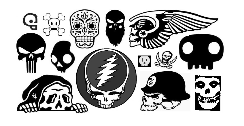
At Halloween, skulls and skeletons make for popular decorations, but in recent years they have been appearing with much greater frequency as design elements in American logos. Skulls, in particular, seem to have assumed a more prominent place in trademarks. Before the turn of the millennium, not many organizations, outside of the occasional rock band or biker gang, were interested in adopting a logo featuring a skull, traditionally the most common memento mori, or reminder of death. The skull’s long-held associations with piracy and poison did not help, either.
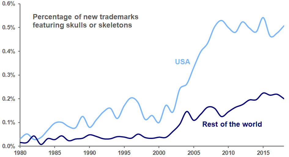
But analysis of United States Patent and Trademark Office data shows that between 2000 and 2009, the percentage of new logos with skulls and skeletons more than quintupled, and has remained at this higher level ever since.
What accounts for this increase? The trend toward skull logos has not been as noticeable outside of the United States. Analysis of World Intellectual Property Organization data from more than 100 other countries shows that the use of skulls and skeletons in logos also rose during the first decade of the millennium, but not nearly to the extent seen in the US.
It’s hard to ignore that the increase in American skull logos took place at the same time that the nation assumed a war footing after the terrorist attacks of September 11, 2001. As the number of combat deaths in Iraq and Afghanistan grew, so did the number of skull logos in the US. It does not seem unreasonable to speculate that, just as the use of logos featuring hearts increased after September 11, the specter of death raised by these wars permeated American culture and saw its expression in symbols of commerce. As these wars wound down, the use of skull logos leveled off, but has stayed high.
An examination of today’s American skull logos shows a variety of businesses exhibiting crude expressions of menace, juvenile assertions of badassedness, and more than a little fascist iconography. There are some exceptions to these trends, including the recent popularity of the calavera (the Mexican “sugar skull” used to celebrate Día de los Muertos) as a logo design element. But for the most part, these skull logos are more trick and less treat.
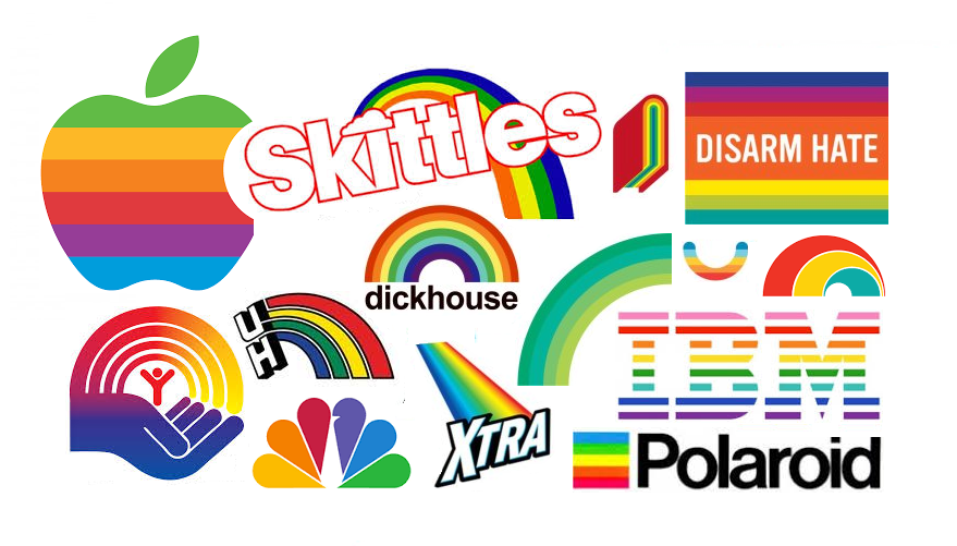
June is Pride Month, and the most visible manifestation of this celebration of the gay community is the rainbow–in particular, the Rainbow Flag designed by Gilbert Baker in 1978. In recent Junes, the flag has gone mainstream as companies such as IBM have rolled out rainbow versions of their logos to honor (or co-opt) the Pride movement.
The use of rainbows in commercial symbolism is a relatively recent phenomenon. Analysis of United States Patent and Trademark Office data (see below) shows that, prior to the late 1970’s, very few American logos featured rainbows. Saul Bass’s 1972 United Way logo was a notable exception, and Rob Janoff’s 1977 Apple mark, with its famously out-of-order colors, helped bolster the trend. In 1978, as Baker sewed his first flag and Robin Williams’s Mork from Ork first graced American airwaves with his rainbow suspenders, the popularity of rainbow logos suddenly spiked, and remained high throughout the 1980’s.
Early uses of rainbow colors in logos often specifically emphasized color as a product feature: NBC’s peacock highlighted the network’s color broadcasts, and Apple’s logo touted the Apple II computer’s color graphics capabilities. But the positivity and cheerfulness communicated by the rainbow make it an attractive choice as a general design element.
Of course, the rainbow’s appeal is based in color; designers’ early aversion to rainbows was likely due to the fact that logos often had to be presented in black-and-white media such as newspapers and fax. Throughout the 1980’s, this black-and-white world was still a reality, so rainbow logos had to be readable as rainbows even without color; hence, the familiar semicircular shape.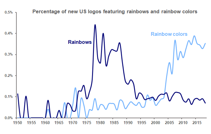
But in more recent years, as technological advances have brought color to almost every medium, the spirit of the rainbow can be communicated through its colors without the need for its explicit shape. Consequently, the use of rainbows as logo design elements has fallen back almost to its pre-1970’s level, while the use of rainbow colors in logos has taken off.
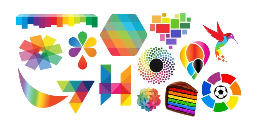
Today’s rainbow-colored logos reflect the joy and optimism inherent in the rainbow in a multitude of new expressions.
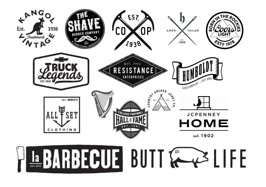
Does your local craft brewery’s logo helpfully inform you that the business was “Est. 2016”? Logos declaring the year that a company was established seem to be everywhere recently. In particular, businesses seeking to adopt a hipster aesthetic appear to append an “est.” to their logos just as often as they use crossed objects or mustaches in their marks. What accounts for the prevalence of this visual quirk?
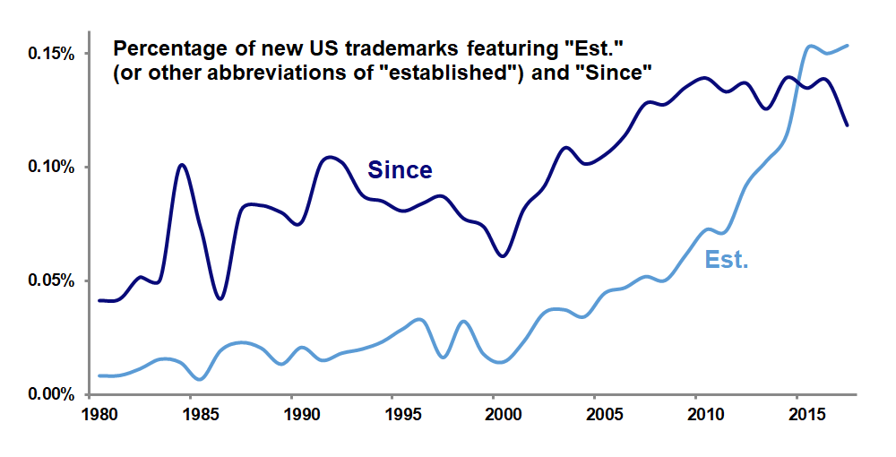
Analysis of United States Patent and Trademark Office data confirms that “est.” and other abbreviations for “established” have been appearing in trademarks much more often in recent years–in fact, in terms of percentages, 19 times more often this year than in 1980. The related term “since” has also enjoyed increased popularity among trademarks, but was no match for “est.,” which surpassed it in use in 2015.
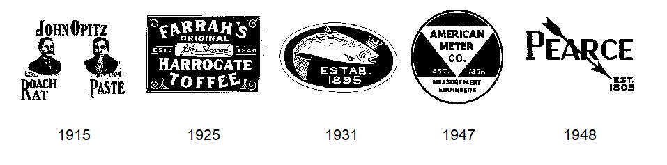
Among these “est.” trademarks filed this decade, the most common abbreviation used is “est.” itself (with or without the period), appearing in 91.7 percent of such marks. Less often used, accounting for 8 percent of these trademarks, is “estd.” and its variant “est’d.,” which, perhaps owing to their rarity, seem to project more gravitas, particularly in the typographic variation in which the “D” is made smaller and placed above the period (see the Guinness and Coors Light logos above). Only 0.3 percent of these marks dare to go with the “estab.” abbreviation.
“Est.” seems to function in trademarks in two ways. First, in a basic sense, it seeks to use the business’s longevity as a proxy for its trustworthiness and reliability. When a logo notes that a restaurant was “est. 2015,” though, this function disappears.
Among trademarks filed in 2017 to date, the average year that follows the “est.” is 1988, just 29 years ago. In comparison, the average year after the “est.” in trademarks filed in 2000 was 1939, or 61 years earlier. Clearly, the longevity-signalling function of “est.” is becoming less important today.
The second way that “est.” works in trademarks is to evoke the logos of the past. There is a sense that “est.” was used a lot in old trademarks; the marks below, all from the first half of the last century, exemplify this usage. Including “est.” in today’s logos is an attempt to imbue them with a vintage feel that often aligns with the aforementioned hipster look.
Digging back further into USPTO records, we can see that “est.” was indeed used much more often in the first half of the twentieth century than in the second half. Interestingly, though, the rate of use of “est.” during this decade has surpassed that of the 1910’s!
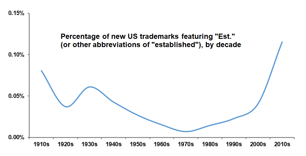 Today’s use of “est.” in trademarks is doubly ironic. Promoting a business as “est. 2017” in 2017 borders on ridiculousness. And using “est.” as a symbol of old-timeyness more often than it was used during those actual old times is nearly as silly. What is not clear, though, is how much of this irony is intentional.

When it comes to logos, it’s still a man’s world. Since 2000, male figures in US logos have outnumbered female figures by 3 to 1. A look back at logo design trends over the past 60 years shows that this is not a new state of affairs.

As the graph above shows, there has not been much change in the relative percentage of logos featuring males and females since 1950. Perhaps most notable here is the slight overall decline in male logos, which may be the result of the contemporary trend of designers using what Michael Bierut calls “neutered sprites” to represent people in general, when in the past they might have gone with more graphically elaborate male figures. (Gender-neutral figures such as Bierut’s sprites are not included in this analysis.)

We see above that this ratio of male to female logos has not changed much over the years; again, it appears that 3 out of 4 new logos that have some gendered element are male as opposed to female, with a slight decline in that ratio over time that may be attributable to the “sprite effect” discussed above.
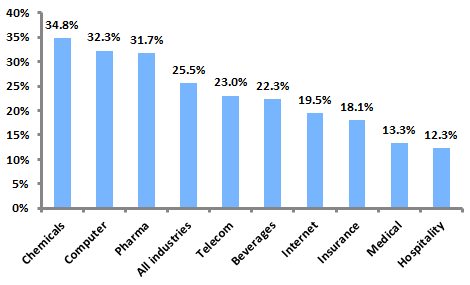
 Across all years, 76 percent of gendered logos feature male design elements, while 24 percent contain females. There is variation from these averages across industries, however. Logos from industrial categories such as firearms, construction, and telecommunications are more likely to include male figures, while among logos related to clothing, pharmaceuticals, and alcohol, there is a more pronounced tendency toward featuring females.
Will the gender gap in logos ever be closed? There certainly do not seem to be a lot more women appearing in logos. Designers seeking to avoid giving off an impression of sexism seem more likely to use a genderless figure, rather than a female one, to represent a generic person. If women are to catch up to men in logos, it will probably be due to more male figures being replaced by “neutered sprites,” not to any increase in the use of female design elements.
Now that twenty-three U.S. states have legalized marijuana in some form, the drug’s potential in the legitimate business world is quickly being recognized. The legal sale of marijuana is now being bolstered by the same marketing and branding techniques used to sell soap and toothpaste. But a quick glance at the current practice of marijuana branding reveals that it is clearly still in its infancy.
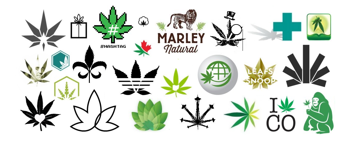
In a 2015 interview with Fortune magazine, investor Brendan Kennedy, a backer of the Marley Natural marijuana brand, complained that in the marijuana business, “Everything is named ‘canna-something’ or ‘mari-something,’ with a green and black logo and pot leaves.” Indeed, analysis of United States Patent and Trademark Office records shows that 44 percent of logos registered as trademarks for marijuana-related businesses feature the familiar cannabis leaf.
As a result, marijuana branding is visually indistinct. Even when the heavy hitters of branding and design have been brought in, avoiding the easy design solution represented by the leaf has proven difficult. For instance, the mark for Snoop Dogg’s high-profile Leafs by Snoop marijuana line, designed by Pentagram’s Emily Oberman, while visually arresting, is simply a depiction of a pot leaf. And even the Heckler Associates-designed logo for Kennedy’s Marley Natural featured the leaves as a secondary design element at the time of his quote (although they have been recently dropped, with the focus now squarely on the brand’s lion symbol).
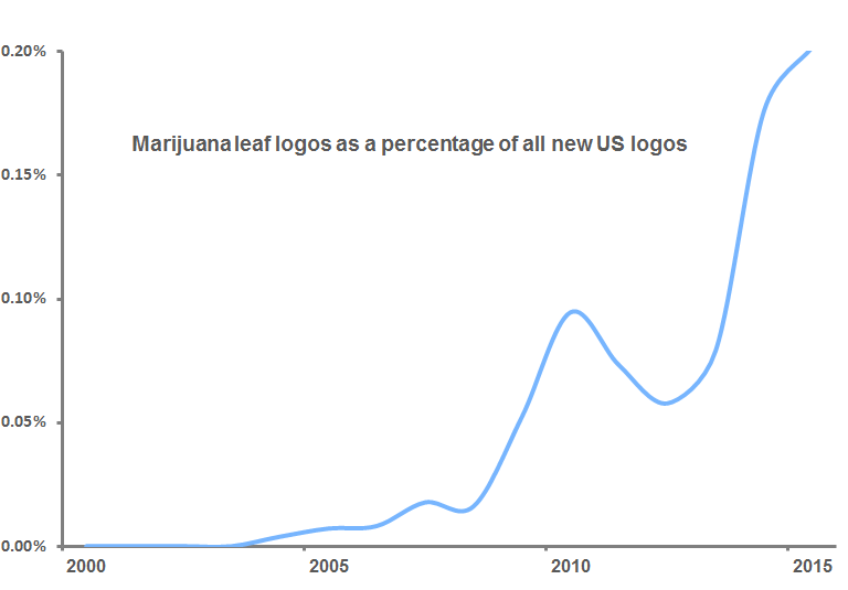
USPTO records show that the first U.S. marijuana leaf logo trademark was filed in 2004, and the years since have seen an explosion in the symbols. By 2015, over 1 in 500 new U.S. logos featured a cannabis leaf.
The problem with the leaf as a symbolic element in a marijuana business logo is that it is so commonly used that it acts as a symbol of merely the general category, rather than of the specific brand. Such visual clichés can be found in many fields, stemming from tradition (such as the use of striped poles as symbols for barbers) or obviousness (like dentists employing tooth logos). The graph below shows that the use of cannabis leaves in marijuana logos has reached a particularly heightened level of cliché.
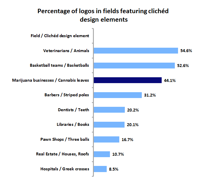
This is fine when the category is more important than the brand. If you need a quick haircut or your molar is killing you, you’ll look for the first striped pole or tooth logo you can find. Because legal pot is still a novelty, the leaf itself is enough to attract business. But as marijuana becomes legally available on a more widespread basis, its branding is going to have to move beyond the generic leaf to incorporate more distinctive visual elements.
With Valentine’s Day upon us, hearts are everywhere, and they seem especially prevalent these days in logos and other visual symbols. Art historian Martin Kemp, in his 2012 book Christ to Coke: How Image Becomes Icon, outlines the fascinating and complex use of the “heart-shape” over history, from early anatomical depictions of the organ to the symmetrical symbol that we are familiar with today. “It is,” Kemp writes, “a shape that is appealing in its simple yet seductive rhythm, and once seen it is difficult to forget. It is like the melody of a great pop song.”
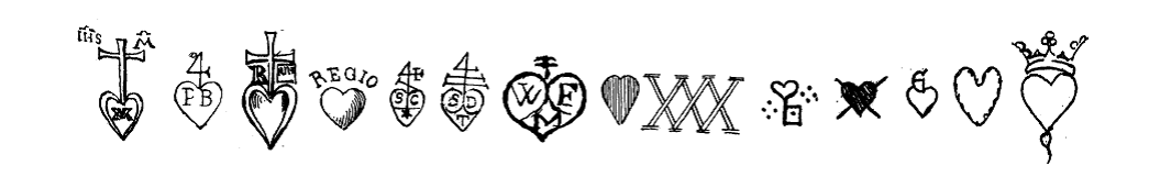
This appeal of the shape, along with its positive connotations of love and life, have long made it a popular design element. Oscar-Edmond Ris-Paquot’s 1893 Dictionnaire Encyclopédique des Marques & Monogrammes is full of heart marks used over the previous several centuries.
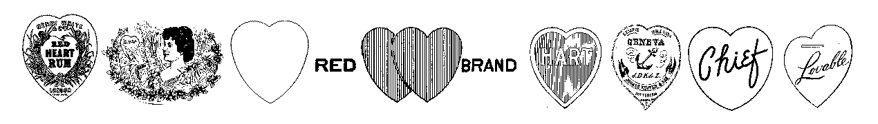
By the early twentieth century, there were warnings that hearts made for poor trademarks and logos due to overuse and subsequent lack of distinctiveness. Glen Buck, in his 1916 book Trademark Power: An Expedition Into An Unprobed and Inviting Wilderness, wrote “Common and familiar forms do not usually make good trademarks, for they lack distinction. The circle, the square, the crescent, the star, the diamond, the heart, the oval, the shield, the cross, all have long ago been usurped and are burdened with significance.” And yet the register of the United States Patent and Trademark Office continued to fill up with heart trademarks.
The use of hearts in logos was further boosted in 1977 with the introduction of Milton Glaser’s massively popular “I ♥ NY” mark, which quickly inspired a host of imitators. As of this writing, United States Patent and Trademark Office records show that there are 1,407 “I ♥” trademarks registered.
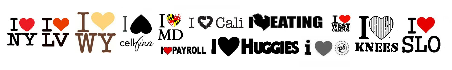
In recent years, designers have realized the potential of the simple heart shape to be used in increasingly clever and elaborate ways. One such application is to turn the heart into a letter of the alphabet for use within a wordmark. The versatile heart shape may take the form of, at a minimum, the letters a, b, c m, o, u, v, and y. A 2013 Emblemetric analysis showed that hearts are especially popular elements of “frankenmarks” (wordmarks featuring a pictorial element replacing a letter), appearing in 3.54 percent of such logos.
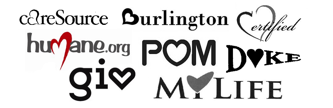
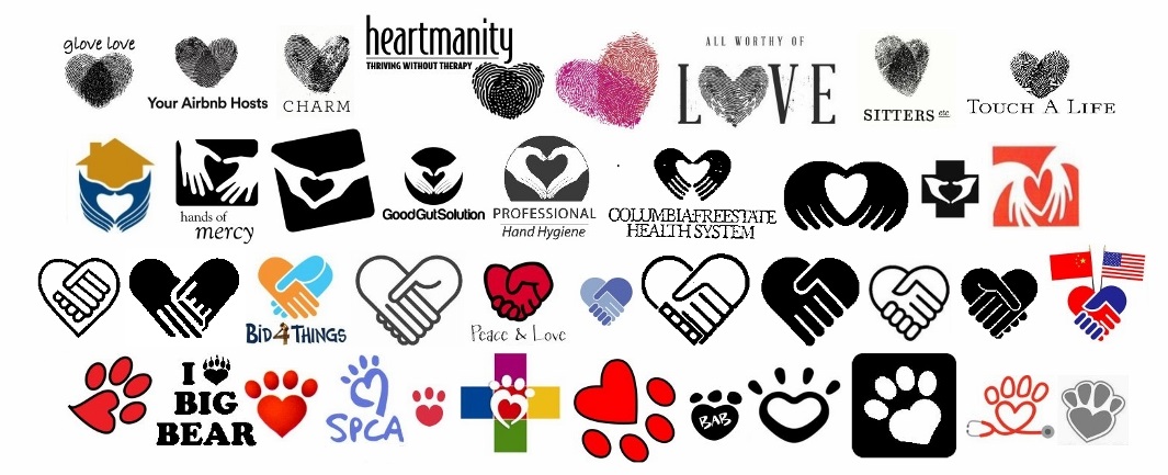
The popularity of the heart, though, often means that appealing visual uses of the shape have been done before. Designers seeking to create a logo that employs two fingerprints to make a heart, or two hands to form a heart, or a handshake as a heart, or a heart within a pawprint should perhaps reconsider.
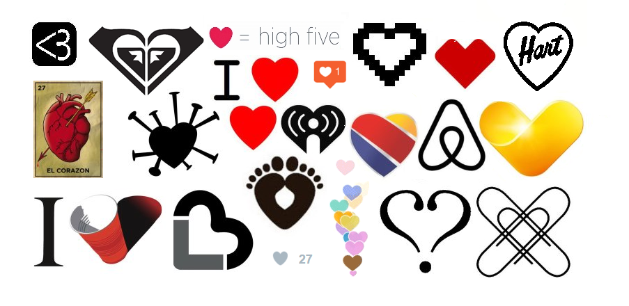
The ubiquity of hearts has continued in recent years, as companies such as Southwest Airlines, CVS Health, Airbnb, and Thomas Cook have unveiled new heart logos. Hearts play an important role in indicating positivity on social media sites such as Instagram and Periscope. Late last year, Twitter famously changed its starred “favorites” to heart-denoted “likes,” and detached the symbol from its traditional meanings, declaring that it could represent anything from “wow” to “high five” to “stay strong.” Hearts are consistently among the most commonly-used emoji, and can even be expressed in plain text form as “<3”.
Analysis of United States Patent and Trademark Office data reveals the increasing use of hearts in logos over time. Heart logos as a percentage of all US logos peaked in 1989 at 1.74 percent, then declined to 0.95 percent in 2000. Starting in 2001, heart marks took off again, reaching 2.25 percent of all logos in 2013.
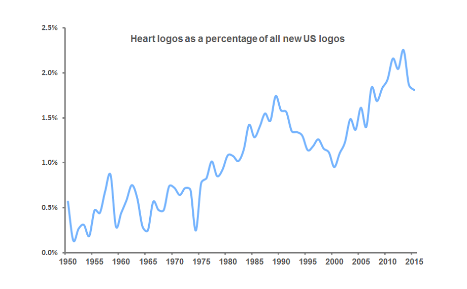
The sharp increase between 2001 and 2013 may be attributable to any number of causes that lie beyond our understanding. But it is worth considering the possible impact of the September 11, 2001 terrorist attacks on the American psyche and, subsequently, American logo design.
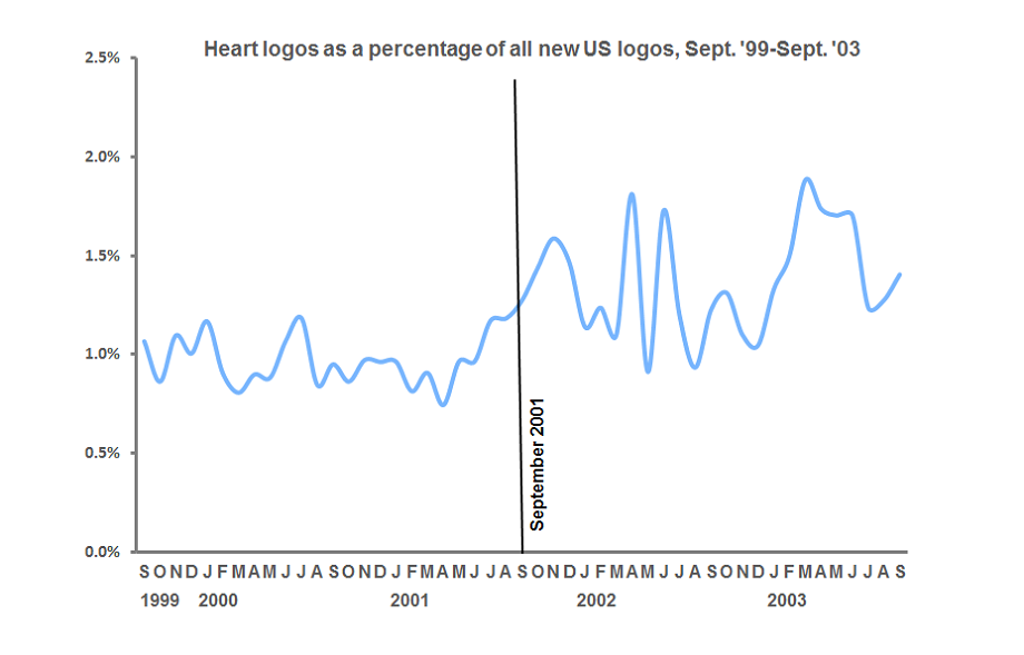
Zooming in to examine the data by month, we can see that the period following September 2001 brought several spikes in heart logos as the trend began to move upward. Of course, the timing of the filing of trademarks for businesses and products is dependent upon many factors. I don’t find it unreasonable, however, to speculate that in the wake of September 11, Americans’ yearning for love and healing was ultimately manifested in the heart-shaped logos that surround us today.
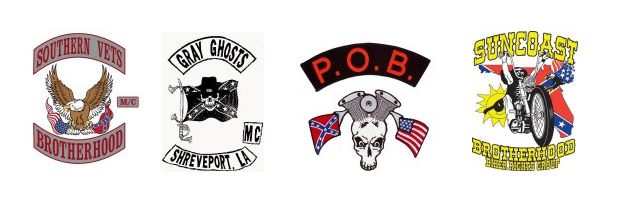
The horrific June massacre of nine African-American churchgoers in Charleston, South Carolina by a gunman with a fondness for the Confederate battle flag galvanized public opinion against the symbol, resulting in its removal from the state’s capitol grounds after years of controversy. The perception of the flag as symbolic of racist hate seemed to gain traction against the competing view of it as a benign emblem of Southern heritage.
From a commercial standpoint, this was a debate that appears to have long since ended. The Confederate flag’s use as a logo design element by US companies has dwindled to a low level, according to an analysis of United States Patent and Trademark Office records. Currently, there appear to be just eighteen active, or “live,” US trademarks that feature Confederate flag imagery (by contrast, there are 1,938 active marks featuring the US flag). Tracking these flag logos over time is difficult, because USPTO records do not include marks that “died” prior to the 1980’s. But of the 83 marks that can be identified in the USPTO database, most were owned by companies in the South, as shown on the map below, and 78 percent are no longer active, or dead.

Of course, not all businesses officially register their marks with the USPTO, so there are other Confederate flag logos in use, including one that an Iowa bagged-ice company has said it will not abandon. But use of the flag in larger, mainstream contexts appears to have vanished.
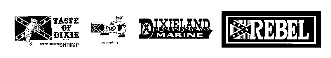
Older USPTO records show the flag in logos for products like shrimp (“Taste of Dixie,” 1991), mops (“Dixie Dust Control,” 1981), boats (“Dixieland Marine,” 1981), and blue jeans (“Rebel,” 1984). But these marks are no longer active, just as, over the years, the Six Flags amusement park lowered the battle flag, the NASCAR Southern 500 race dropped it from its logo, and the country band Alabama stopped using the flag, which had adorned four of its album covers.
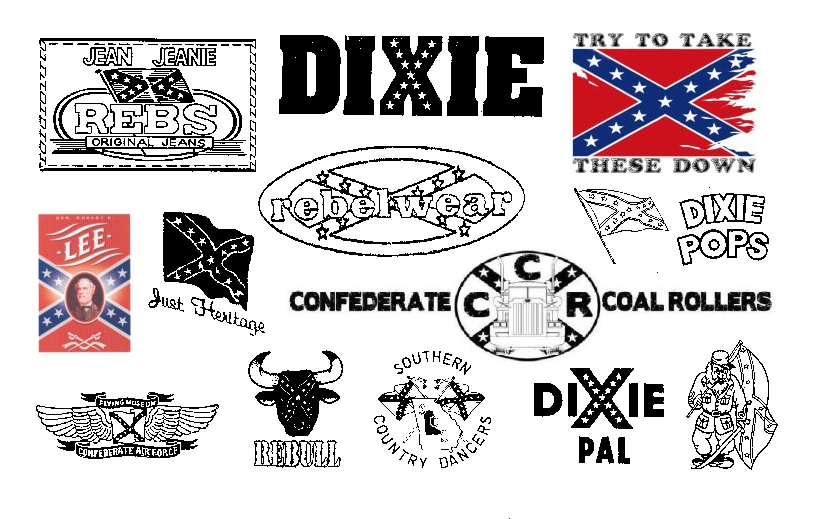
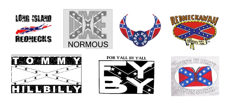
Today, use of the Confederate flag in logos is confined to a narrow group of business types. Of the 49 Confederate flag marks filed since 2000, over half (55%) represent clothing lines, such as the purveyors of lifestyle or novelty t-shirts seen below.
Interestingly, some of these marks have attempted to co-opt the flag as a symbol of African-American identity, in the manner of Kanye West.
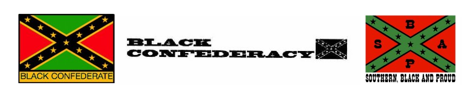
Eighteen percent present the flag in an historical context, often in conjunction with the US flag.
Sixteen percent are associated with motorcycle clubs, where the “rebel” aspect of the flag’s meaning is still appreciated.
The meaning of symbols, including words and logos, can change over time. If public opinion continues to turn against the Confederate flag, it is not inconceivable that logos featuring it might someday be denied trademark protection, in much the same way that National Football League’s Washington team has seen its “Redskins” trademark canceled.
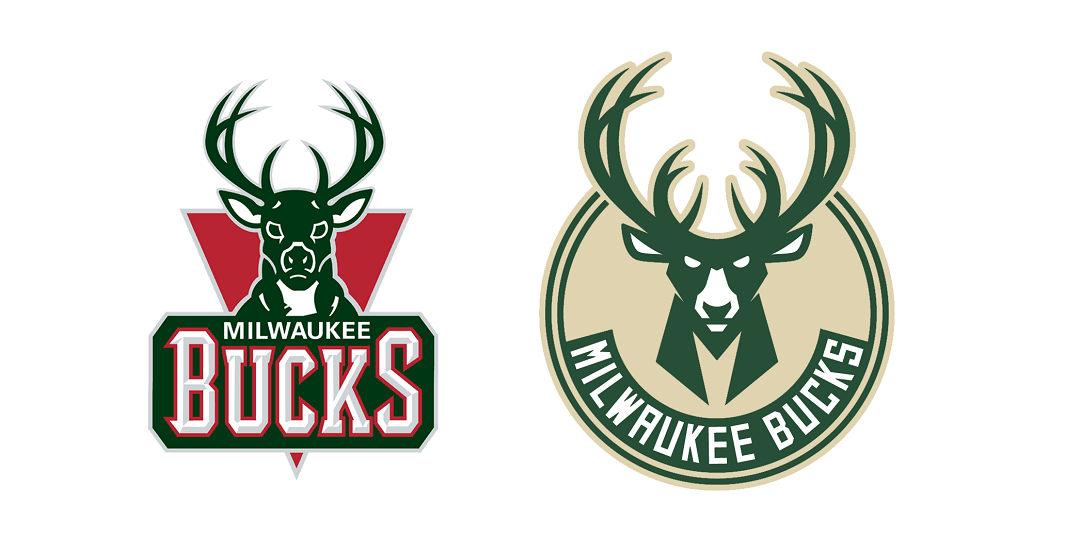
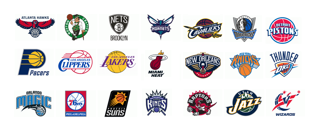
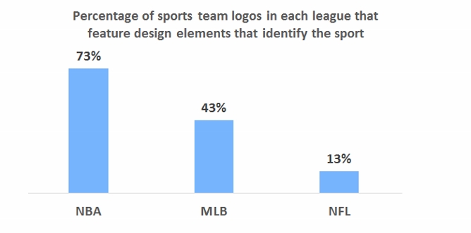
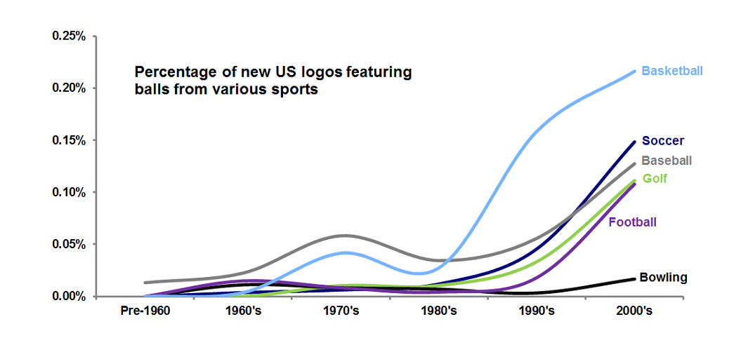
On Monday, the Milwaukee Bucks of the National Basketball Association unveiled a new logo. Like the team’s old emblem, it is a depiction of a fierce stag, but the new mark contains an image of a basketball, cleverly hidden in the negative space of the antlers. By switching from a logo without a basketball to a mark with one, the Bucks have joined 21 other NBA teams with basketballs in their primary logos. Seventy-three percent of NBA teams’ symbols now include basketballs.
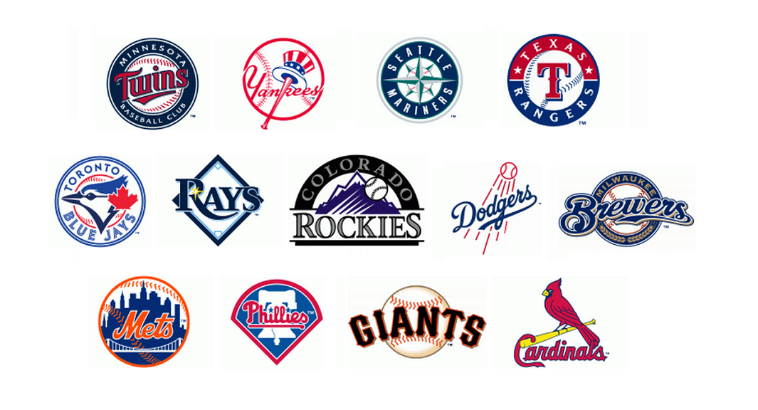
By contrast, only 13 Major League Baseball teams, or 43 percent of the total, have baseballs or other imagery inherent to the sport in their logos.
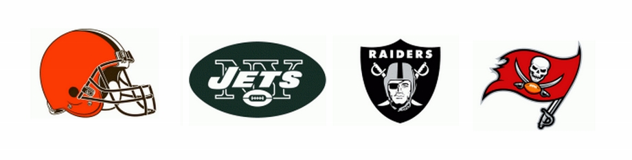
And just four National Football League team logos, or 13 percent, feature footballs or football-related imagery.
Why the discrepancy between the leagues? One might speculate that spherical basketballs and baseballs make for more visually pleasing design elements than oblong footballs. Analysis of data from the United States Patent and Trademark Office shows that while all sorts of sports balls have become more common in American logo design over the years, round basketballs, soccer balls, baseballs, and even golf balls are more common than footballs in logos.
 But there may be more going on here. It is useful to consider Rutgers University sociologist Karen A. Cerulo’s 1995 book, Identity Designs: The Sights and Sounds of a Nation, which included a quantitative analysis of national flag designs. Cerulo found that the flags of powerful “core” nations (such as those of Russia, Italy, and Germany, below left) tend to have simpler designs, while the flags of less-powerful, lesser-known “peripheral” countries (like those of Mongolia, Fiji, and the Marshall Islands, below right) are often more elaborate and embellished in their designs. There are exceptions, of course. The U.S. flag’s design is one of the world’s most elaborate, but when it was created, the country was still unquestionably “peripheral.”
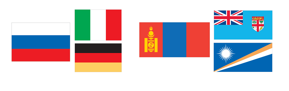
Core nations are so widely recognized that their flags need not say much specific about them, in the same way that well-known companies like Nike and Starbucks are able to drop their names from their logos and be known simply by their symbols. Peripheral nations, however, must use their flags to communicate detailed information about themselves to a world audience that is likely unfamiliar with them.
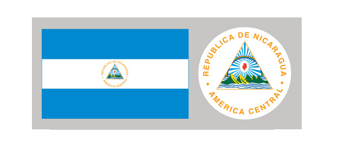
Consider the flag of Nicaragua. While its basic design of three horizontal bands is similar to the flags of many core nations, the national coat of arms in the center includes text spelling out the country’s name and geographic location, as well as depictions of symbolic elements like a rainbow, five volcanoes, an ocean, and a Phrygian cap. The busyness of the design screams “peripheral nation.”
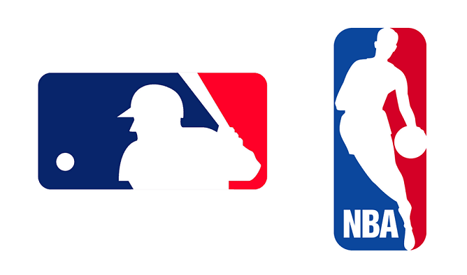
The NBA was once very much a “peripheral” U.S. sports league, far less popular than the country’s “national pastime,” baseball. Indeed, in designing its new logo in 1970, the NBA, in an attempt to boost its legitimacy, was reduced to mimicking Major League Baseball’s one-year-old silhouetted batter logo. Unlike baseball, though, the NBA felt the need to include its initials in its logo, in much the same way that Nicaragua needed to write its name on its flag.
Today, football is the most popular sport in the U.S., and few NFL teams are inclined to include footballs in their logos. They don’t need to, because the public knows that they are football teams; there’s no reason to spell it out. As a consequence, NFL logos are among the most striking and visually powerful in sports. They don’t get bogged down in communicating something like, “Hey, we’re a football team,” just like Germany’s flag doesn’t need to use symbolism to say, “Hey, we’re a country in Europe, we make nice cars, maybe you’ve heard of us?”
It wasn’t always this way though: a look back in NFL history shows that before football was king, many NFL teams featured football-related imagery in their marks.
Major League Baseball, knocked from its perch by football, features more team logos with design elements related to its sport than does the NFL. The NBA, though, is absolutely overrun with basketballed logos. Some, such as those of the Los Angeles Lakers, Los Angeles Clippers, New York Knicks, and Detroit Pistons, are little more than generic depictions of basketballs. It is as if a refrigerator manufacturer decided to use a picture of a fridge as its logo; it’s hard to imagine a less evocative, less distinctive, or more boring visual symbol.
The irony is that the NBA is no longer peripheral; it has become quite popular not just in the United States, but worldwide. There’s no need any more for it to use the design strategy of a second-rate organization. When it comes to logo design, the NBA should drop the ball and seek to build stronger visual identities for its teams.
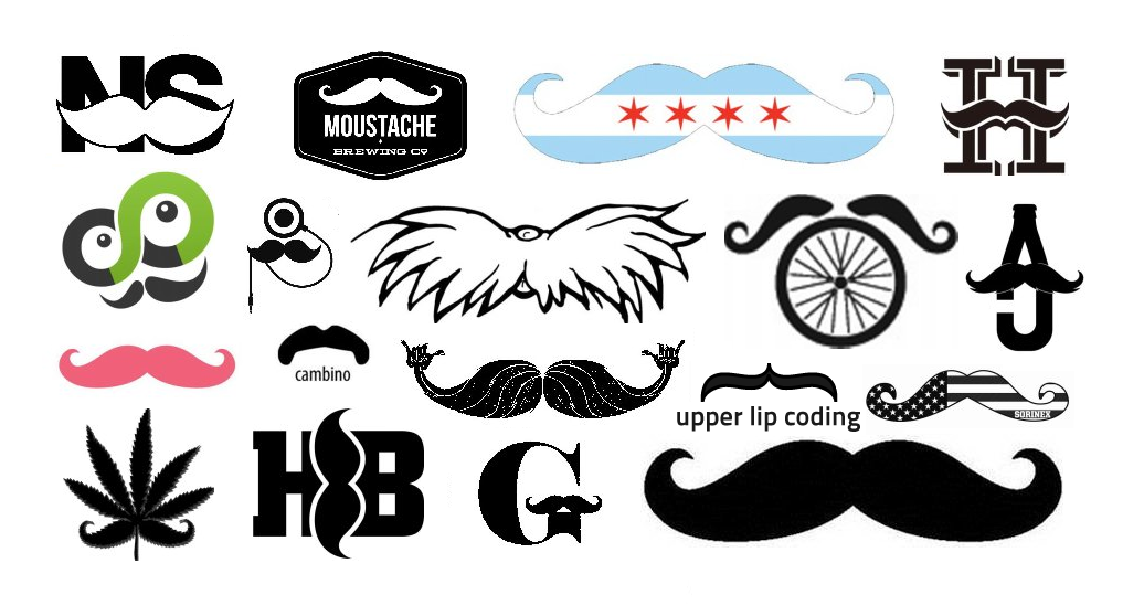
As November dawns, the world’s attention turns to mustaches. In recent years, movements such as Movember and No-Shave November have turned this month into an opportunity for men to raise money for charities concerned with men’s health issues by growing facial hair. The popularity of these events can certainly be tied to the larger trend of men increasingly sporting beards and mustaches (or, to use the hipper British spelling, moustaches).
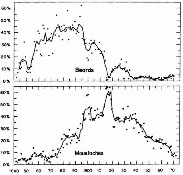
A 1976 study in the American Journal of Sociology found that, although both beards and mustaches had enjoyed periods of high levels of popularity among Englishmen over the previous century and a half, both had fallen out of fashion by the 1970’s, as illustrated in the graph below.
By the late twentieth century, facial hair had taken on negative connotations, becoming associated with villainy, stodginess, and deviance. An early-seventies researcher for CBS Television went so far as to say that “there were four leprous castes that viewers would never accept as lead characters: divorced people, Jews, New Yorkers, and men with mustaches.” That line of thinking was soon to be obliterated by shows such as Magnum, P.I. Contemporary observation, as well as recent market research, shows that facial hair, whether worn earnestly or ironically, is making a comeback, particularly among younger men.
Culturally, facial hair, and the mustache in particular, has taken on a new symbolic presence, one that is reflected in the logos of United States businesses and products. Analysis of data from the U.S. Patent and Trademark Office shows that the percentage of new American logos featuring facial hair of some sort as a design element has shot up over the past decade.
![]()
Looking back through older U.S. trademarks, it becomes apparent that the way facial hair is used in logos has changed as well. A famous early mark that incorporated facial hair was that of Smith Brothers Cough Drops, featuring portraits of the bearded “Trade” and “Mark” Smith, which was first used in the 1870’s. A 1931 article in the trade publication Printer’s Ink called it “one of the most utterly distinctive trade-marks in existence…This is partly due, no doubt, to the almost diabolical skill of the artist who made the original drawing of the bewhiskered visages of Trade and Mark Smith.”
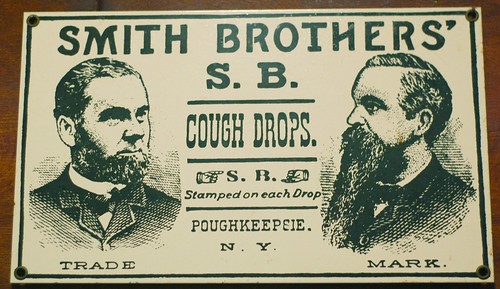
While not very impressive by modern standards, the Smith Brothers mark’s appeal is probably similar to that of Duck Dynasty today: many people seem enamored by families with abundant beards.
The used of bearded and mustachioed trade characters in logos continues to this day. Because facial hair is an particularly distinctive personal characteristic, especially during times when relatively few men have it, it makes for an effective design element.
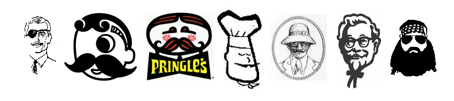
As logos in general began to become less realistic and more abstract, the mustache took on the role as stand-in for a man’s face. When used in conjunction with a hat, a mustache could often represent a man in an abstract way that was consistent with contemporary trends.
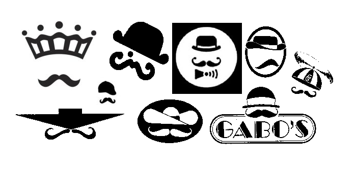
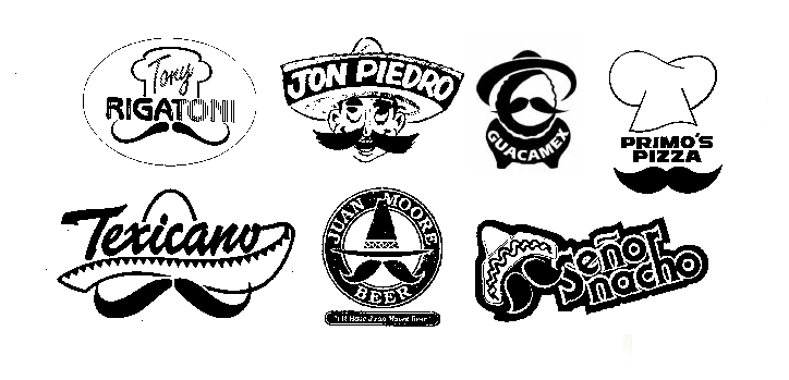
A related use for mustaches in American logos has been as a somewhat unfortunate and lazy way to communicate Italian or Mexican identity, particularly among marks for restaurants. In these more culturally sensitive times, this trope would seem to be on its way out.
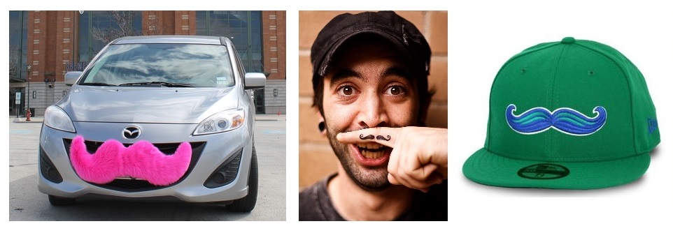
In recent years, the mustache has escaped the confines of the male face to emerge as a stand-alone design element in logos. The “olde-timey” stylized mustache shape, as exemplified by the pink, furry mustaches on the front of Lyft cars, the hipster finger mustache tattoo, and the Lexington Legends minor-league ballcap, has become almost ubiquitous, and, dare I say, iconic.
The beard, on the other hand, while becoming much more prevalent on male faces and in popular culture, has not yet had a big impact in the world of logo design. As a design element, the beard cannot match the mustache’s ability to stand on its own.
Without connection to a face, the beard seems adrift in space, floating disembodiedly. Perhaps some intrepid designer may be able to solve this problem; the next fortune to be made in graphic design might lie in the harnessing of the symbolic potential of the beard.
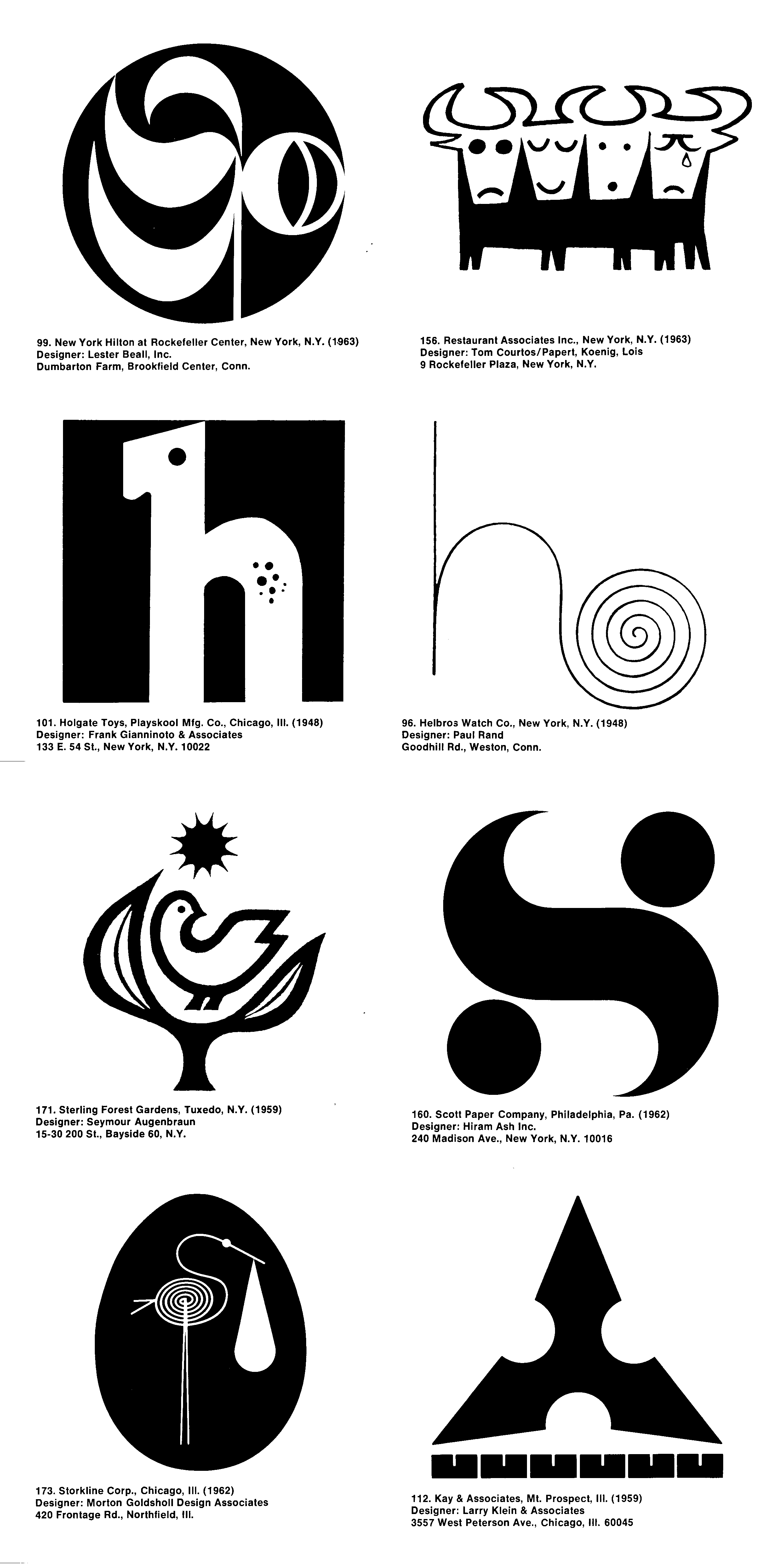
Fifty years ago, on April 22, 1964, Trademarks/USA, the first national retrospective logo design exhibit, opened at the National Design Center in Chicago’s just-completed Marina City towers. The exhibition, hosted by the Society of Typographic Arts, featured 193 American trademarks from the period 1945-1963, chosen from over 1,600 entries by a seven-member jury that included Lester Beall and Egbert Jacobson. The fourteen marks shown above were chosen for particular distinction by the jury.
This event was perhaps the high point of a period in which logos were receiving unprecedented attention from both the business world and the public at large. “Today’s corporate logo or trademark is almost as important as the balance sheet,” gushed the Chicago Tribune in its coverage of the exhibition. That logos would be exhibited in the manner of fine art would have seemed ludicrous only a few years before, yet in the Mad Men mid-sixties, as the field of corporate identity emerged and the importance of a company’s image to its marketing became heightened, logos had acquired a hip, modernist cachet.
This was reflected in the marks selected for Trademarks/USA, as 69 percent of them were from 1960 or later. (Almost as interesting as the logos chosen for the exhibition are the familiar ones not picked, including Paul Rand’s ABC and UPS marks, Lippincott and Margulies’ Steelmark and Chrysler Pentastar, the Coca-Cola script, Raymond Loewy’s Nabisco triangle, and the venerable General Electric logo.)
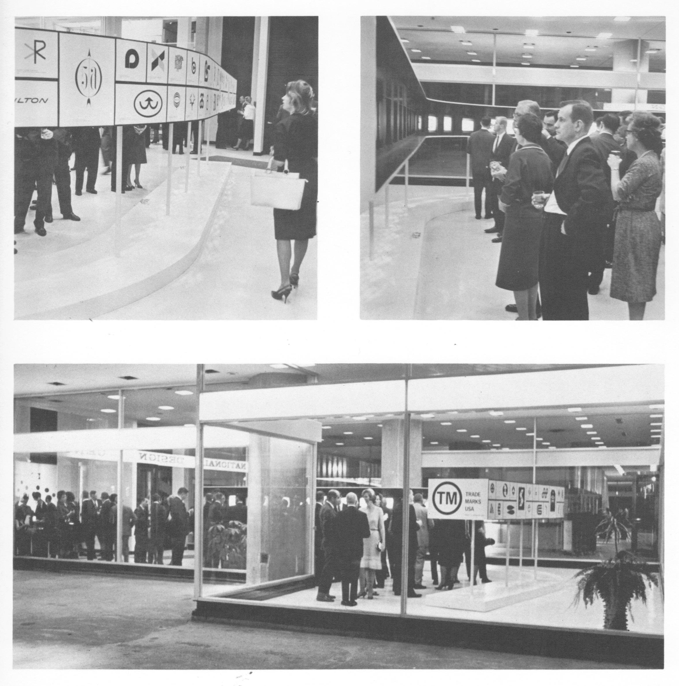
Exhibition chairman Larry Klein characterized the logos on display as “simpler, blacker, more geometric and formal and sometimes more even in color and weight of line…marks–both good and bad–are growing very much stronger and bolder.” These trends are obvious in a casual perusal of the exhibition catalog, published in 1968.
In tallying up selected design characteristics of these 193 marks and comparing them to all US logos filed for registration with the United States Patent and Trademark Office since 2000, further trends become apparent.
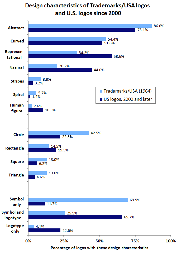
The Trademarks/USA logos were, in comparison to today’s logos, more abstract, far less representational, and much less likely to contain human design elements or those related to nature. Geometric shapes such as circles, squares, and triangles were in abundance, and unaccompanied symbols were the norm, as logotypes, either with symbols or alone, were much less common than they are today.
Spirals were a particularly trendy element among the exhibition’s logos, perhaps inspired by Paul Rand’s 1948 Helbros Watch mark. And while representational marks were rare, fully 12 percent of them featured birds, compared to less than five percent of modern representational logos. Perhaps the most striking trend among the Trademarks/USA selections was the tendency to portray, often through clever design, an initial letter or letters; nearly half (45.6%) featured such a graphic element.
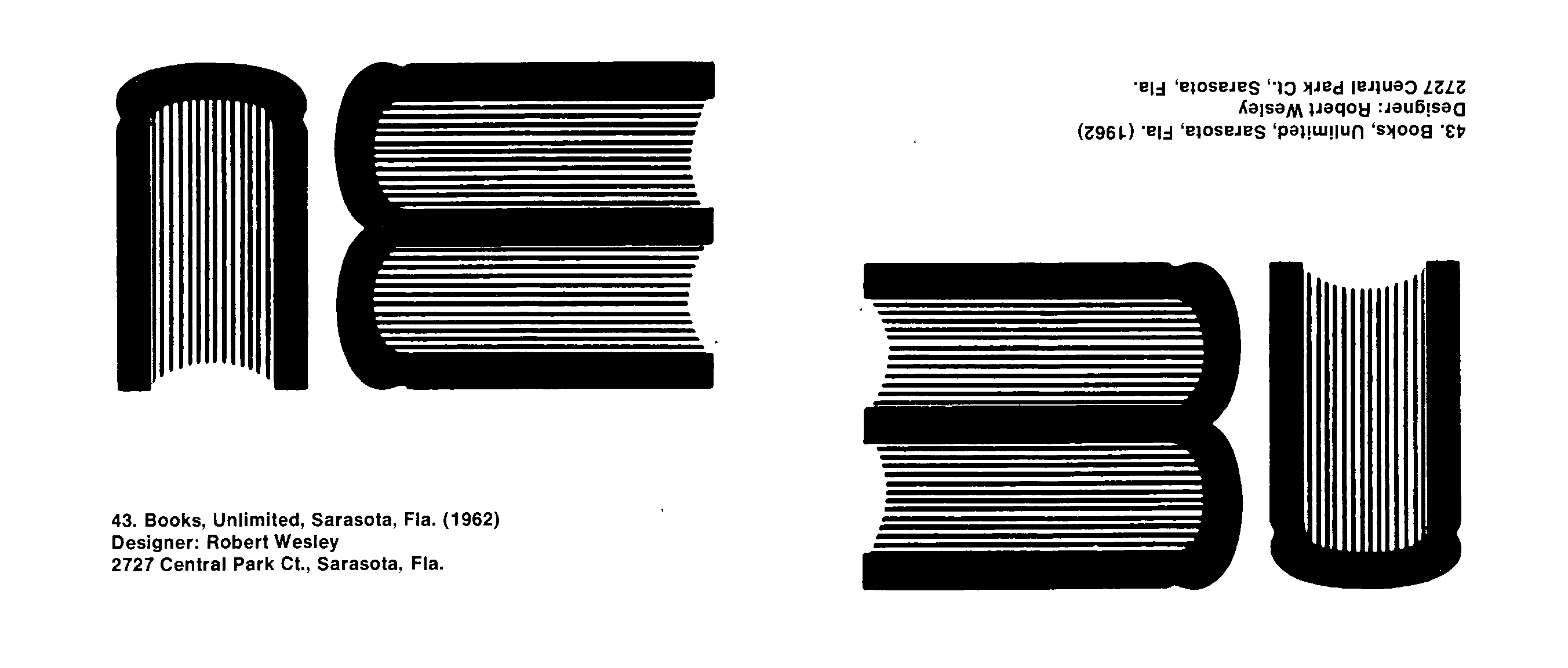
One such logo was the Books Unlimited mark (below), which seemingly used a side view of three books to form the BU initials. Yet, like the old joke about no one noticing the modern abstract painting hanging upside-down in the gallery, this logo appears to have been inverted in the Trademarks/USA catalog.
This blunder might be seen as prescient, as, in the years following Trademarks/USA, the shine came off the clean, abstract, modernist logo to some extent. Critics of this style of logo became louder over the remainder of the 1960’s and into the 1970’s as the overuse of simple, stark, geometric forms in logo design led to a glut of indistinct, meaningless, and look-alike marks. Still, the Trademarks/USA exhibition was a clear sign of the growing importance of logos and graphic design in American business and culture.
“Banal and trite” logos, from The Corporate Personality, p. 188
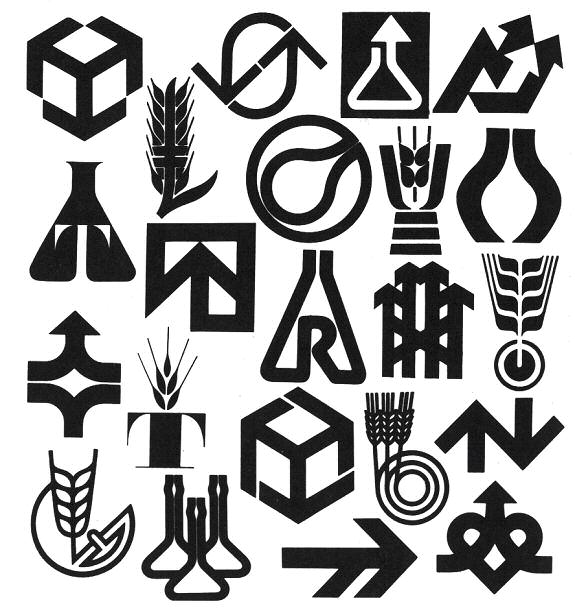
Corporate identity legend Wally Olins died Monday at 83 after a brief illness. Here at Emblemetric, we remember fondly his 1978 book The Corporate Personality, in which he unleashed a scathing criticism of the clichéd logo design trends of the day:
Why are graphic designers still busily scribbling away at stylised flasks symbolising the powerful modern chemical company busying itself with Man’s Future but human enough to remember its Humble Origins? Why are they still producing stylised sheaves of some unspecified grain for food companies, indicating that the organisation has an involvement of however remote a kind with agriculture and Dear Old Dame Nature Herself by whose Bounty we all live? Above all, why are they still churning out these symbols consisting of initial letters tormented into a bizarre shape and ending with an arrow, preferably pointing upwards and slightly to the right, indicative of Progress, Dynamism and a controlled but powerful thrust towards what is clearly a Better and Brighter Future?
Why is it that the design idea that ultimately emerges is so often banal and trite? Is this naïve rubbish the best that we can do?
— Wally Olins, The Corporate Personality: An Inquiry Into the Nature of Corporate Identity, page 188
In honor of Mr Olins, let’s take a look at how those logo design trends have shown up in US logo design over the years, by analyzing logo design data from the United States Patent and Trademark Office.
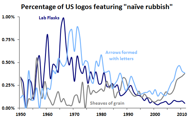
When Olins launched his broadside in 1978, the laboratory flask logo design trend was already on its way out, and such flasks are rarely seen in logos today. Arrows formed with letters were similarly on the decline in 1978, although they saw a resurgence in the last decade. Sheaves of grain were seemingly never as common as Olins seemed to think, and are also on the rise among today’s logos. Hopefully, they are being used in a way that is neither banal nor trite.
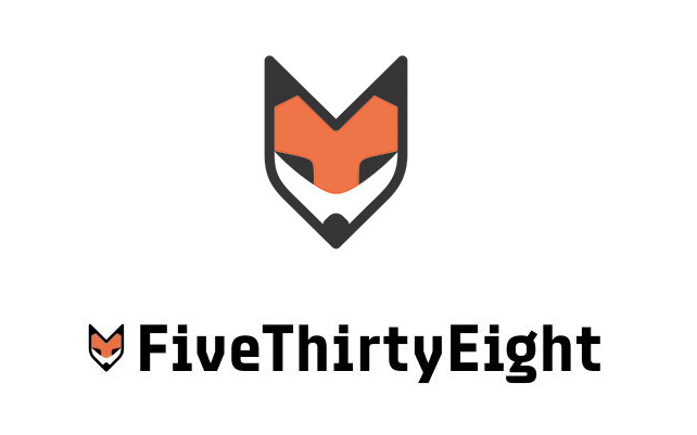
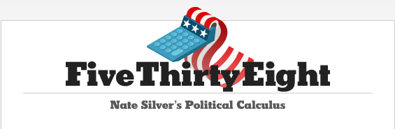
The new incarnation of Nate Silver’s FiveThirtyEight website made its ESPN-affiliated debut last week, to the delight of data nerds everywhere, including here at Emblemetric. The site promises to expand FiveThirtyEight’s data journalism beyond politics and into the worlds of sport, economics, and popular culture. With the new website came a new logo, a stylized fox head, known in house as “Fox No. 9,” that Silver says is intended to be emblematic of FiveThirtyEight’s pluralistic approach, as expressed in the old saying “the fox knows many things, but the hedgehog knows one big thing.” While the choice of a fox seems somewhat curious given that one of the biggest hedgehogs in Silver’s sights is Fox News, and while some have questioned whether Silver got the fox/hedgehog analogy correct, the new fox logo represents a big step up from the one used during FiveThirtyEight’s New York Times days, a calculator spewing out an American flag:
The new logo, designed by Michael Meyers under the guidance of FiveThirtyEight creative director Kate Elazegui, is a handsome one, and has the added bonus of looking like a pencil, a tool that holds a nostalgic resonance for the nerd. Let’s turn the tables on FiveThirtyEight and subject Fox No. 9 to some quantitative analysis, using data on trademark design from the United States Patent and Trademark Office.
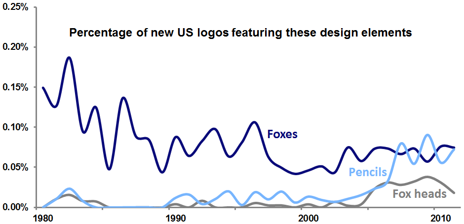
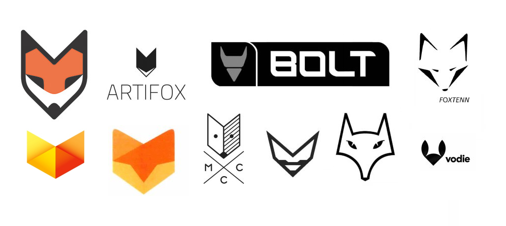
While the use of foxes in US logos has tailed off over the last several decades, fox heads in particular have enjoyed a bump in popularity recently, and logos featuring pencils are also in vogue. The fox head logo trend has resulted in a number of recent trademarks that seem to anticipate the look of Fox No. 9:
A deeper understanding of how FiveThirtyEight’s logo fits with recent trends can be gained by measuring the “trendiness” of particular design elements. This is done by calculating the share of an element’s use in new logos relative to the share of its use in dying logos. If a design element appears in the same percentage of new and dying logos, its ratio is 1, meaning that it is not at all trendy in a positive or negative way. However, if an element were used 80 percent of the time in new logos and just 40 percent of the time in dying logos, its ratio would be 2, meaning that it would be very “hot.” For the period 2005-2011, the trendiness measure for fox heads is 1.72; for pencils, it is 1.77. FiveThirtyEight seems to have hit upon a couple of very hot logo trends in its design.
Aside from the logo, an interesting choice in the new site’s branding was the decision to stick with the “FiveThirtyEight” name (which comes from the number of members of the US Electoral College) over the shorter “538,” which Silver occasionally uses (his new Twitter handle is @NateSilver538).
Since 1990, there have been almost 1.1 million wordmark logos filed as trademarks in the US. Of these, 3.3 percent have been wordmarks that are three characters in length, like 538, and 3.2 percent have been wordmarks that are fifteen characters long, like FiveThirtyEight. Of all of the post-1990 wordmarks, 44.1 percent have survived in use to the present day. Of the three-character wordmarks, 49.4 percent have survived, while only 42.1 percent of the fifteen-character wordmarks are still in use.
In sticking with its fifteen-character wordmark, FiveThirtyEight has thrown caution to the wind, disregarding the sort of quantitative insight that is its bread and butter. Here’s hoping the site will prosper nevertheless.
![]()
In April 2009 Michael Bierut wrote on Design Observer of a “plague” of “sexless, blankly cheerful little people” in contemporary logo design. The piece, titled “Invasion of the Neutered Sprites,” struck a chord among designers, many of whom lamented the ubiquity of the abstract figures and vowed to abstain from what they viewed as an out-of-control, hopelessly clichéd logo design trend.
Five years later, it is possible to analyze data from the United States Patent and Trademark Office to assess the impact of this trend. Was it really as widespread as Bierut and others made it out to be?
![]()
Yes it was! It turns out that Bierut was writing in the veritable heyday of the Neutered Sprite, as the innocuous logo design elements were rocketing to previously unseen levels of popularity. Their use in US logos shot up in 2006 and 2007, before peaking in 2008, when they could be found in 1.15 percent of all new logos, and they made up 11 percent of all logos featuring human figures.
![]()
Bierut asserted that “the traditional habitat of the Sprites today, of course, is Nonprofitland. Finding them isn’t hard. Look for logos for organizations dedicated to community-building, or health-supporting, or any kind of relentlessly positive thinking.” Indeed, analysis shows that sprites are most common in the medical field, as well as in the personal services industry, and in education. They have yet to invade the firearms business, however.
What is behind the Neutered Sprites trend? We can only speculate. It may have to do with the increasing propensity in recent years of nonprofit organizations to adopt the branding and identity strategies that were already well-established in the for-profit world. The Neutered Sprite represents a handy graphic peg on which these organizations can hang their new identities.
Another factor may be a pent-up desire for more humanity in logos. Since the sixties and seventies, when modernist logo design had, in the eyes of a number of designers and critics, devolved into a meaningless amalgam of cold, abstract forms, many have called for a return to a warmer, more personal style of logos. In an age of economic and political uncertainty, as companies seek to appear less foreboding and more approachable, the Neutered Sprite may represent an attempt to inject a human element back into logos. Yet it is an unsuccessful attempt, as the design cannot escape the overly-abstract tendencies of its predecessors.
In fact, in looking again at these Sprites, it seems possible that they have evolved from the “swoosh” logos of the late-nineties dot-com boom. They are perhaps nothing more than anthropomorphic swooshes.
Essential to both the swoosh and the Sprite is the notion of curvedness:
![]()
Analysis shows that Sprites are far more likely to be curved than are other logos depicting humans or logos in general. As Emblemetric recently discussed, rounded and curved logos have been replacing angular marks, and Neutered Sprites live on as a big part of this movement.
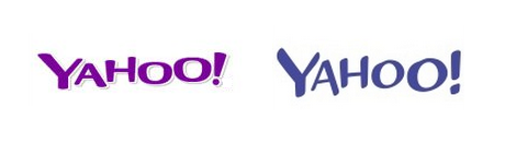
Later this week, Yahoo will unveil a new logo, replacing the wordmark (above) that has remained virtually unchanged since 1996, aside from a 2009 switch from red to purple. Leading up to this unveiling, Yahoo has been featuring a new logo every day in its “30 Days of Change” campaign. Yahoo’s Chief Marketing Officer Kathy Savitt has already revealed that the new mark will retain the color purple and the “iconic” exclamation point, and each of the “30 Days” logos has simply been a wordmark rendered in a different typographic style, so it seems that the change will not be a drastic one.
The month-long buildup to the new logo’s debut has succeeded in attracting interest and, by easing people into the idea of change, has perhaps served to prevent a Gap-style backlash. Speculation about the new logo has focused on Yahoo CEO Marissa Mayer’s inclination toward data-driven design decision-making, with particular attention paid to her famous test of 41 shades of blue at Google. Indeed, Yahoo seems to have tested new logo designs on its site in 2008 and 2012 (below), so this week’s change should not come as a big surprise.
Analysis of United States Patent and Trademark Office data on logo designs can allow us to see where the current Yahoo logo stands in relation to nationwide and industry-wide logo design trends.
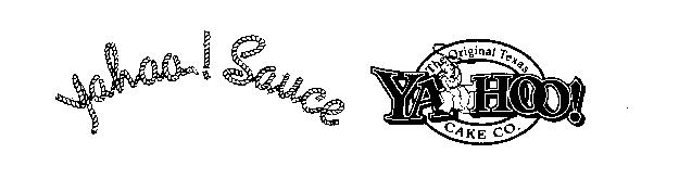
The Yahoo name, an acronym for “Yet Another Hierarchically Officious Oracle,” is a nerdy joke that probably shouldn’t have survived the nineties, but is far too familiar to change now. Its exclamation point is certainly one of Yahoo’s most distinctive brand elements. Given that “Yahoo!” is itself an exclamation, it’s not surprising that it is there. Companies previous to Yahoo certainly felt inclined to include it in their logos in 1985 and 1988:
Over the years, wordmarks (that is, logos that are words presented in a stylized form) ending in exclamation points have become increasingly common, as the graph below illustrates. Currently, 1.17 percent of new wordmarks end with an exclamation point, while among internet wordmarks, the figure is 1.52 percent. Yahoo certainly seems to have been a trendsetter here, part of a 1995 spike in which 2.42 percent of all new internet wordmarks ended with exclamation points.
And, as shown below, internet firms are significantly more likely to use wordmarks ending in exclamation points than are companies in many other industries.
In all though, the exclamation point belies a certain cheesiness and feels like a cheap marketing gimmick. While Yahoo presents an exception, in general, wordmarks ending in exclamation points tend not to last: of the wordmarks filed for registration with the USPTO since 1990, 44.1 percent have survived in use to the present, while just 39.2 percent of exclamation point wordmarks are still around.
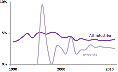
After wavering for years between red and purple, Yahoo has gone “all in” on purple as its defining color. Purple is certainly an “ownable” color for Yahoo in that it is relatively rarely used in the corporate world. The graph below shows that purple has consistently appeared in only about five percent of US logos over the past several decades. Among new internet-related logos, the use of purple shot up to 9.52 percent in 1996, another spike that Yahoo certainly contributed to. Today, purple is found less often among internet logos than in logos as a whole.
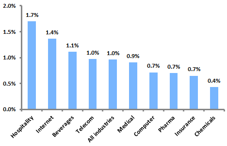
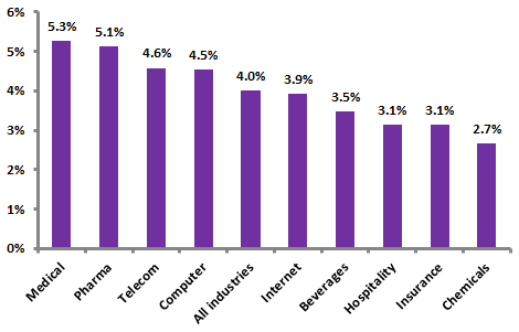
Further analysis shows that, across time, purple appears most often in the logos of medical and pharmaceutical companies and less often in internet logos.
Yahoo’s apparent decision to stick with a wordmark-only logo (as opposed to a symbol-only or symbol-plus-wordmark logo) runs against contemporary logo trends. While Microsoft, last year’s most prominent new logo adopter, opted to ditch its wordmark for a wordmark/symbol combination, Yahoo seems to be standing pat. Although its “Y!-bang” mark might be considered a symbol of sorts, it hasn’t been used very prominently to date. Analysis of USPTO data shows that, among new wordmarks today, only about one-fifth stand alone without a symbol. The figure is slightly lower for internet wordmarks, which have seen a steep dropoff in solo wordmarks since the dot-com boom of the late nineties.
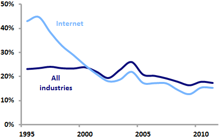
Indeed, internet wordmarks are among the least likely to be unaccompanied by a symbol, meaning that Yahoo is going against the industry trend.
The three main characteristics of Yahoo’s current logo (purple, solo wordmark, ending with an exclamation point) saw higher levels of popularity among internet-related logos in the late 1990s, implying that Yahoo’s image may be tied to that time period, and suggesting that the company is indeed in need of an updated logo. But all three of these characteristics seem likely to remain prominent in this week’s new logo. To enable Yahoo to escape the dot-com era look, the typographical changes incorporated in the new logo will have to be quite strong.
One of the most fundamental dichotomies in logo design lies between angular and straight design elements and those that are rounded and curvilinear. While the former suggest qualities of precision, strength, and solidity, the latter are associated with softness, friendliness, and nature.
In recent years, it has been argued that more rounded forms have come into vogue in logo design. Identity guru Tony Spaeth noted in 2006 that “soft, shaded, rounded, and multicolor marks, enabled by technology, are in fashion.” In a 2009 Brandweek piece, Todd Wasserman wrote that “as the economy gets uglier, logos are getting prettier. The stolid angular look of visual trademarks like IBM’s and Bank of America are being supplanted by ones that sport softer, more approachable fonts, multiple colors and natural, child-like symbols.” The article quoted adman Cal McAllister, who said that “when you see a logo that’s boxy and the edges are hard and sharp, and the company just laid off 10,000 people, you get mad at them. But if it’s a watercolory rounded logo, you feel kind of sorry for them.”
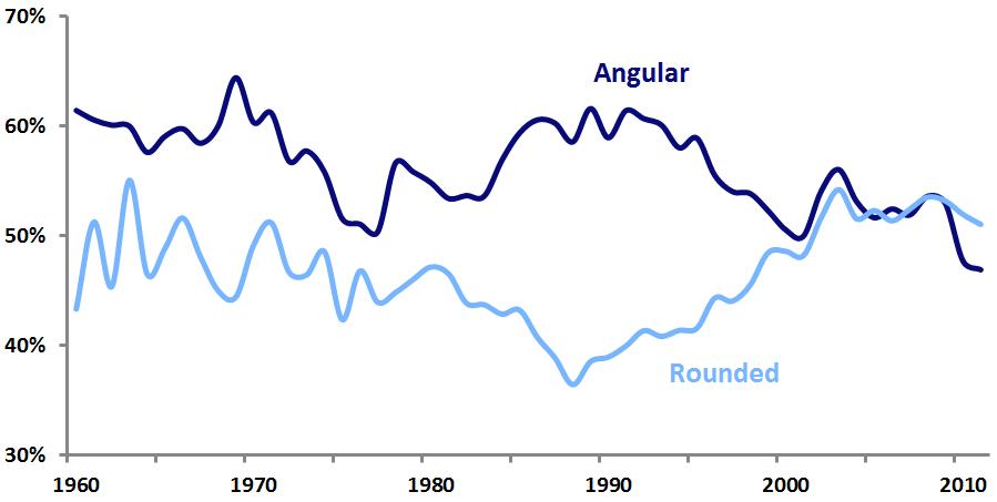
Analysis of United States Patent and Trademark Office data confirms that the perceptions of this logo design trend are correct. Historically, US logos have been more likely to contain angular elements than rounded elements. This was most evident in 1989, when 62 percent of new logos featured angular elements, while only 39 percent had rounded elements. But throughout the 1990s and early 2000s, rounded logo design elements steadily increased in popularity, while angular ones dropped off. Finally, in 2005, rounded elements gained the upper hand. Perhaps part of the reason for the hostile reaction to 2007’s unveiling of the jagged London 2012 mark was that it stood in utter contrast to the prevalent trend of roundedness.
Logo design trends such as this one are not easily explained. As previous Emblemetric analysis has shown, circles had become more popular than rectangles. And it is likely that as many high-tech companies sought to move away from images of cold technical perfection toward those of more humanity and relatability, they abandoned their hard-edged logos for more rounded forms. Apple was certainly a pioneer in this regard, and the onslaught of logos containing swooshes in the late-1990s dot-com boom showed that tech companies were no longer afraid of curves.
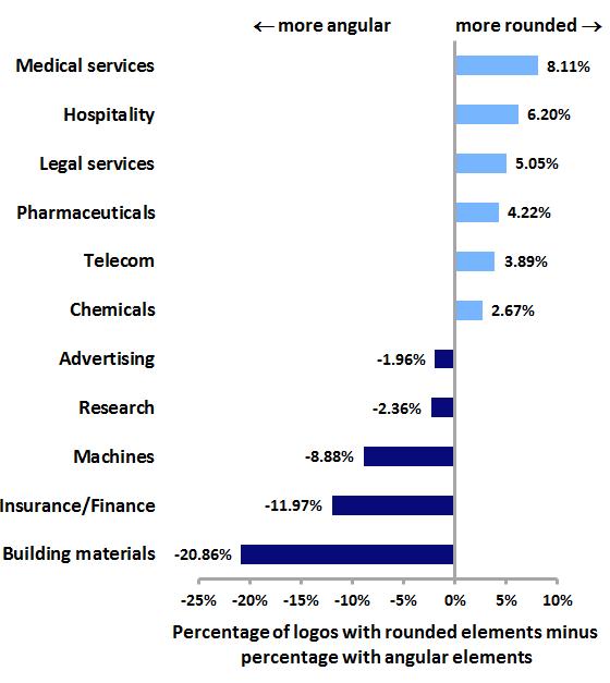
Further analysis shows that the roundedness and angularity of logos varies widely by industry. More human-centered industries like medical services and hospitality are the most likely to feature rounded logo design elements, while more technical industries like insurance, finance, and building materials exhibit the most angular logos.
Will this logo design trend swing back the other way, toward angularity? Perhaps as the worldwide economy recovers, consumers will feel less of a need for the comfort of rounded, huggable marks and more of a desire for logos with confident, aggressive lines and sharp edges. But for now, curviness rules.
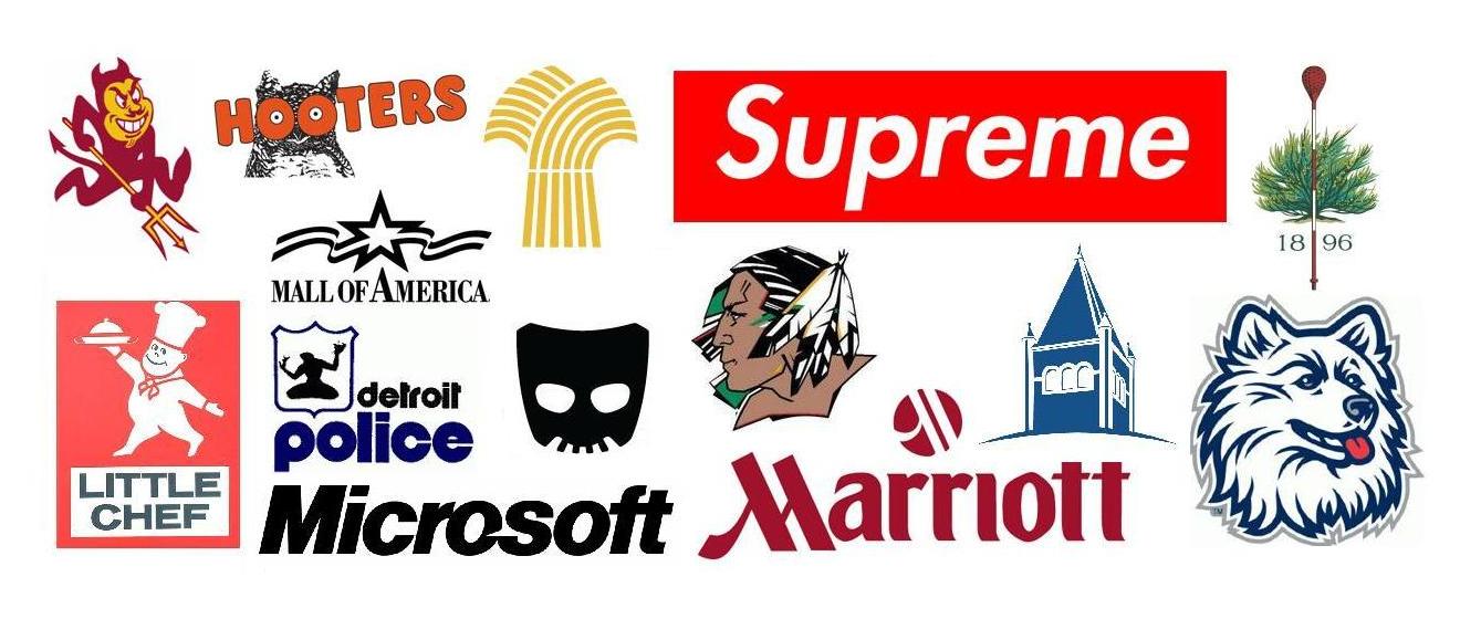
The logos featured above are just a few of those that have been described as “iconic” in 2013 news stories. The term “iconic” has become quite a buzzword in recent years, particularly with reference to logos, a fact that is borne out by an analysis of news stories in the LexisNexis Academic database.
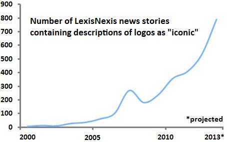
As depicted in the graph above, the last decade has seen a great increase in the number of logos described as “iconic” in news stories. This trend was preceded by an earlier spike in the use of the word “icon.”
![]()
Using Google’s Ngram Viewer, we can see that use of the word “icon” in books peaked in 2001 and has fallen off somewhat since. The popularity of the word seems to have increased over the twentieth century as it began to be used in contexts outside its original meaning of a religious work of art. The word, which derives from the Greek term for “image,” became used as a synonym for “symbol,” and took on heightened importance in our increasingly visually-driven and celebrity-obsessed society.
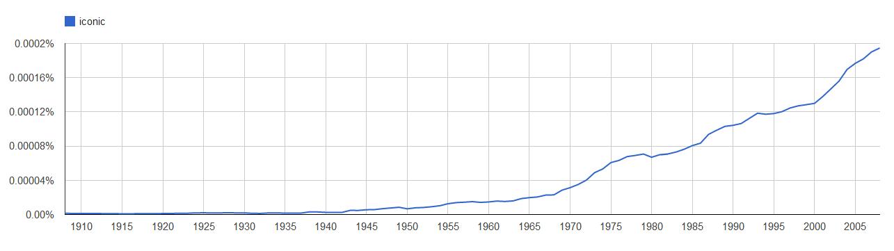
On the heels of “icon” came its adjectival form “iconic,” which, as Google Ngram shows, is seeing a steady increase in use. In today’s media environment, the term seems to pop up everywhere, describing all manner of products, institutions, and people. Perhaps nothing shows the extent to which it has permeated the culture and cements its status as a buzzword as its use as the basis of Pepsi and Mountain Dew’s most recent seasonal promotion: the “Iconic Summer.”
As a descriptor of logos, “iconic” has a lot to offer. The qualities of instant recognition, striking visual appeal, and universally-understood meaning that “iconic” suggests are certainly all that could be hoped for in a logo.
But the cavalier use of the term to describe logos threatens to undermine its efficacy. The bar has been set so low for logos to be considered iconic that any mark with any degree of fame, familiarity, or simply age seems to qualify. “Iconic” is in danger of becoming nothing more than a marketing term, stripped of all its meaning, in the same way that words like “delectable,” “sumptuous,” and even “decadent” have been reduced to mere puffery in the dessert menu of a mediocre chain restaurant. Let’s try to save “iconic” from such a fate by reserving its use for the logos that truly deserve it.
A prominent contemporary logo design trend has featured an “X” with letters or symbols in each of the four quadrants it forms. While today the trend is often associated with a “hipster” aesthetic, its origin was recently pinpointed by Sue Apfelbaum in Red Bull Music Academy Magazine within the hardcore and straight-edge punk scenes of the 1980s, as kids appropriated the X that was written on their hands to mark them as underage at shows.
The trend has perhaps tired itself out at this point, becoming ripe for parody from the “Your Logo is Not Hardcore” Tumblr and the 2013 Brand New Conference identity. But, as noted by Bill Gardner in his 2013 Logo Trends article on Logolounge, a variant of the trend has emerged in which the X’s are made up of crossed design elements such as tools, cooking utensils, and sporting goods, as well as the more traditional swords and bones.
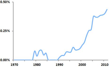
By analyzing United States Patent and Trademark Office data on logo registrations, we can see that this “crossed” logo trend is real, having taken off in the early 2000’s and continuing today to the point that nearly one out of every 200 new logos features some sort of crossed element.
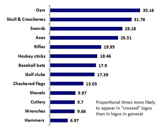
Further analysis shows that oars are the design element most likely to be crossed, as they appear in crossed logos 35 times more often than they do proportionately in logos as a whole. Gardner’s observations are borne out as well, as axes, golf clubs, cutlery, wrenches and the like round out the list of frequently crossed elements.
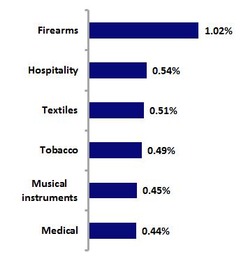
Analysis by industry shows that firearms logos are the most likely to contain crossed logos; this is not surprising given that rifles are a frequently crossed element. History suggests, though, that the “industry” that first gave birth to this crossed look, though, may be the stonemasonry of the Romanesque and Gothic periods, as the personal seals of the masons often incorporated it.
So this logo design trend is both old and new, but its future is somewhat doubtful. Analysis of the “birth” and “death” rates of crossed logos over the past five years shows a “trendiness” measure of 0.99, which, because it is (barely) below 1, indicates that crossed logos make up a greater percentage of “dying” logos than of new logos. This pattern appears likely to not only continue, but to accelerate, leading to the demise of the trend.
Procter and Gamble, the world’s largest consumer packaged goods company, earlier this year quietly rolled out a new logo from Landor Associates. The lack of fanfare was understandable, given P&G’s history: the company unsuccessfully battled outlandish rumors that its century-old “Man in the Moon” logo was satanic, finally removing the mark from its packaging in 1985. Since 1991, the company has relied on basic “P&G” logotypes; the new logo puts the type in a circle of P&G’s traditional dark blue and recalls the old mark with a light blue crescent shape.
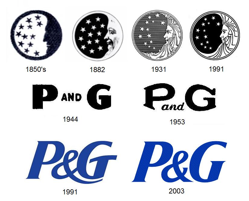
The old logo was not without its weaknesses. P&G had always had great success promoting its famous brands (Ivory soap, Tide detergent, Crest toothpaste, etc.) much more heavily than itself, so the Man in the Moon mark, appended at small size to obscure parts of the product packaging, was unfamiliar and meaningless to the consumer. It practically invited people to come up with an interpretation for it, and they did, to disastrous effect. (Ironically, P&G had briefly stopped using the symbol in the 1860’s, considering it “meaningless,” but quickly reconsidered when a merchant rejected as “not genuine” a shipment of candles that lacked the mark.)
The logo had been redesigned by sculptor Ernest Haswell in 1931 in an ornate style out of step with modern marks. As early as 1961, Modern Packaging magazine had called it “tiny, oddly out-of-date and almost unnoticed.” In 1991, corporate identity guru Tony Spaeth, citing its “visual weakness,” used it to illustrate the point that “sometimes the logo is indeed a problem, if not the problem” with corporate identity.
The new P&G logo represents part of the company’s effort to increase its profile. As Landor puts it in describing the mark, “For the first time, P&G is starting to talk to consumers as one company, not just as individual brands, in an effort to build awareness and trust.” Internally, the mark is cleverly being called the “New Phase” logo, in a reference to both the new awareness campaign and the phases of the moon (although, unfortunately, while the old Man in the Moon symbol depicted a waxing moon, one that is growing in size, the New Phase logo shows a waning moon that is fading into nothingness).
The most obvious change from the most recent logo to the New Phase mark is the switch from logotype alone to symbol with logotype. As we saw last year with Microsoft’s new logo, and with logos in general, such a switch is quite common today. Analysis of United States Patent and Trademark Office data on logos bears this out.
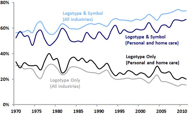
Among all US logos as well as logos within the personal care and home care industries that P&G is a part of, logotype/symbol combinations are increasing in popularity, while logotypes alone are becoming less common. P&G’s adoption of this new logotype/symbol combination is squarely in line with current logo design trends.
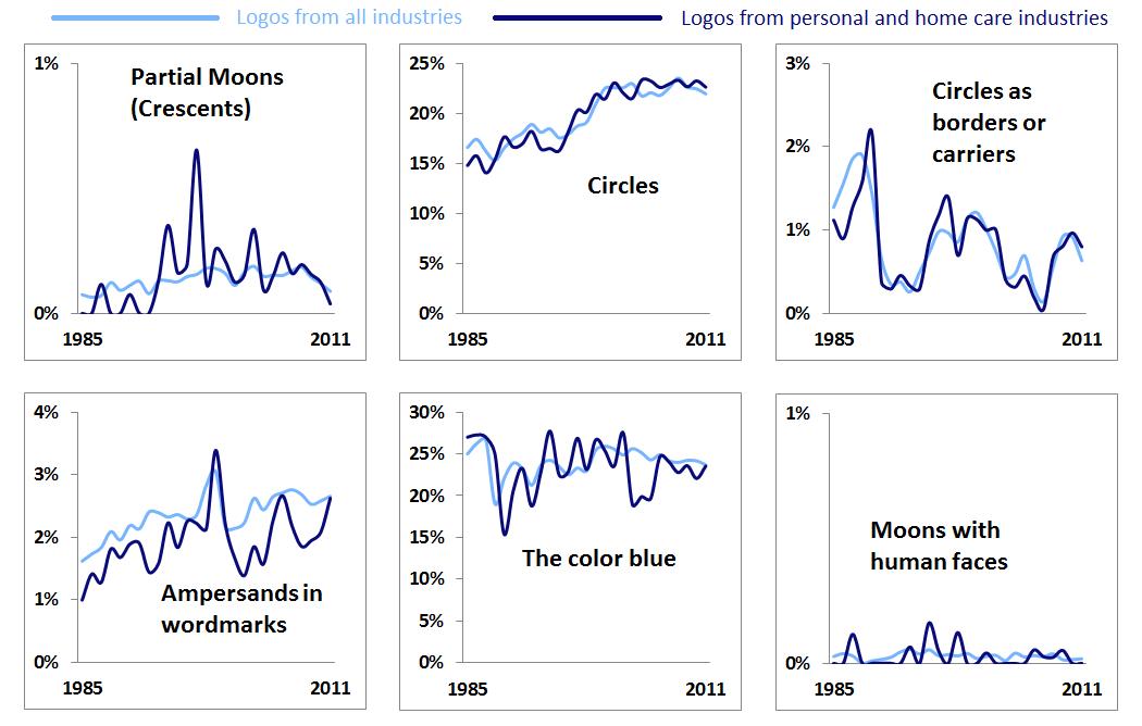
Looking at the individual elements that make up the New Phase identity, it appears that crescent moons and circles as borders or carriers are not particularly popular today either among logos as a whole or within the personal and home care industries (and Man in the Moon-style lunar faces are practically nonexistent). However, as noted here last year, circles are enjoying renewed popularity in logos and blue has equaled red as the color used most often in logos. The use of ampersands in wordmarks is on the rise as well (a trend that is often reflected in the graphic design world’s own logos).
We may extend our analysis by looking at the “trendiness” of the design elements associated with the new P&G logo, which can be measured as a ratio of the share of each element among new logos from the last five years to the share of each element among “dying” logos over the same period. Using such a measure, values above 1 indicate design elements that are relatively “hotter,” while values below 1 suggest “colder” design elements.
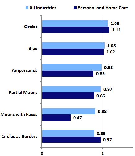
The most prominent aspects of the New Phase logo, the circle and the color blue, are currently somewhat trendy, suggesting that P&G and Landor have created an identity that, while certainly not groundbreaking, is appropriate for a large, conservative company seeking a refreshed look. Indeed, the new logo is simple and attractive, works well in contemporary applications, and reflects P&G’s long history.
However, it may be that the logo’s nod to that history, in the form of the crescent moon, may be its biggest weakness. There was no great impetus to bring back the moon. Virtually no one outside of P&G held positive associations with the Man in the Moon logo; most of the the public was only aware of the mark due to the rumors that sank it in the 1980’s. Reintroducing the moon in the new mark not only might allow for the rekindling of those old rumors, it creates the possibility of new negative associations. Today, unfortunately, the crescent moon is seen by a certain number of Americans as symbolic of the Islamic religion that they foolishly fear and abhor.
The 2010 controversy surrounding the introduction of a new logo for the Department of Defense’s Missile Defense Agency illustrates the potential for graphic symbolism to spark anti-Muslim sentiment among the same types of people who fell for the P&G logo rumors in the 1980’s. Hopefully, Procter and Gamble will be able to avoid any such nonsense related to its new mark, but perhaps it might have been better to avoid such possibilities by simply starting fresh with a logo that ditched any historical baggage and steered clear of potential new controversies.
Last year, an Emblemetric analysis showed that logotype/symbol combinations were becoming increasingly popular relative to logotypes (wordmarks) or symbols alone. A prominent logo design trend among these logotype/symbol combination marks involves a wordmark in which one or more letters have been replaced with pictorial design elements. The resulting mark is neither symbol nor wordmark, but one that gives the appearance of having been cobbled together using disparate pieces, much as Frankenstein’s monster was assembled. These “frankenmarks,” if you will, have seen a resurgence in popularity over the last decade.
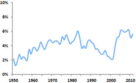
An analysis of United States Patent and Trademark Office data shows that frankenmarks first enjoyed a period of popularity in the 1970s and 80s, peaking in 1983, when 6.04 of all new US logos were frankenmarks. After declining in prominence in the 1990s, they surged back into heavy use in the early 2000s. By 2009, they accounted for 6.21 percent of new US logos.
Among the design elements used most frequently in frankenmarks are stars (appearing in percent of 5.02 percent of frankenmarks), hearts (3.54%), and globes (2.83%), elements that are not only common symbols but that can easily stand in for commonly-used letters such as “o” and “a.” Design elements that appear in frankenmarks at a much higher rate than in logos as a whole include zippers (found in frankenmarks at a rate 4.34 times higher than in all logos), buttons (4.33 times higher), paper clips (4.18 times higher), and handcuffs (3.82 times higher).
How did the earlier period of frankenmark popularity (1975-1984) differ from the later period (2003-2011)? The particular design elements incorporated in frankenmarks changed somewhat. From 1975 to 1984, t-shirts were 5.54 times more likely to appear in frankenmarks than in the later period, while candy canes were 4.97 times more common and tridents were 3.13 times as prevalent.
From 2003 to 2011, magnifying glasses were 9.35 times more likely to appear in frankenmarks than they were in the earlier period, syringes were 4.42 times as likely, and bells were 41.5 times more common.
Interestingly, designers of contemporary frankenmarks seem to feel less need to have the pictorial elements of their logos correspond graphically to the letters they are replacing. This results in marks that a viewer reads by essentially “filling in the blanks” to account for the missing letters. While this is not typically a problem when the mark uses common words, legibility of less-well-known words or brand names may be threatened.
All in all, frankenmarks often seem to reflect a certain design amateurishness. Their designers’ attempts to combine wordmarks with symbols are frequently clumsy and overreaching, resulting in marks that can appear cheap and gimmicky. They rarely exude a sense of permanence and they don’t seem to last in use: indeed, of the logos filed between 2003 and 2011, 36.4 percent of the frankenmarks have “died,” compared to just 32.8 percent of the other logos. Those looking for a new logo should think carefully before adopting a frankenmark.
Texas “state shape” logos
The outlines of US states are often used as design elements in the nation’s logos. The shape of a state can be a meaningful symbol of identity for its residents.
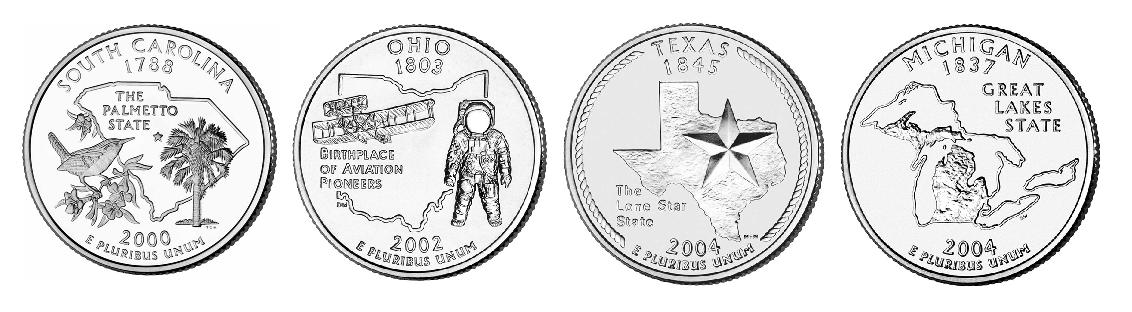
US state quarter coins featuring state outlines
In the “50 State Quarters” program, which ran from 1999 to 2008, each US state was given the opportunity to be represented on the back of a US coin. Fifteen of the fifty states chose to include their state outlines as part of the coin design.
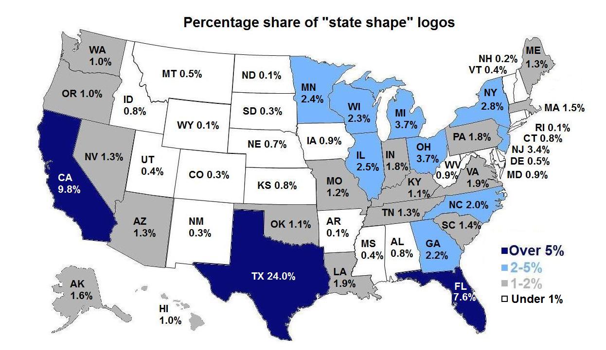
By examining United States Patent and Trademark Office data, we can see that the state of Texas features over twice as many “state shape” logos as its nearest competitor, California. Nearly one-quarter of all “state shape” logos depict Texas. This is not surprising, given the strong sense of state pride that Texans exhibit, the state’s large population and geographic size, and the fact that the state’s shape itself is distinctive, memorable, and relatively easy to use in a design context.
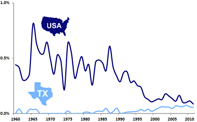
By 2011, the percentage of new US logos featuring the shape of Texas (0.06%) had nearly equaled that of logos depicting the outline of the United States itself (0.09%), although this was due more to a decrease over time in the use of USA outline logos than to an increase in Texas state shape logos.
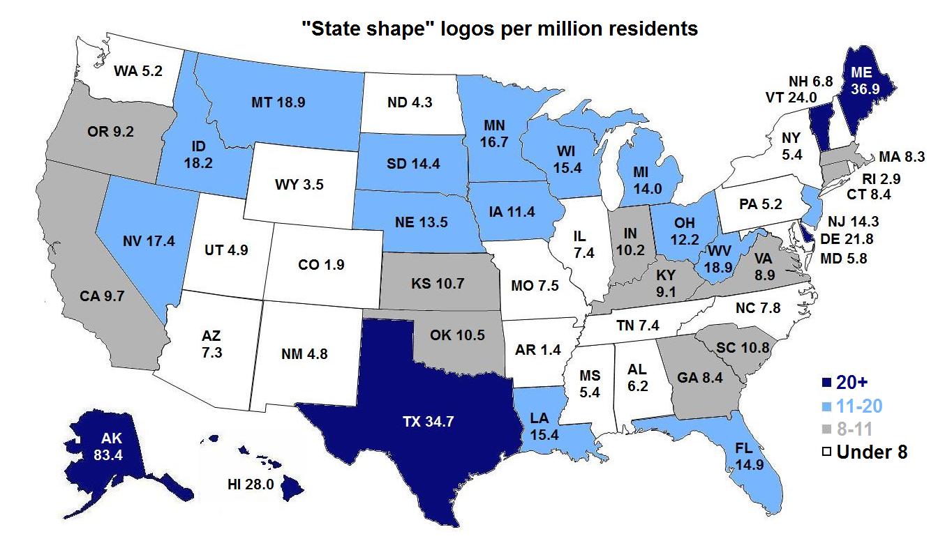
If we take the relative population of US states into account in our analysis, a slightly different picture emerges. The states of Alaska and Maine, each with much smaller populations than Texas, surpass it in terms of state shape logos per capita, perhaps putting a small dent in Texas pride.
Do you have a favorite logo that features the shape of a nation, state, province, or the like? Contact us and share it!
As China rings in the Year of the Snake, it’s a good time to look at the increasing prominence of the nation’s logos. The recent growth of the Chinese economy has brought with it a big jump in the number of trademarks that Chinese firms are filing in the United States. By 2011, Chinese companies accounted for 2.56 percent of the logos filed for trademark registration in the US.
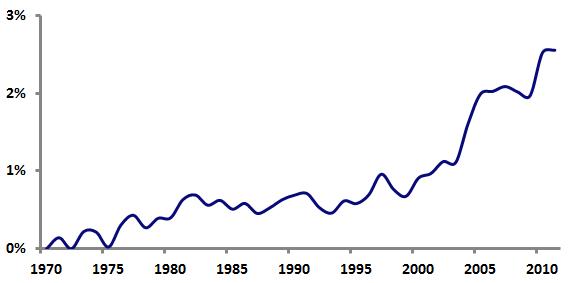
Are there any logo design trends associated with this influx of Chinese marks? Analysis of United States Patent and Trademark Office data shows that, over the period from 2007 through 2011, certain design elements are much more likely to appear in logos from China than in non-Chinese logos.
Totally unsurprisingly, Chinese logos are 30.6 times more likely than other logos to contain inscriptions written with Asian characters.
Similarly, Chinese logos are 7.35 times more likely to feature depictions of Asian men and 4.39 times more likely to include Asian women.
Polygonal shapes containing bars or lines seem to be a popular element in Chinese design; they are 3.99 times more likely to appear in logos from China. Notably, abstract marks in general are 1.64 times more common in Chinese logos.
Pandas are 3.67 times more likely to appear in Chinese logos.
Circles with bars or lines are featured in Chinese logos 2.50 times more often than in non-Chinese logos.
Geometric figures forming letters are 1.99 times more likely to appear in Chinese logos.
Shaded triangles are 1.77 times more common in Chinese logos.
“Swooshes” appear in Chinese logos 1.52 times more than in other logos.
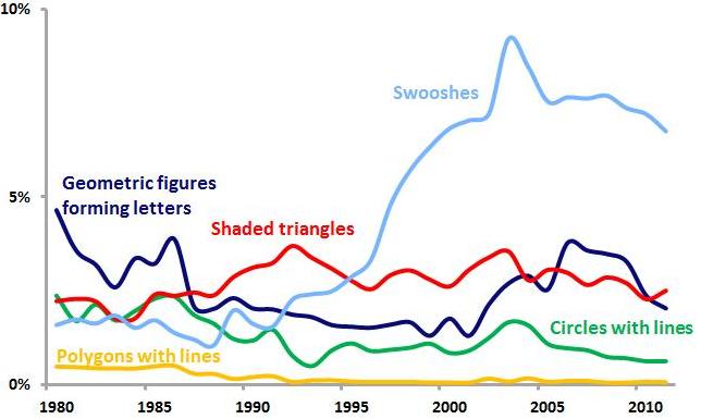
The graph above shows the five abstract logo design trends popular within Chinese logos in terms of logos from American companies only. Swooshes, shaded triangles, and geometric figures forming letters have all enjoyed relatively recent popularity in US logos, suggesting that their prominence in Chinese logos may be due to logo trends spreading worldwide. But the relative paucity of US logos featuring circles with lines and polygons with lines indicates that these logo design trends may be more specific to China. Even in an increasingly globalized economy, it appears that there is still room for regional and national variation in logo design styles.
FutureBrand’s redesign of Massimo Vignelli’s classic 1968 American Airlines logo and livery is the first big identity design news of the year. How does the new “Flight Symbol” relate to larger trends in U.S. logo design? Let’s investigate…
American’s 1968 logo
The most obvious change from the old American logo is the switch from a stylized depiction of an eagle in flight to an abstract version. By going abstract, FutureBrand has dealt with a couple of nagging problems related to using birds in airline logos.
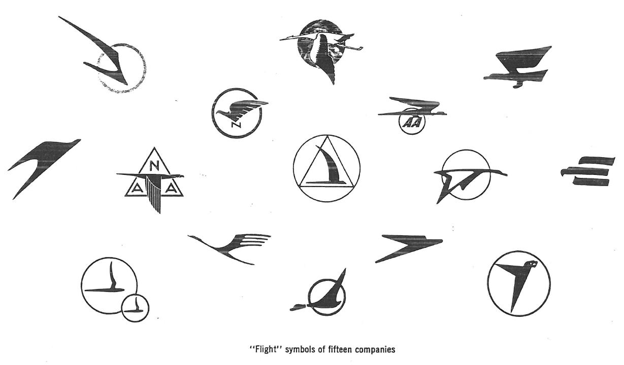
from Communication Arts, January 1963
The first is that airline bird logos have long been clichéd. Even a half-century ago, in 1963, a Communication Arts article detailed the work of designer Jim Cross in redesigning the identity of aerospace giant Northrop (now Northrop Grumman). Cross, noting the overabundance of birds in flight in aviation logos, did away with Northrop’s bird symbol and replaced it with a simple wordmark.
Secondly, airline bird logos reek of old-fashionedness. Discussing his work for United Airlines in a 1981 Los Angeles Times interview, the legendary Saul Bass noted, “Almost all airlines begin with a birdlike mark, but when we leap into jet technology, the safety factor becomes more important. You can’t go around with flapping birds any more.”
American’s new Flight Symbol is sufficiently abstract to mitigate these concerns.
Interestingly, it seems that had Vignelli had his way, American would have dropped its bird long ago. As he related to Bloomberg BusinessWeek, Vignelli did not want to include the traditional American eagle in the logo unless it was depicted fully realistically, so Henry Dreyfuss was enlisted by American to shoehorn an eagle into the design.
Some insight into the origin of the Dreyfuss eagle comes from a 1969 New York Times interview, in which Dreyfuss argues that “Designing a trademark is one of the most difficult things in the world. You have to become completely saturated in what you’re doing.” Reporter Philip Dougherty notes that Dreyfuss then “confided that American’s new mark was born on a paper napkin in the Plaza bar and one began to wonder just what kind of saturation he was talking about.”
In its abstraction, the new Flight Symbol is able to suggest elements beyond the flying eagle, such as a star and an “A” monogram. The design also incorporates a red-and-blue color scheme, the U.S. flag (on the plane’s tail), a single diagonal element, and it is abstract in general. Analysis of United States Patent and Trademark Office data allows us to assess the relative use of each of these design elements since 1968 among logos of all industries and those of the transportation industry in particular.
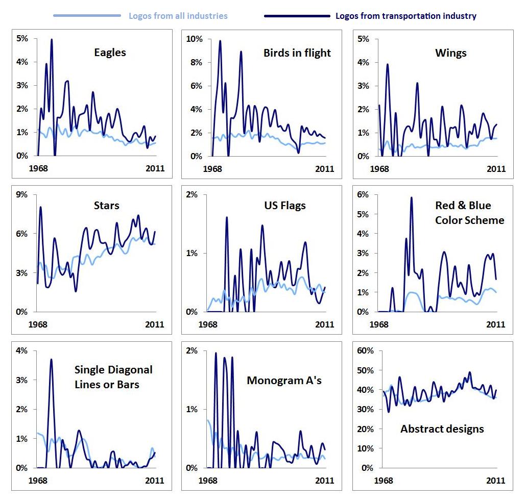
The associated avian design characteristics (eagles, birds in flight, wings) seem to be declining both in general and in transportation industry logos in particular. In order to preserve the visual heritage of its logo, American must employ design elements that imply a certain datedness. As noted above, however, the abstract nature of the Flight Symbol helps to allay these concerns. Other elements, such as stars and U.S. flags, have enjoyed somewhat more common use in recent years.
We may extend our analysis by looking at the “trendiness” of these design elements, which can be measured as a ratio of the share of each element among new logos from the last five years to the share of each element among “dying” logos over the same period. Using such a measure, values above 1 indicate design elements that are relatively “hotter,” while values below 1 suggest “colder” design elements.
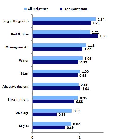 As the graph above shows, the “hottest” aspect of the design is the single diagonal, which is essentially the only new element added to the old Vignelli/Dreyfuss identity. This suggests that FutureBrand has done a good job of implementing a contemporary look that nicely augments and preserves American’s traditional identity, weighted down as it is with somewhat dated elements.

2012 marked the 40th anniversary of Paul Rand’s 8-stripe IBM logo (top left) and, according to some chronologies, the 45th anniversary of the less-used 13-stripe version (top right). These marks launched a thousand imitators and defined the look of high-technology logos for years. But before they could do so, they were subject to the same sort of armchair design criticism that today’s social media have made so common. As Rand recounted in a 1991 article, his pitch to add stripes to the IBM mark he had previously designed prompted one IBM executive to snort, “It reminds me of the Georgia chain gang.” A prison uniform may have been the most obvious visual referent for stripes at the time, but the IBM logo quickly changed that.
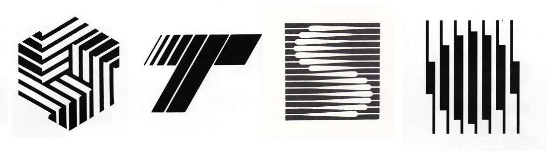
Striped 1970s and 80s logos from John Mendenhall’s “High Tech Trademarks”
As the computer industry and related high-tech fields took off in the 1970s and 80s, they spawned companies that looked to Big Blue for inspiration when adopting logos. John Mendenhall’s excellent 1985 book, High Tech Trademarks, displayed dozens of examples of these striped marks. Moving beyond the IBM comparisons, Mendenhall saw in them the imagery of the integrated circuit: “This intricate circuitry with its intriguing pattern of lines, often tapering from thick to thin, is the physical embodiment of unseen power. It is appropriate then that these linear compositions, seemingly random yet actually highly structured, have become the visual metaphor for an entire industry.”
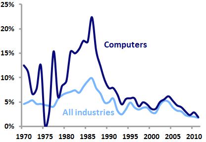
Analysis of United States Patent and Trademark office data shows that use of stripes in logo designs peaked in 1986, when 9.9 percent of all new logos and 22.4 percent of new computer-related logos featured stripes. But the trend quickly died off amid criticism of the glut of lookalike marks, as stripes went from being seen as technical, precise, and advanced to simply cold, impersonal, and anonymous. By 2011, only 1.8 percent of new logos and 1.9 percent of new computer logos were striped.
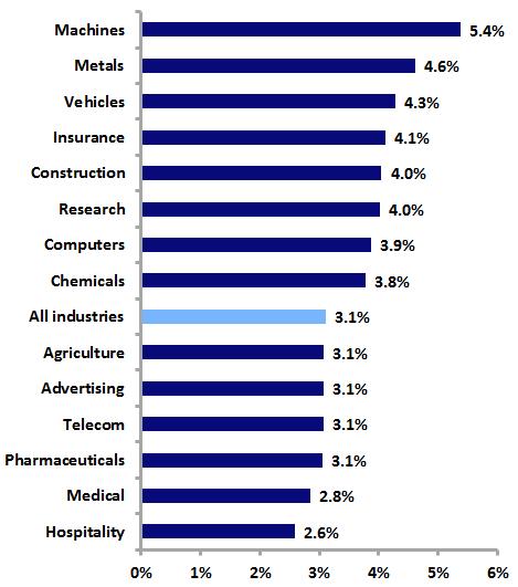
Where are striped logos to be found today? The graph above shows the prevalence of new striped logos within selected industries over the last ten years. Decidedly lower-tech industries such as machines, metals, and vehicles, perhaps late to the striped-logo party, are more likely to use stripes than their high-tech counterparts.

Perhaps the most significant development in twentieth-century logo design was the rise of the abstract logo. In the United States, the burgeoning corporate identity field helped spread modernist German and Swiss design philosophies, resulting in many pictorial logos being replaced by clean, stark, abstract marks. Such logos were particularly favored by expanding American corporations whose business activities, as they became more varied and technologically complex, could no longer be depicted in a simple, realistic trademark.
Abstract logos faced a strong backlash from Americans accustomed to more realistic symbols. A 1966 Printers’ Ink cover story asked whether these new trademarks were “Imagery or Tomfoolery?” In 1972, Tom Wolfe called abstract logos “the creamiest piece of pie-in-the-sky that American graphic arts have ever sold to American business” and said that they “make absolutely no impact…except insofar as they create a feeling of vagueness or confusion.” Karrie Jacobs in 1987 noted that “Logos, then, evolve backward with complex, multifaceted trademarks down in the primordial muck and geometric marks of amoebalike plainness up at the top of the ladder.”

Analysis of United States Patent and Trademark Office data shows that the use of abstract logos peaked twice in the last half-century, although abstract logos have never been more common than realistic marks. In 1971, 42.3 percent of new U.S. logos were abstract, but that figure dropped over the next several decades.
By the mid-1990’s, abstract logos began a comeback that culminated in 2001, when 45.8 percent of new logos were abstract. This spike was almost certainly driven by the late-90’s dot-com boom and the wave of abstract swooshes that accompanied it. Look for Emblemetric to examine this trend in a future article.
The last decade has seen a significant drop in the use of abstract logos, with a corresponding increase in realistic symbols. In 2011, 36.0 percent of new logos were abstract, while 61.8 percent were realistic.


The graphs above show that, not surprisingly, abstract logos are more common in high-technology industries and those where the product or service cannot be easily depicted, while realistic logos are more prevalent in industries where the product has been long established and its consumption occurs on a personal level.
Overall, whether a logo is realistic or abstract seems to have little effect on whether it survives or “dies” over time. Of the realistic logos created since 1960, 34.8 percent are still in use as trademarks, compared to 35.6 percent of abstract logos.

The single-letter monogram is a basic and classic form of logo that still enjoys wide use today. Looking back through United States Patent and Trademark Office data, we can see that the use of such monograms peaked in the US in 1970, when they made up 6.7 percent of new logos. By 2011, just 2.4 percent of new logos were single-letter monograms.

Further analysis reveals which letters are most popular for use in single-letter monogram logos. By comparing the prevalence of particular letters in monograms relative to their use as the initial letters in all trademarked words and phrases, we can see which letters are disproportionately used as monogram logos. For instance, “M” is the first letter in 6.3 percent of all trademarked words, but is used in 9.4 percent of single-letter monogram logos. This gap of 3.1 percent is the highest for any letter, indicating that “M” is most favored for use in monograms. The table below shows these figures for all letters.
M 3.1%
V 2.0%
A 1.7%
X 1.4%
K 1.4%
W 1.4%
Z 1.2%
H 1.1%
Q 1.0%
E 1.0%
G 0.8%
R 0.5%
Y 0.2%
N 0.2%
U 0.1%
J -0.3%
I -0.5%
D -0.8%
O -0.8%
B -0.9%
S -1.2%
F -1.3%
L -1.8%
P -2.2%
C -2.6%
T -4.5%
Interestingly, the four most popular letters for monograms (M, V, A, and X) are vertically symmetrical, while six of the seven least-popular letters are vertically asymmetrical.
Which letters are currently “trendy” for use in single-letter monograms? We can answer this question by analyzing data from the past five years related to new trademarks and “dying” trademarks. The table below shows the ratio of the share of each letter’s use in new monograms over the last five years to the share of each letter’s use in dying monograms over that period. So if a letter appears in 10 percent of new monograms and 10 percent of dying monograms, its ratio is 1, meaning that it is not at all trendy in a positive or negative way. However, if a letter appeared in 40 percent of new monograms and just 20 percent of dying monograms, its ratio would be 2, meaning that it would be very “hot.” Likewise, if a letter were used just 10 percent of the time in new monograms and 30 percent of the time in dying monograms, its ratio would be 0.33, making it quite “cold.”
O 1.43
V 1.36
U 1.26
E 1.23
B 1.20
W 1.20
G 1.19
F 1.09
T 1.05
R 1.04
K 1.03
A 1.03
Z 1.01
Q 0.97
I 0.97
S 0.95
H 0.95
Y 0.94
L 0.94
P 0.91
J 0.90
M 0.89
N 0.80
X 0.78
C 0.75
D 0.66
“O” leads the way here, perhaps in part due to the popularity and success of the Obama campaign’s “O” monogram, while old standbys “M” and “X” seem to be losing steam.
Single-letter monograms, although their greatest popularity appears to be behind them, remain a viable option for logos. The suggestion here is that formal characteristics of letters themselves, particularly vertical symmetry, may impact which letters are more likely to be turned into monograms.

October is Breast Cancer Awareness Month in the United States, and the associated pink ribbons are everywhere. Over the last several decades, such “cause ribbons” designed to raise awareness of various issues have become extremely common visual symbols. The graph below shows the recent sharp increase in the use of ribbons in US logos.

The popularity of the ribbon symbol took off in the United States in 1979, when yellow ribbons were tied around trees in support of the American embassy personnel held hostage in Iran. This practice was inspired by the song “Tie A Yellow Ribbon ‘Round the Ole Oak Tree,” which had been a hit for Tony Orlando and Dawn in 1973. The song was based on an American folk tale of a man returning to his hometown after serving a prison sentence. He had written a letter to his old girlfriend asking her to tie a yellow ribbon around an oak tree if she still loved him; as his bus pulls up he sees “a hundred yellow ribbons ’round the old oak tree.”

MADD door handle ribbon, Red Ribbon Drug-Free Youth mark, Arthur Ashe looped ribbon with tennis ball logo
The use of cause ribbons began to spread in the 1980s and 1990s, as yellow ribbons took on a meaning of “supporting the troops” and red ribbons were used in the anti-AIDS movement. In 1989, a cause ribbon first appeared in a registered US trademark, a symbol of MADD (Mothers Against Drunk Driving) depicting a red ribbon tied around a car door handle. In 1990, the National Federation of Parents for Drug Free Youth used a red ribbon logo, and in 1993, the now-familiar looped ribbon first appeared in another red ribbon mark used by Arthur Ashe’s organization in its fight against AIDS.
While ribbons had traditionally been used in logos to depict gifts (as in Paul Rand’s original UPS logo), awards (Pabst Blue Ribbon), or as banners for text, cause ribbons quickly assumed a prominent place in logos. By 2011, 21 percent of logos containing a ribbon of any sort featured a cause ribbon.
The looped ribbon symbol ultimately became so popular that the United States Patent and Trademark Office came to consider it a “universal symbol,” like the Christian cross or the peace symbol, meaning that it cannot be registered as a trademark without being graphically modified in a distinctive way.

Color is obviously an important aspect of cause ribbons, as different colors signify various causes. The graph above shows that as cause ribbons have proliferated, the variety of colors used in ribbon logos has exploded. While 95 percent of ribbon logos featuring colors between 1980 and 1999 used either red or blue, since 2000 other colors have seen dramatic increases in use. Most notable among these is pink, which has become nearly as popular as red and blue in ribbon logos, a testament to the success of the breast cancer awareness movement.
![]()
Thursday’s unveiling of Microsoft’s new logo was the biggest logo design news of the year to date. Let’s take a look at the new mark in terms of how it relates to trends in United States Patent and Trademark Office data on logo design.
Perhaps most notable is Microsoft’s switch from a logotype (or wordmark) alone to a logotype/symbol combination.
 The graph above shows that among both logos in general and computer-related logos in specific, logotype/symbol combinations are becoming more popular and logotypes alone are becoming less popular (and as Emblemetric’s Logotype vs. Symbol analysis reported, logotype/symbol combinations are currently trendy, while logotypes alone are not). And although combination marks are slightly less common among computer-related logos than among logos as a whole, Microsoft’s decision to change to a logotype/symbol combination is consistent with trends both in its industry and in general.
Looking at the symbol itself, it is quite simply a square element made up of smaller multicolored squares. The graph below shows the prevalence of both squares in general and groups of three or more squares as design elements in new logos over the last three decades. Data for computer-related industries is again contrasted with data for industries as a whole.

It is apparent that squares have long been a logo design favorite for computer-related businesses. And over the last ten years, just 6.08 percent of all logos featured squares of some sort, compared to 9.62 percent of computer logos. Logos featuring three or more squares accounted for 1.05 percent of all logos, while among computer logos, the figure was double: 2.10 percent. Microsoft is certainly sticking close to industry conventions with its use of squares in its new logo.

The graph above shows that logos with squares and 3 or more squares are not dying out (i.e., being abandoned or canceled, or expiring) at alarming rates, so Microsoft is not hitching its wagon to some fading trend with this new logo.

Microsoft’s use of the combination of red, green, blue, and yellow in its new symbol is not typical of computer-related logos, or logos in general, for that matter. The graph above shows that the percentage of new logos featuring this combination has never approached one-half of one-percent since 1980.
But Microsoft has long associated itself with this color combination, dating back to the very first red/green/blue/yellow computer-related logo, the original Windows flag, filed for trademark registration this week in 1991. Indeed, 20.3 percent of all such logo registrations are Microsoft’s. The company’s challenge now is to “own” this combination, given that it is also used by Google and eBay.
In all, the new Microsoft logo strikes a nice balance between bringing the company’s visual image more in line with contemporary design trends and retaining distinctive elements of the Microsoft graphic identity.
![]()
In the first ten months of 2011, there were 44,227 logos filed for trademark registration with the United States Patent and Trademark Office. Among them:
The EMAX VPMA logo, above, a trademark of Encore Legal Solutions of Los Angeles, represents a web-based legal support service system. It may not be 2011’s most beautiful, best-designed, or most effective logo, but it fits the criteria above perfectly and is therefore the most typical, making it Emblemetric’s Logo of the Year.
Geometric shapes are some of the most basic design elements of logos, but designers and businesses have been cautioned for years about the drawbacks to relying on them. Almost a century ago, in his 1916 book Trademark Power: An Expedition Into An Unprobed and Inviting Wilderness, Glen Buck warned that “round trademarks are as numerous as cart-wheels and quite as lacking in distinction.”

Similarly, in 1954, Jim Nash wrote in The Trademark Reporter that “a quick look at existing trade-marks shows that abstract shapes, such as squares, diamonds, ovals, triangles, and so on, have been used by so many firms that they have lost their interest,” and Lippincott & Margulies declared in a 1958 issue of their in-house magazine Design Sense, “our markets are visually oversaturated with more than 9,000 diamond symbols, not to speak of the multitudes of look-alike squares, triangles, circles, and assorted forms.
Studying United States Patent and Trademark Office data, we can evaluate the popularity of geometric shapes as design elements over time. The graph below shows the percentage of new logos in each year since 1950 that contained at least one of eight specific shapes (circles, ovals, triangles, diamonds, squares, rectangles, quadrilaterals, and polygons, defined in this case as shapes with five or more sides).

This percentage has remained remarkably consistent over time, although it’s worth noting the drop over the past several years. In 2010, the figure fell to 49.22 percent, representing the first time since 1944 that less than half of new logos featured shapes.

The graph above shows the relative popularity of the eight shape types over the years. Circles and rectangles have been most common, with rectangles enjoying a decided advantage in the 1980’s and 1990’s, only to be overtaken by circles in recent years.

The popularity of shapes in logo designs varies across industries. The graph above illustrates this point for seven selected industries. Circles are most common in healthcare and telecommunications logos and least common in insurance. Chemical logos feature more triangles, diamonds, and polygons than the other industries. Squares are most common in insurance and least prevalent among beverage marks.

The above graph’s vertical axis represents a ratio of the share of shape type in new logos in a given year to the share of shape type in dying logos from that year. So if circles appear in 20 percent of new trademarks in a year and 20 percent of dying trademarks in that year, their ratio is 1, meaning that they are not at all trendy in a positive or negative way. However, if squares were in 80 percent of new trademarks and just 40 percent of dying trademarks, their ratio would be 2, meaning that they would be very “hot” for that year. Likewise, if triangles were used just 20 percent of the time in new trademarks and 60 percent of the time in dying trademarks, their ratio would be 0.33, making them quite “cold.”
Looking at the graph, we can see that circles have virtually never been “out” over the last two decades, while rectangles have not been in vogue for much of that period. Squares have enjoyed periods of trendiness, including over the last several years. Their compatibility with new visual forms of identity such as favicons and social media profile photos may push them to greater heights in the future.

“Leaf” logos filed for trademark registration in 2011
One of the most prominent trends in logo design in recent years has been the proliferation of leaves as design elements. As companies have attempted to adopt images that reflect our society’s increasing concern for the environment, the leaf has become visual shorthand for eco-friendliness.

The graph above shows the sudden jump in leafy logos over the past decade (the analyses here are concerned only with logos containing generic leaf images; logos featuring specific leaves such as maple, oak, and holly are not included). By 2009, the percentage of logos with leaves reached 3.87 percent, before dropping off slightly in 2010 and 2011. It may be that we have seen this trend peak.

Of course, the leaf logo trend has not taken hold equally across all industries. The graph above shows that logos in industries such as agriculture, chemicals, and pharmaceuticals are much more likely to feature leaves: for example, in 2008, almost 16 percent of all new agricultural logos contained leaves. But even those industries such as insurance and advertising that would seem to have little use for natural or “green” images have seen marked increases in leafy logos.

The flipside of the leaf’s popularity as a design element is that more and more “dying” trademarks (those that are abandoned, canceled, or expired) contain leaves. The graph above shows this increase. By 2011, 3.44 percent of dying logos contained leaves, nearly matching the percentage of new 2011 logos with leaves (3.68%). It appears that the leaf is transitioning from logo design trend to logo design cliché.
A common question in branding and identity design concerns the relative effectiveness of logotypes (stylized typographic expressions of a company or brand name) and symbols (graphic icons that represent a company or brand).
Those from a marketing background often pooh-pooh graphic symbols and recommend the use of logotypes, which promote a name above all else. Jack Trout, writing for Forbes in 2007, declared:
“Logos have been with us for thousands of years…The Roman legions had them. In the middle ages, every two-bit duke with a handful of knights had one plastered on their shields. There were crests or coats of arms everywhere. But none ever amounted to anything. What lived on were the names of the people involved or the places the big battles were fought. What does that tell you? It’s not about the symbol. It’s about the name connected to the symbol.”
Designers, not surprisingly, have more appreciation for the power of symbols relative to logotypes. In a 1999 Communication Arts article, Mark Fox discussed Nike’s decision to detach its Swoosh symbol from its logotype:

“After the connection between a company and logo…is sufficiently understood by the public, the power of the logo can, on occasion, be increased by dropping the company name. Beyond making the symbol translingual, the lack of text can allow the logo to possess a certain ineffable quality that suggests far more than it could before. The ancient Hebrews realized this and, as a result, had a proscription against writing the name of God. That which is named is always less powerful than that which is unnamed.”
Analysis of United States Patent and Trademark Office data can shed some light on the relative use and success of symbols and logotypes.

The graph above shows that, over the last five decades, the most common type of graphic trademark filed for registration in the US has moved from the logotype alone to the combination of logotype and symbol. The prevalence of the unaccompanied symbol has risen slightly, but it remains the least common of the three options (of course, many companies will register multiple versions of their trademarks, featuring logotype, symbol, or both).

By factoring in the types of trademarks that are “dying” (being abandoned or canceled, or expiring) in a given year, we can get a sense for how “trendy” each of these types has been.
The above graph’s vertical axis represents a ratio of the share of graphic trademark type in new logos in a given year to the share of graphic trademark type in dying logos from that year. So if symbols account for 20 percent of new trademarks in a year and 20 percent of dying trademarks in that year, their ratio is 1, meaning that they are not at all trendy in a positive or negative way. However, if logotypes made up 80 percent of new trademarks and just 40 percent of dying trademarks, their ratio would be 2, meaning that they would be very “hot” for that year. Likewise, if combinations of logotypes and symbols were used just 20 percent of the time in new trademarks and 60 percent of the time in dying trademarks, their ratio would be 0.33, making them quite “cold.”
We can see that for much of the past two decades, symbols were “hot” while logotypes were “cold.” Only in the past few years has the logotype/symbol combination become hotter than symbols alone, while logotypes alone continue to seem to be dying out at a faster rate than they are being created.

Looking at selected industries, we can see that symbols alone are used most often in pharmaceutical and alcohol trademarks, and least often in advertising and hospitality. Logotypes alone are used most in chemical and pharmaceutical marks, and least often in hospitality and medical marks. Combinations of logotypes and symbols are used most often in the hospitality and medical industries, and least often in chemical and pharmaceutical trademarks.
Another way to assess the relative success of the different types of graphic trademarks is to look at how long they survive in use, from the time they are filed for registration until they are abandoned, canceled, or expired.

The graph above shows that, among trademarks that have died, those using logotypes alone had the longest average lifespan (11.7 years, followed by symbols alone (8.07 years) and the logotype/symbol combination (7.08 years). While a trademark’s survival over time does not necessarily mean that it is an effective mark, such longevity should be seen as a positive thing in general.
Color has become an even more important aspect of logo design in today’s web-based world. How has color been used in US logo design over the past several decades? Analysis of United States Patent and Trademark Office data can provide some answers.

The graph above shows the relative share of color use in US logos over the last two decades (logos that did not contain these colors, or that did not feature color at all, were omitted from the analysis). The vertical axis indicates the percentage of logos filed for trademark registration in a given year that contained each color; these percentages add up to 100 percent for each year.
A few trends stand out here. Red, which was by far the most popular color used in logos in the 1990’s, has been caught by blue; they now are used about equally. Green has seen a modest rise in use, most likely due to increased environmental consciousness in American society. And orange has enjoyed a slight increase in popularity.

Another way to address this issue is to analyze the colors used not just in new logos, but in logos that have “died” (i.e., trademarks that have been abandoned, canceled, or expired). The graph above provides a measure of trendiness by combining color data from new logos with color data from dying logos.
The graph’s vertical axis represents a ratio of the share of color use in new logos in a given year to the share of color use in dying logos from that year. So if red accounts for 20 percent of the use of color in new logos in a year and 20 percent of the use of color in dying logos in that year, its ratio is 1, meaning that it is not at all trendy in a positive or negative way. However, if blue were used 80 percent of the time in new logos and just 40 percent of the time in dying logos, its ratio would be 2, meaning that it would be a very “hot” color for that year. Likewise, if green were used just 20 percent of the time in new logos and 60 percent of the time in dying logos, its ratio would be 0.33, making it quite “cold.”
With this in mind, we can see that violet was a trendy color in US logos for much of the 1990’s, before cooling off in the last decade. Orange, brown, and green have been hot in recent years, while red has languished somewhat. Over the last three years, the lines on the graph converge around the middle, suggesting that no color is particularly hot or cold.

Color use in logos can also be addressed in terms of particular industries. The graph above shows the relative use across time of eight colors in the logos of seven selected industries (again, these shares sum to 100 percent).
While there are not drastic differences in color use across these industries, some results are notable. Red is used most often in the logos of the beverage and hospitality industries, and least often in insurance and medical services. Blue is used most in telecom and insurance, and least in hospitality marks. Green appears most often in chemicals and least often in telecommunications.
Are there geographical aspects to logo design? In other words, do logos differ based on the location of the companies and organizations they represent? An examination of United States Patent and Trademark Office data may provide some insight.

In the graph above, we can see that companies in the western US have claimed the largest share of US logos, while 18 percent of logos registered in the US have foreign owners. Broken down by state, California (14.4%) is home to the most logos, followed by New York (8.8%), Florida (5.2%), and Texas (5.1%).

Looking at the data over time, it appears that, since 1960, the East and Midwest have lost ground in terms of their share of the nation’s logos, while the West and South have seen gains. This is not surprising, given the shifts in the US population over this period.
Further examination of the data allows for identification of content-related design trends among the logos of the different geographical regions. The following results are based on analysis of logos filed for registration over the past ten years.

Logos of Eastern companies and organizations feature the following graphic elements at significantly higher rates than are seen in US logos as a whole:

Logos of Western companies and organizations feature the following graphic elements at significantly higher rates than are seen in US logos as a whole:

Logos of Midwestern companies and organizations feature the following graphic elements at significantly higher rates than are seen in US logos as a whole:

Logos of Southern companies and organizations feature the following graphic elements at significantly higher rates than are seen in US logos as a whole:

Logos of Foreign-owned companies and organizations feature the following graphic elements at significantly higher rates than are seen in US logos as a whole:
Foreign logos are also the most likely to contain abstract, artificial, and curved design elements.
In general, these geographic characteristics of logos are interesting, but, for the most part, not too surprising. However, some seem to cry out for explanations that are not immediately obvious. Why do Eastern logos feature so many dogs? What explains the popularity of abstract elements such as ovals and shaded squares among non-US companies? Perhaps further research may offer some answers. Do you have a theory? Contact us and share it!

2011 logos featuring two stars in a circular border
The use of two stars as a design element in US logos increased by 170 percent in 2011 over the preceding five-year period. Looking back over time, we can see that, following a pronounced dip in the 1970’s, logos with two stars have been claiming an increasing share of new trademark filings for the last three decades.

What explains this rise? Looking through US trademark registration images, it appears that many of the “two-star” logos employ a similar graphic device: the two stars are used as markers or dividers within a logo’s circular border containing text. Analysis of US trademark data shows that the percentage of “two-star” logos that include a circular border element has increased sharply in recent years.

Consequently, logos with two stars in a circle have become more prevalent in general, with particular increases occurring in the 1990’s and 2000’s.

Of course, this graphic convention is nothing new; for instance, university seals have been employing it for decades:

But the recent popularity of this visual device may be attributable to perhaps the best-known logo to use it: that of Starbucks. The coffee chain first used the two stars in 1987 and retained them in its 1992 logo (below). It’s not a stretch to attribute the rise of this logo design trend over the last couple of decades to the ubiquitous Starbucks siren.

The Starbucks connection makes more sense when this logo design trend is examined in terms of the industries associated with the marks. Aside from the relatively small industry categories of firearms and yarns, the “two stars in a circle” design element appears most frequently in the logos of the hospitality industry (restaurants, bars, and hotels). Of course, in 2011 Starbucks famously dropped the circle and stars from its logo, so it would not be surprising to see this trend lose steam soon.