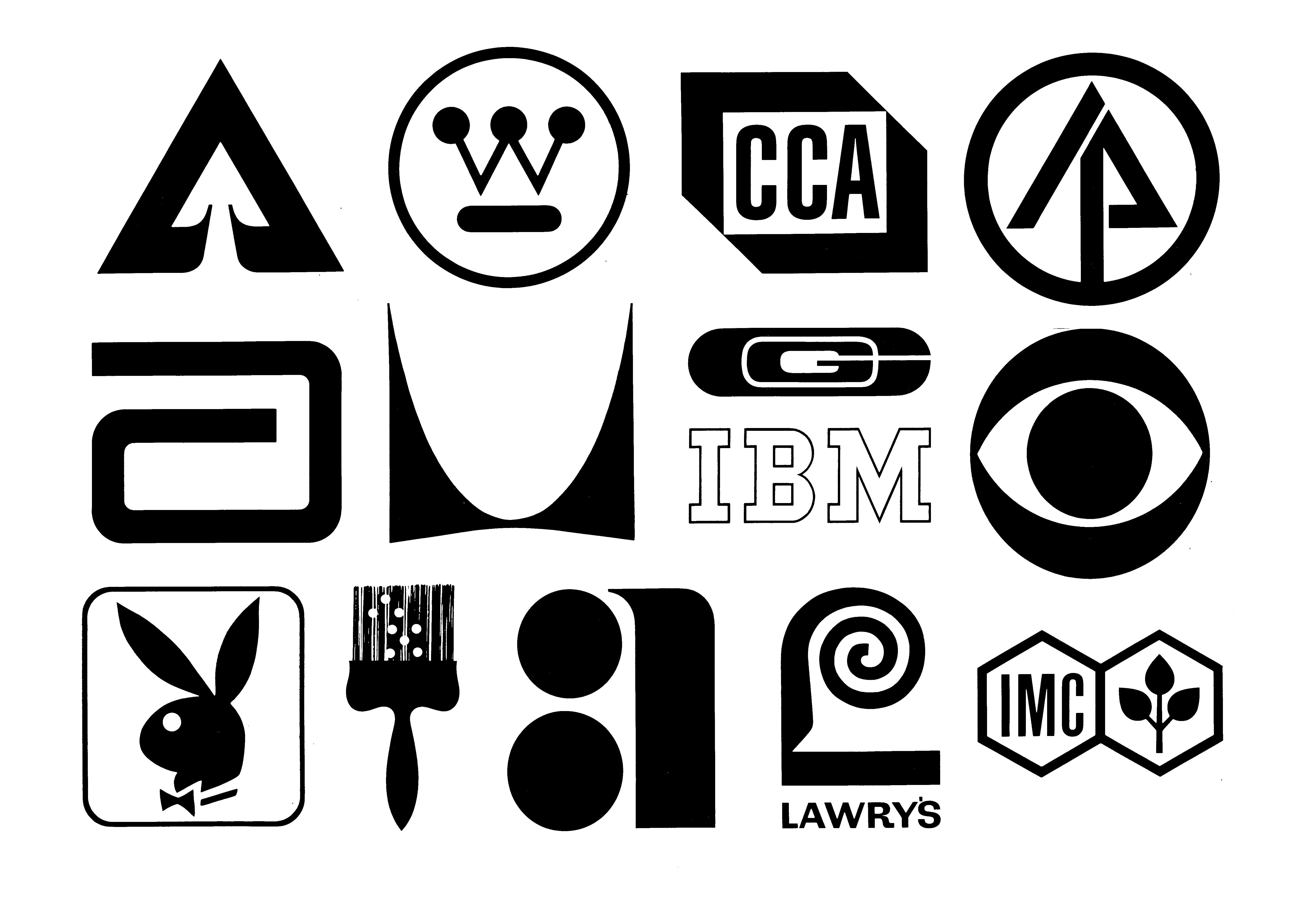
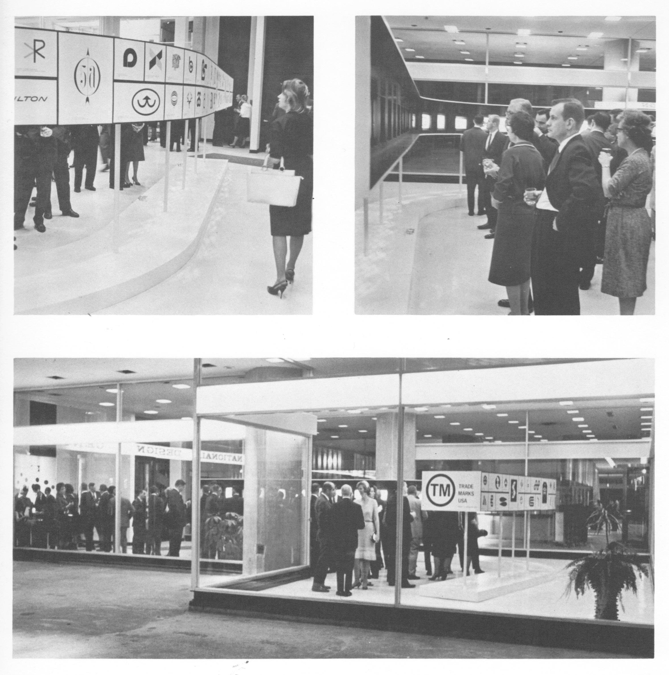
Fifty years ago, on April 22, 1964, Trademarks/USA, the first national retrospective logo design exhibit, opened at the National Design Center in Chicago’s just-completed Marina City towers. The exhibition, hosted by the Society of Typographic Arts, featured 193 American trademarks from the period 1945-1963, chosen from over 1,600 entries by a seven-member jury that included Lester Beall and Egbert Jacobson. The fourteen marks shown above were chosen for particular distinction by the jury.
This event was perhaps the high point of a period in which logos were receiving unprecedented attention from both the business world and the public at large. “Today’s corporate logo or trademark is almost as important as the balance sheet,” gushed the Chicago Tribune in its coverage of the exhibition. That logos would be exhibited in the manner of fine art would have seemed ludicrous only a few years before, yet in the Mad Men mid-sixties, as the field of corporate identity emerged and the importance of a company’s image to its marketing became heightened, logos had acquired a hip, modernist cachet.
This was reflected in the marks selected for Trademarks/USA, as 69 percent of them were from 1960 or later. (Almost as interesting as the logos chosen for the exhibition are the familiar ones not picked, including Paul Rand’s ABC and UPS marks, Lippincott and Margulies’ Steelmark and Chrysler Pentastar, the Coca-Cola script, Raymond Loewy’s Nabisco triangle, and the venerable General Electric logo.)
Exhibition chairman Larry Klein characterized the logos on display as “simpler, blacker, more geometric and formal and sometimes more even in color and weight of line…marks–both good and bad–are growing very much stronger and bolder.” These trends are obvious in a casual perusal of the exhibition catalog, published in 1968.
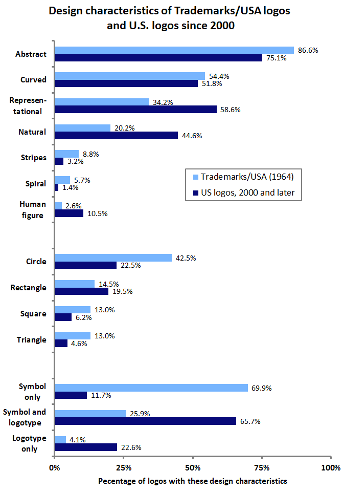
In tallying up selected design characteristics of these 193 marks and comparing them to all US logos filed for registration with the United States Patent and Trademark Office since 2000, further trends become apparent.
The Trademarks/USA logos were, in comparison to today’s logos, more abstract, far less representational, and much less likely to contain human design elements or those related to nature. Geometric shapes such as circles, squares, and triangles were in abundance, and unaccompanied symbols were the norm, as logotypes, either with symbols or alone, were much less common than they are today.
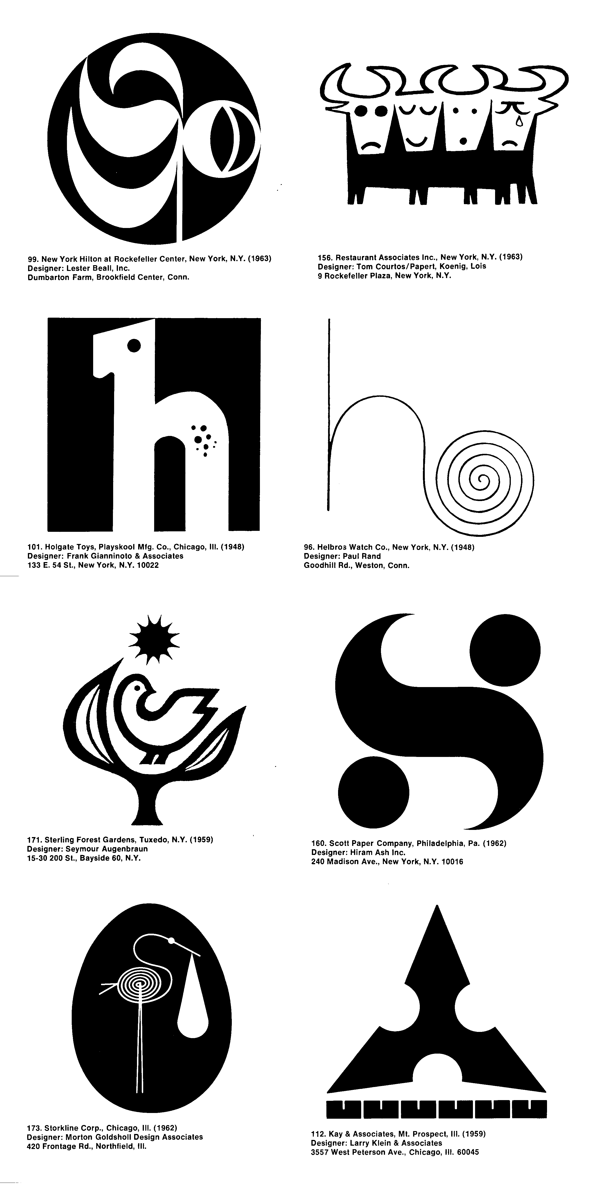
Spirals were a particularly trendy element among the exhibition’s logos, perhaps inspired by Paul Rand’s 1948 Helbros Watch mark. And while representational marks were rare, fully 12 percent of them featured birds, compared to less than five percent of modern representational logos. Perhaps the most striking trend among the Trademarks/USA selections was the tendency to portray, often through clever design, an initial letter or letters; nearly half (45.6%) featured such a graphic element.
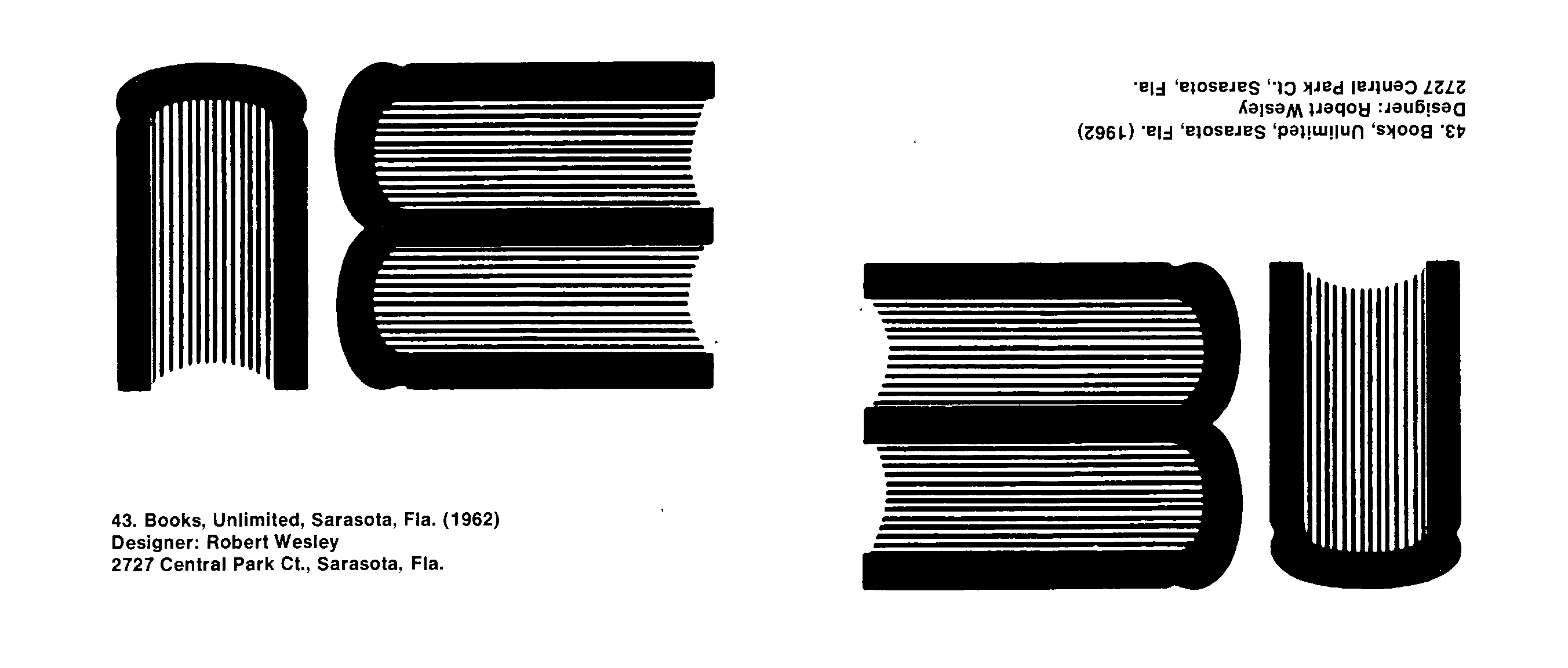
One such logo was the Books Unlimited mark (below), which seemingly used a side view of three books to form the BU initials. Yet, like the old joke about no one noticing the modern abstract painting hanging upside-down in the gallery, this logo appears to have been inverted in the Trademarks/USA catalog.
This blunder might be seen as prescient, as, in the years following Trademarks/USA, the shine came off the clean, abstract, modernist logo to some extent. Critics of this style of logo became louder over the remainder of the 1960’s and into the 1970’s as the overuse of simple, stark, geometric forms in logo design led to a glut of indistinct, meaningless, and look-alike marks. Still, the Trademarks/USA exhibition was a clear sign of the growing importance of logos and graphic design in American business and culture.

