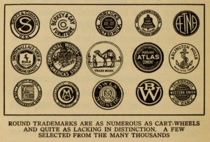
Thursday’s unveiling of Microsoft’s new logo was the biggest logo design news of the year to date. Let’s take a look at the new mark in terms of how it relates to trends in United States Patent and Trademark Office data on logo design. Perhaps most notable is Microsoft’s switch from a logotype (or wordmark) …
Monthly Archive: August 2012
Logo of the Year
In the first ten months of 2011, there were 44,227 logos filed for trademark registration with the United States Patent and Trademark Office. Among them: The two most common design elements were “shaded circles” (found in 4.3 percent of the logos) and “shaded rectangles” (found in 3.8 percent of the logos); see Logos Taking Shape …
Logos Taking Shape
Geometric shapes are some of the most basic design elements of logos, but designers and businesses have been cautioned for years about the drawbacks to relying on them. Almost a century ago, in his 1916 book Trademark Power: An Expedition Into An Unprobed and Inviting Wilderness, Glen Buck warned that ”round trademarks are as numerous as cart-wheels …

