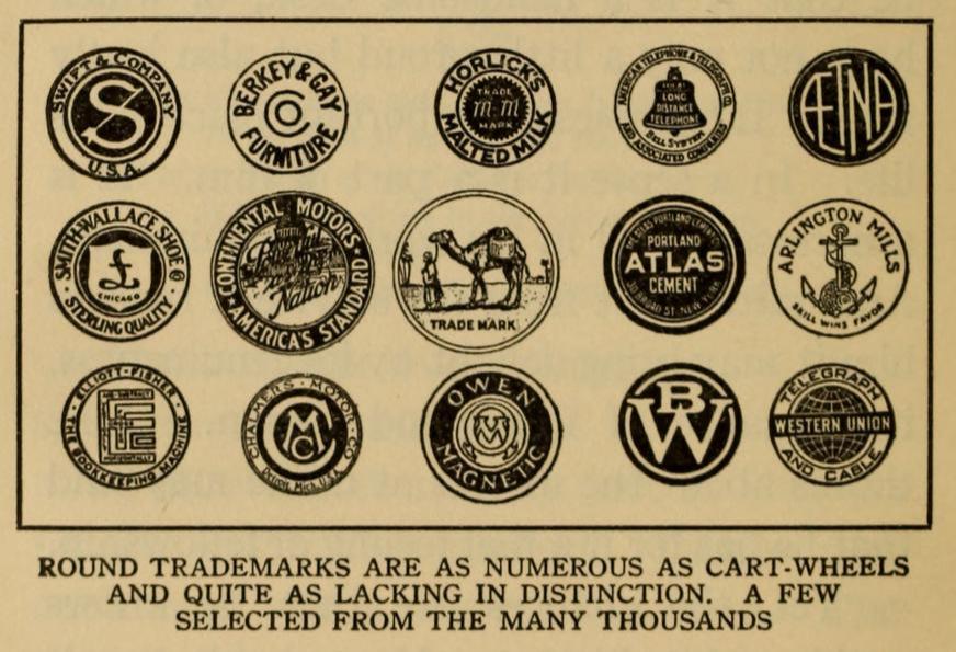
Geometric shapes are some of the most basic design elements of logos, but designers and businesses have been cautioned for years about the drawbacks to relying on them. Almost a century ago, in his 1916 book Trademark Power: An Expedition Into An Unprobed and Inviting Wilderness, Glen Buck warned that “round trademarks are as numerous as cart-wheels and quite as lacking in distinction.”
Similarly, in 1954, Jim Nash wrote in The Trademark Reporter that “a quick look at existing trade-marks shows that abstract shapes, such as squares, diamonds, ovals, triangles, and so on, have been used by so many firms that they have lost their interest,” and Lippincott & Margulies declared in a 1958 issue of their in-house magazine Design Sense, “our markets are visually oversaturated with more than 9,000 diamond symbols, not to speak of the multitudes of look-alike squares, triangles, circles, and assorted forms.
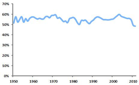
Studying United States Patent and Trademark Office data, we can evaluate the popularity of geometric shapes as design elements over time. The graph below shows the percentage of new logos in each year since 1950 that contained at least one of eight specific shapes (circles, ovals, triangles, diamonds, squares, rectangles, quadrilaterals, and polygons, defined in this case as shapes with five or more sides).
Percentage of new logos featuring any shape element
This percentage has remained remarkably consistent over time, although it’s worth noting the drop over the past several years. In 2010, the figure fell to 49.22 percent, representing the first time since 1944 that less than half of new logos featured shapes.
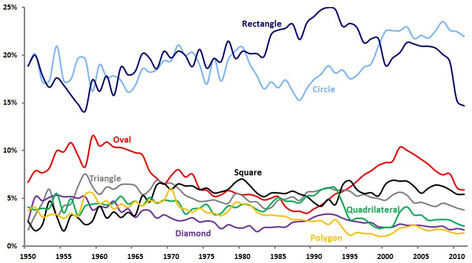
Percentage of new logos featuring specific shape elements
The graph above shows the relative popularity of the eight shape types over the years. Circles and rectangles have been most common, with rectangles enjoying a decided advantage in the 1980’s and 1990’s, only to be overtaken by circles in recent years.
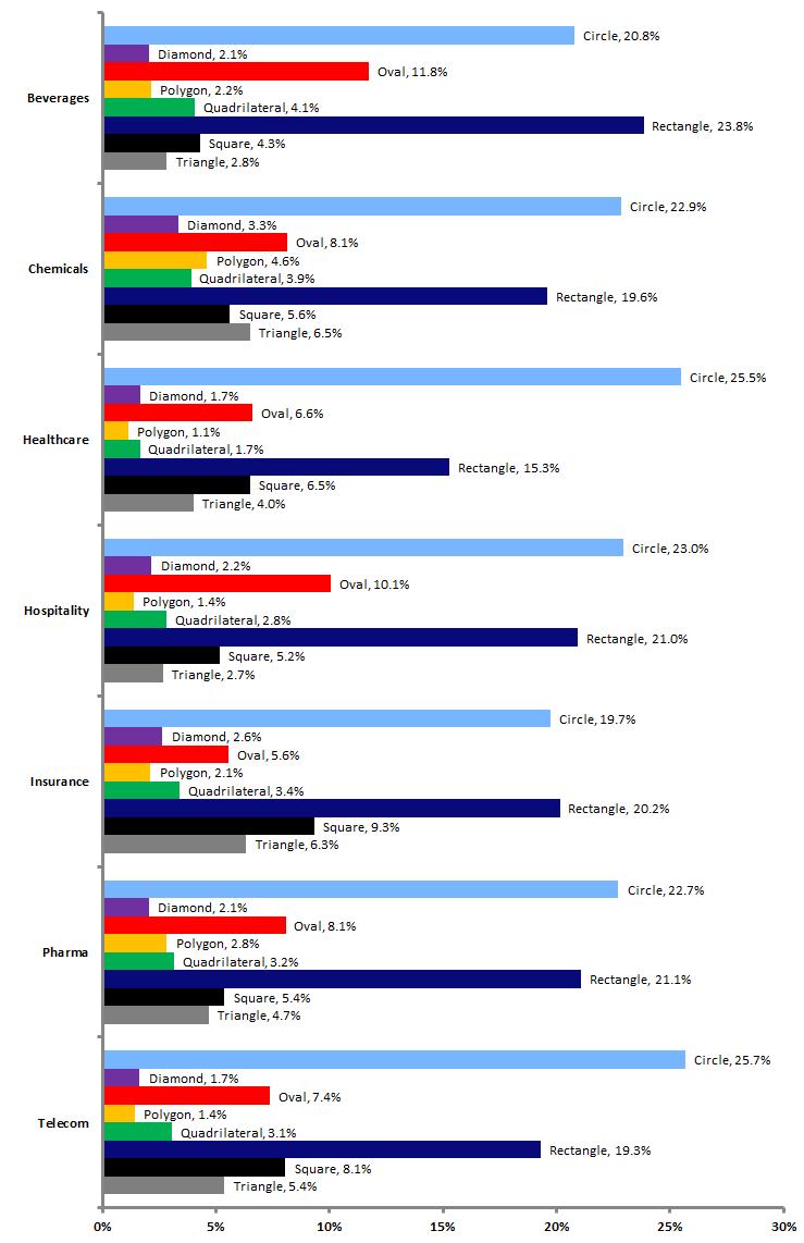
Percentage of logos featuring shape elements by industry
The popularity of shapes in logo designs varies across industries. The graph above illustrates this point for seven selected industries. Circles are most common in healthcare and telecommunications logos and least common in insurance. Chemical logos feature more triangles, diamonds, and polygons than the other industries. Squares are most common in insurance and least prevalent among beverage marks.
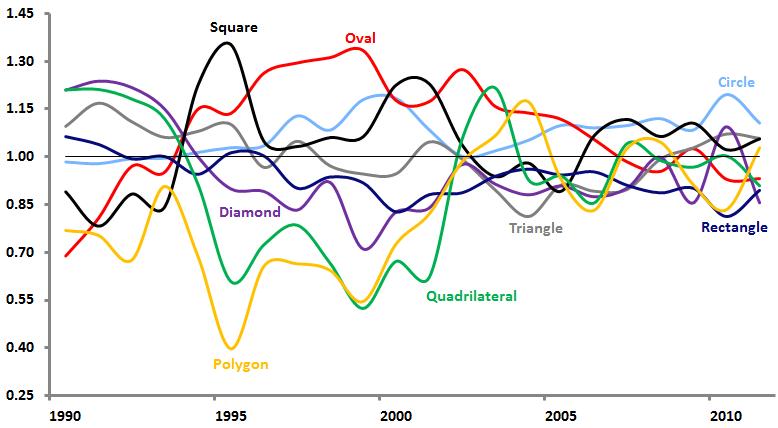
“Trendiness” of shape elements
The above graph’s vertical axis represents a ratio of the share of shape type in new logos in a given year to the share of shape type in dying logos from that year. So if circles appear in 20 percent of new trademarks in a year and 20 percent of dying trademarks in that year, their ratio is 1, meaning that they are not at all trendy in a positive or negative way. However, if squares were in 80 percent of new trademarks and just 40 percent of dying trademarks, their ratio would be 2, meaning that they would be very “hot” for that year. Likewise, if triangles were used just 20 percent of the time in new trademarks and 60 percent of the time in dying trademarks, their ratio would be 0.33, making them quite “cold.”
Looking at the graph, we can see that circles have virtually never been “out” over the last two decades, while rectangles have not been in vogue for much of that period. Squares have enjoyed periods of trendiness, including over the last several years. Their compatibility with new visual forms of identity such as favicons and social media profile photos may push them to greater heights in the future.

