By Their Stripes You Shall Know Them

2012 marked the 40th anniversary of Paul Rand’s 8-stripe IBM logo (top left) and, according to some chronologies, the 45th anniversary of the less-used 13-stripe version (top right). These marks launched a thousand imitators and defined the look of high-technology logos for years. But before they could do so, they were subject to the same sort of armchair design criticism that today’s social media have made so common. As Rand recounted in a 1991 article, his pitch to add stripes to the IBM mark he had previously designed prompted one IBM executive to snort, “It reminds me of the Georgia chain gang.” A prison uniform may have been the most obvious visual referent for stripes at the time, but the IBM logo quickly changed that.

1980sstripedlogos

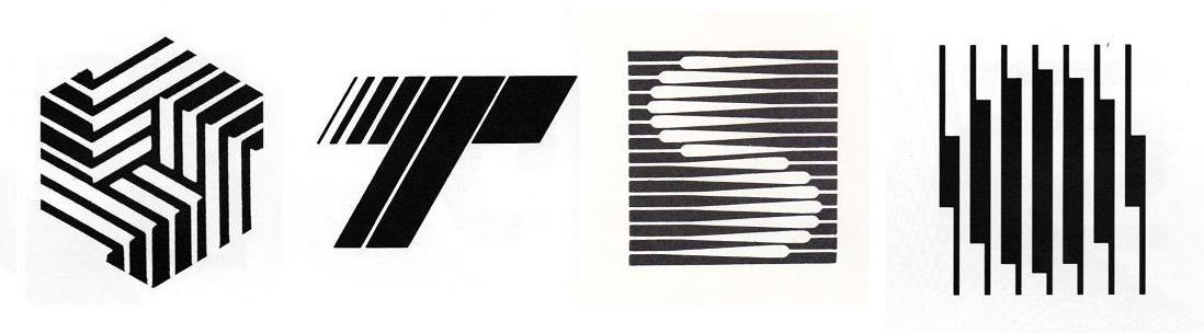
Striped 1970s and 80s logos from John Mendenhall’s “High Tech Trademarks”

As the computer industry and related high-tech fields took off in the 1970s and 80s, they spawned companies that looked to Big Blue for inspiration when adopting logos. John Mendenhall’s excellent 1985 book, High Tech Trademarks, displayed dozens of examples of these striped marks. Moving beyond the IBM comparisons, Mendenhall saw in them the imagery of the integrated circuit: “This intricate circuitry with its intriguing pattern of lines, often tapering from thick to thin, is the physical embodiment of unseen power.  It is appropriate then that these linear compositions, seemingly random yet actually highly structured, have become the visual metaphor for an entire industry.”

Percentage of new US logos featuring stripes, by industry

stripeindustry

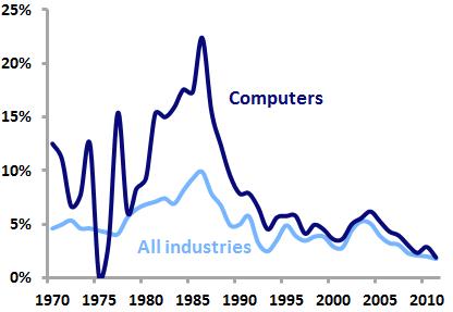
Analysis of United States Patent and Trademark office data shows that use of stripes in logo designs peaked in 1986, when 9.9 percent of all new logos and 22.4 percent of new computer-related logos featured stripes. But the trend quickly died off amid criticism of the glut of lookalike marks, as stripes went from being seen as technical, precise, and advanced to simply cold, impersonal, and anonymous. By 2011, only 1.8 percent of new logos and 1.9 percent of new computer logos were striped.

Striped logos as a percentage of all new US logos, 2002-2011, in select industries

stripeindustry2

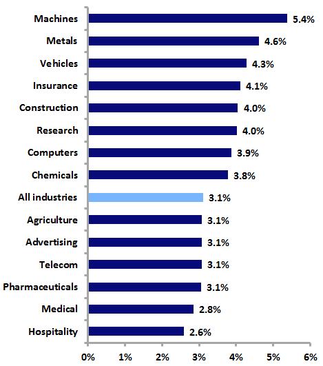
Where are striped logos to be found today? The graph above shows the prevalence of new striped logos within selected industries over the last ten years. Decidedly lower-tech industries such as machines, metals, and vehicles, perhaps late to the striped-logo party, are more likely to use stripes than their high-tech counterparts.

Logos Get Real

Perhaps the most significant development in twentieth-century logo design was the rise of the abstract logo. In the United States, the burgeoning corporate identity field helped spread modernist German and Swiss design philosophies, resulting in many pictorial logos being replaced by clean, stark, abstract marks. Such logos were particularly favored by expanding American corporations whose business activities, as they became more varied and technologically complex, could no longer be depicted in a simple, realistic trademark.

Abstract logos faced a strong backlash from Americans accustomed to more realistic symbols. A 1966 Printers’ Ink cover story asked whether these new trademarks were “Imagery or Tomfoolery?” In 1972, Tom Wolfe called abstract logos “the creamiest piece of pie-in-the-sky that American graphic arts have ever sold to American business” and said that they “make absolutely no impact…except insofar as they create a feeling of vagueness or confusion.” Karrie Jacobs in 1987 noted that “Logos, then, evolve backward with complex, multifaceted trademarks down in the primordial muck and geometric marks of amoebalike plainness up at the top of the ladder.”

Abstract and realistic logos as a percentage of all new US logos

Analysis of United States Patent and Trademark Office data shows that the use of abstract logos peaked twice in the last half-century, although abstract logos have never been more common than realistic marks. In 1971, 42.3 percent of new U.S. logos were abstract, but that figure dropped over the next several decades.

By the mid-1990’s, abstract logos began a comeback that culminated in 2001, when 45.8 percent of new logos were abstract. This spike was almost certainly driven by the late-90’s dot-com boom and the wave of abstract swooshes that accompanied it. Look for Emblemetric to examine this trend in a future article.

The last decade has seen a significant drop in the use of abstract logos, with a corresponding increase in realistic symbols. In 2011, 36.0 percent of new logos were abstract, while 61.8 percent were realistic.

Industries with high rates of abstract logo use


 Industries with high rates of realistic logo use

The graphs above show that, not surprisingly, abstract logos are more common in high-technology industries and those where the product or service cannot be easily depicted, while realistic logos are more prevalent in industries where the product has been long established and its consumption occurs on a personal level.

Overall, whether a logo is realistic or abstract seems to have little effect on whether it survives or “dies” over time. Of the realistic logos created since 1960, 34.8 percent are still in use as trademarks, compared to 35.6 percent of abstract logos.

Logo ABC’s

The single-letter monogram is a basic and classic form of logo that still enjoys wide use today. Looking back through United States Patent and Trademark Office data, we can see that the use of such monograms peaked in the US in 1970, when they made up 6.7 percent of new logos. By 2011, just 2.4 percent of new logos were single-letter monograms.

Single-letter monograms as a percentage of all new US logos

Further analysis reveals which letters are most popular for use in single-letter monogram logos. By comparing the prevalence of particular letters in monograms relative to their use as the initial letters in all trademarked words and phrases, we can see which letters are disproportionately used as monogram logos. For instance, “M” is the first letter in 6.3 percent of all trademarked words, but is used in 9.4 percent of single-letter monogram logos. This gap of 3.1 percent is the highest for any letter, indicating that “M” is most favored for use in monograms. The table below shows these figures for all letters.

Percentage difference between use of letters in monograms and use of letters to begin all trademarked words and phrases

M   3.1%
V   2.0%
A   1.7%
X   1.4%
K   1.4%
W   1.4%
Z   1.2%
H   1.1%
Q   1.0%
E   1.0%
G   0.8%
R   0.5%
Y   0.2%
N   0.2%
U   0.1%
J   -0.3%
I   -0.5%
D  -0.8%
O   -0.8%
B   -0.9%
S   -1.2%
F   -1.3%
L   -1.8%
P   -2.2%
C   -2.6%
T   -4.5%

Interestingly, the four most popular letters for monograms (M, V, A, and X) are vertically symmetrical, while six of the seven least-popular letters are vertically asymmetrical.

Which letters are currently “trendy” for use in single-letter monograms? We can answer this question by analyzing data from the past five years related to new trademarks and “dying” trademarks. The table below shows the ratio of the share of each letter’s use in new monograms over the last five years to the share of each letter’s use in dying monograms over that period. So if a letter appears in 10 percent of new monograms and 10 percent of dying monograms, its ratio is 1, meaning that it is not at all trendy in a positive or negative way. However, if a letter appeared in 40 percent of new monograms and just 20 percent of dying monograms, its ratio would be 2, meaning that it would be very “hot.” Likewise, if a letter were used just 10 percent of the time in new monograms and 30 percent of the time in dying monograms, its ratio would be 0.33, making it quite “cold.”

“Trendiness” of letters in single-letter monograms, 2007-11

O   1.43
V   1.36
U   1.26
E   1.23
B   1.20
W   1.20
G   1.19
F   1.09
T   1.05
R   1.04
K   1.03
A   1.03
Z   1.01
Q   0.97
I   0.97
S   0.95
H   0.95
Y   0.94
L   0.94
P   0.91
J   0.90
M   0.89
N   0.80
X   0.78
C   0.75
D   0.66

“O” leads the way here, perhaps in part due to the popularity and success of the Obama campaign’s “O” monogram, while old standbys “M” and “X” seem to be losing steam.

Single-letter monograms, although their greatest popularity appears to be behind them, remain a viable option for logos. The suggestion here is that formal characteristics of letters themselves, particularly vertical symmetry, may impact which letters are more likely to be turned into monograms.

Everyone Gets a Ribbon

October is Breast Cancer Awareness Month in the United States, and the associated pink ribbons are everywhere. Over the last several decades, such “cause ribbons” designed to raise awareness of various issues have become extremely common visual symbols. The graph below shows the recent sharp increase in the use of ribbons in US logos.

“Ribbon” logos as a percentage of all new US logos

The popularity of the ribbon symbol took off in the United States in 1979, when yellow ribbons were tied around trees in support of the American embassy personnel held hostage in Iran. This practice was inspired by the song “Tie A Yellow Ribbon ‘Round the Ole Oak Tree,” which had been a hit for Tony Orlando and Dawn in 1973. The song was based on an American folk tale of a man returning to his hometown after serving a prison sentence. He had written a letter to his old girlfriend asking her to tie a yellow ribbon around an oak tree if she still loved him; as his bus pulls up he sees “a hundred yellow ribbons ’round the old oak tree.”

MADD door handle ribbon, Red Ribbon Drug-Free Youth mark, Arthur Ashe looped ribbon with tennis ball logo

The use of cause ribbons began to spread in the 1980s and 1990s, as yellow ribbons took on a meaning of “supporting the troops” and red ribbons were used in the anti-AIDS movement. In 1989, a cause ribbon first appeared in a registered US trademark, a symbol of MADD (Mothers Against Drunk Driving) depicting a red ribbon tied around a car door handle. In 1990, the National Federation of Parents for Drug Free Youth used a red ribbon logo, and in 1993, the now-familiar looped ribbon first appeared in another red ribbon mark used by Arthur Ashe’s organization in its fight against AIDS.

While ribbons had traditionally been used in logos to depict gifts (as in Paul Rand’s original UPS logo), awards (Pabst Blue Ribbon), or as banners for text, cause ribbons quickly assumed a prominent place in logos. By 2011, 21 percent of logos containing a ribbon of any sort featured a cause ribbon.

The looped ribbon symbol ultimately became so popular that the United States Patent and Trademark Office came to consider it a “universal symbol,” like the Christian cross or the peace symbol, meaning that it cannot be registered as a trademark without being graphically modified in a distinctive way.

Color is obviously an important aspect of cause ribbons, as different colors signify various causes. The graph above shows that as cause ribbons have proliferated, the variety of colors used in ribbon logos has exploded. While 95 percent of ribbon logos featuring colors between 1980 and 1999 used either red or blue, since 2000 other colors have seen dramatic increases in use. Most notable among these is pink, which has become nearly as popular as red and blue in ribbon logos, a testament to the success of the breast cancer awareness movement.

Microsoft’s New Logo, by the Numbers

Thursday’s unveiling of Microsoft’s new logo was the biggest logo design news of the year to date. Let’s take a look at the new mark in terms of how it relates to trends in United States Patent and Trademark Office data on logo design.

Perhaps most notable is Microsoft’s switch from a logotype (or wordmark) alone to a logotype/symbol combination.

Percentage of new logos featuring logotypes and logotype/symbol combinations

The graph above shows that among both logos in general and computer-related logos in specific, logotype/symbol combinations are becoming more popular and logotypes alone are becoming less popular (and as Emblemetric’s Logotype vs. Symbol analysis reported, logotype/symbol combinations are currently trendy, while logotypes alone are not). And although combination marks are slightly less common among computer-related logos than among logos as a whole, Microsoft’s decision to change to a logotype/symbol combination is consistent with trends both in its industry and in general.

Looking at the symbol itself, it is quite simply a square element made up of smaller multicolored squares. The graph below shows the prevalence of both squares in general and groups of three or more squares as design elements in new logos over the last three decades. Data for computer-related industries is again contrasted with data for industries as a whole.

Percentage of new logos featuring “squares” and “3 or more squares” as design elements

It is apparent that squares have long been a logo design favorite for computer-related businesses. And over the last ten years, just 6.08 percent of all logos featured squares of some sort, compared to 9.62 percent of computer logos. Logos featuring three or more squares accounted for 1.05 percent of all logos, while among computer logos, the figure was double: 2.10 percent. Microsoft is certainly sticking close to industry conventions with its use of squares in its new logo.

Percentage of dying logos featuring “squares” and “3 or more squares” as design elements


The graph above shows that logos with squares and 3 or more squares are not dying out (i.e., being abandoned or canceled, or expiring) at alarming rates, so Microsoft is not hitching its wagon to some fading trend with this new logo.

 Percentage of new logos featuring red, green, blue, and yellow

Microsoft’s use of the combination of red, green, blue, and yellow in its new symbol is not typical of computer-related logos, or logos in general, for that matter. The graph above shows that the percentage of new logos featuring this combination has never approached one-half of one-percent since 1980.

But Microsoft has long associated itself with this color combination, dating back to the very first red/green/blue/yellow computer-related logo, the original Windows flag, filed for trademark registration this week in 1991. Indeed, 20.3 percent of all such logo registrations are Microsoft’s. The company’s challenge now is to “own” this combination, given that it is also used by Google and eBay.

In all, the new Microsoft logo strikes a nice balance between bringing the company’s visual image more in line with contemporary design trends and retaining distinctive elements of the Microsoft graphic identity.

Logo of the Year

In the first ten months of 2011, there were 44,227 logos filed for trademark registration with the United States Patent and Trademark Office. Among them:

  • The two most common design elements were “shaded circles” (found in 4.3 percent of the logos) and “shaded rectangles” (found in 3.8 percent of the logos); see Logos Taking Shape
  • The most common color used was red (of logos featuring colors, 23.84 percent contained red and 23.69 percent contained blue); see The Color of Logos
  • The most common USPTO industry classification was advertising/business management/administration (16.2 percent of the logos fell into this category)
  • Logotype/symbol combinations accounted for 87.1 percent of the logos, while logos that only contained symbols made up the other 12.9 percent (logotypes alone are not included in this analysis); see Logotype vs. Symbol
  • The state producing the most logos was California, with 14.9 percent of the total; see Logo Geography

The EMAX VPMA logo, above, a trademark of Encore Legal Solutions of Los Angeles, represents a web-based legal support service system. It may not be 2011’s most beautiful, best-designed, or most effective logo, but it fits the criteria above perfectly and is therefore the most typical, making it Emblemetric’s Logo of the Year.