In Marker, Medium’s business publication, Emblemetric’s James I. Bowie writes about corporate America’s struggle to use depictions of people in its logos:
Replacing Aunt Jemima Is Just the Tip of the Iceberg

In Marker, Medium’s business publication, Emblemetric’s James I. Bowie writes about corporate America’s struggle to use depictions of people in its logos:
Replacing Aunt Jemima Is Just the Tip of the Iceberg
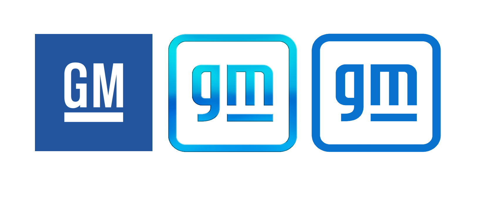
Emblemetric’s James I. Bowie on the new GM logo in Marker, Medium’s business publication:

Emblemetric’s James I. Bowie writes about Supreme and its multibillion-dollar logo for Marker, Medium’s business publication:

Emblemetric’s James I. Bowie writes about the phenomenon of bespoke typefaces for Marker, Medium’s business publication:

Emblemetric’s James I. Bowie writes about the Google Workspace rebrand, including the demise of the Gmail envelope, for Marker, Medium’s business publication:
Those New G-Suite Logos Everyone Hates? They’re Actually a Smart Idea

Emblemetric’s James I. Bowie writes about the branding of Driftwell, Pepsi’s new “enhanced water beverage,” for Marker, Medium’s business publication:
How Pepsi Got Suckered Into Every Hot Branding Trend

For Marker magazine, Emblemetric’s James I. Bowie has written about Spotify’s underwhelming branding:
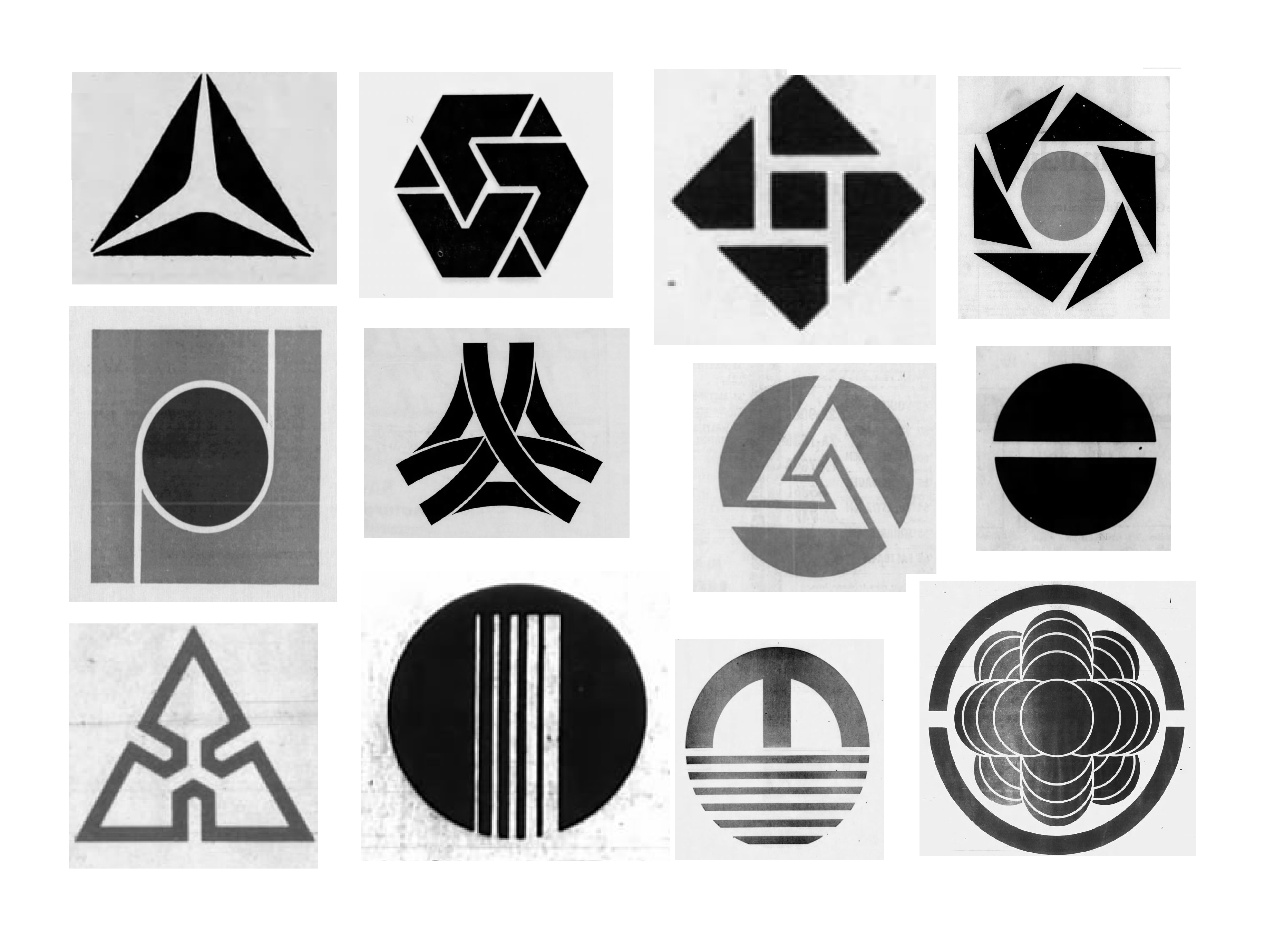
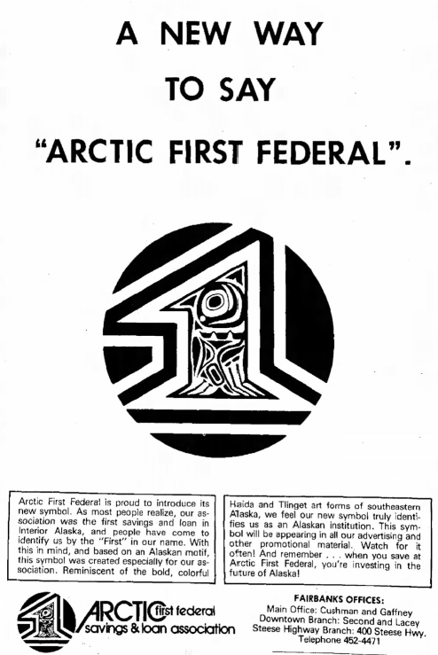
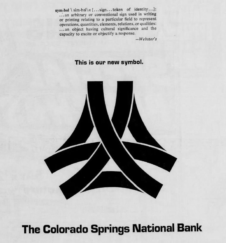
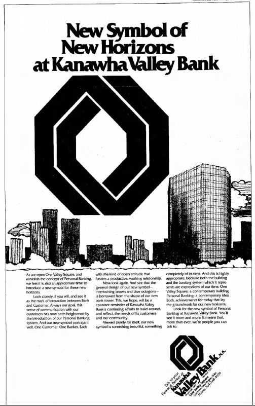
Emblemetric’s James I. Bowie has written an article for Marker about how US banks in the 1960s and 70s used newspaper ads to introduce their new abstract logos:
The Surprising Reason Why All Bank Logos Look the Same