The annual celebration of Earth Day highlights an environmental consciousness that is becoming increasingly important as the threats associated with global warming rise. Yet American logo design has recently seen a resurgence of marks featuring smokestacks and factories which hearkens back to the earliest days of corporate symbolism in a rather environmentally unfriendly way. What’s behind this trend?
When companies first needed to express a visual identity to the public, the factory was a popular image to use. In his 1998 history of American business identity, Creating the Corporate Soul: The Rise of Public Relations and Corporate Imagery in American Big Business, Roland Marchand pointed out that “during the late nineteenth century and even later in some cases, as industries rapidly expanded, the factory image made good sense as a merchandising and public relations vehicle. Impressive and often romanticized, it assured customers that they were dealing with a stable, competent firm.” It had been noted that “these depictions [of factories] sought to hearten executives and impress viewers by displaying billows of (productive) black smoke spouting from a multitude of chimneys.” Marchand reported that “corporations selling products as varied as yeast, razor blades, fertilizer, and underwear all greeted the public with pictures of the factory.”
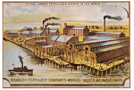
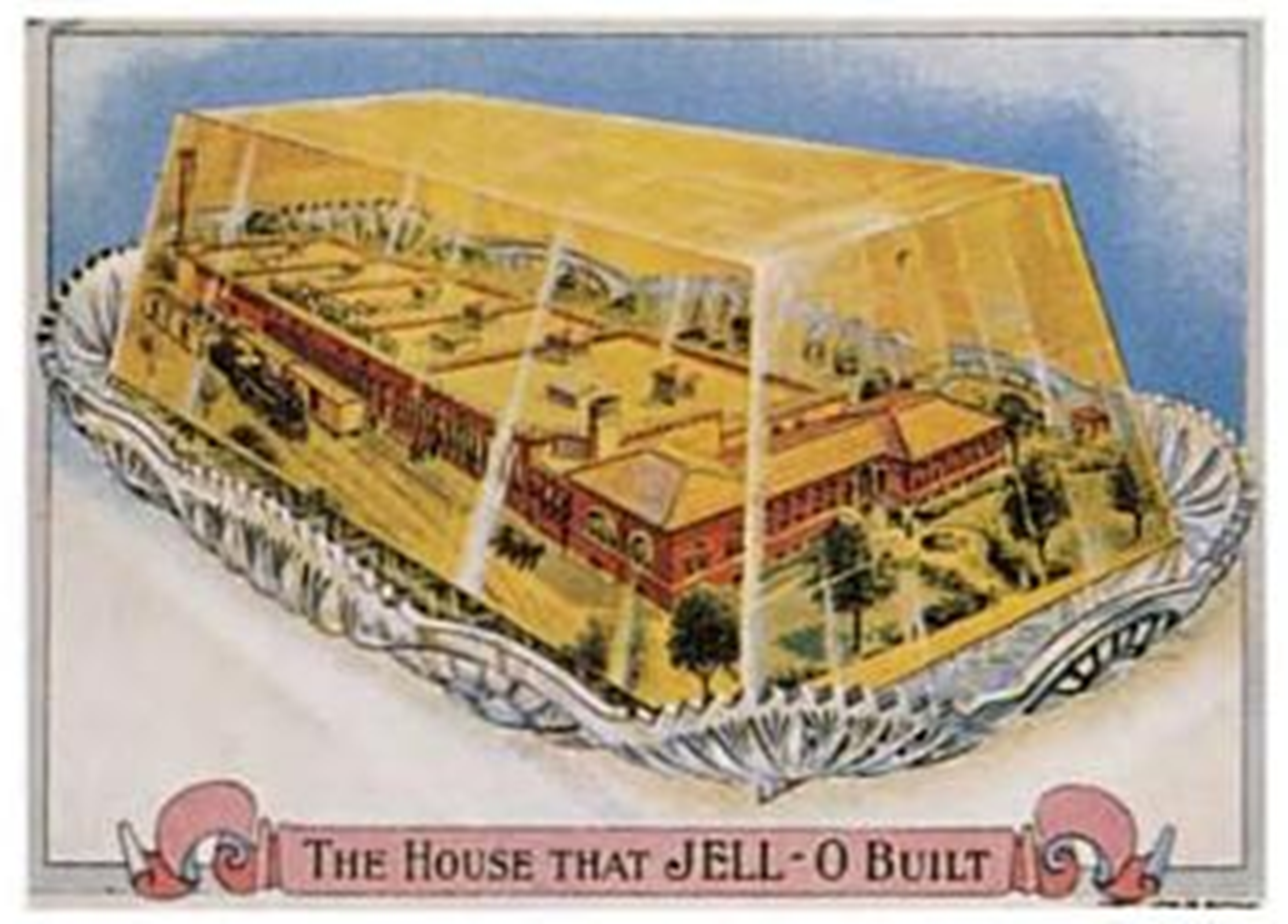
Late nineteenth-century trade cards depicting factories (Marchand, 1998)
The factory with smokestacks cliché in logo design persisted into the 1970s. Designer Jerry Herring’s 1975 pamphlet “Stock Trade Marks,” which satirized the lookalike logos of the time, asked the tongue-in-cheek question, “Dear corporation president, public relations director, or agency art buyer: Are you in need of a dynamic new image to replace the smoking smoke stacks you or your client is now using as a trade mark?”
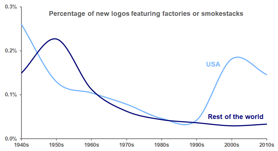
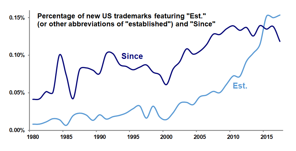
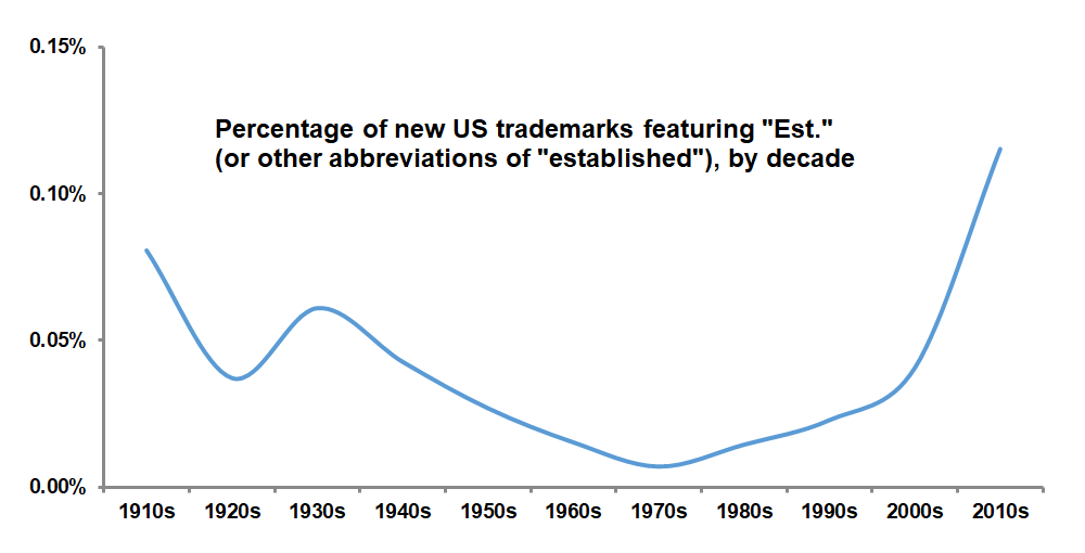
Analysis of data from the United States Patent and Trademark Office and the World Intellectual Property Organization, though, shows that by the seventies, the factory smokestack logo was on its way out, before reaching its nadir in the 1990s. But over the past two decades, these logos have rebounded to become more common again in the United States, although not in the rest of the world. American designers seem to revel in the graphic possibilities of the factory’s wafting smoke and distinctive sawtooth roof.
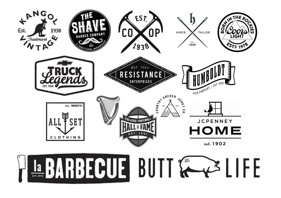
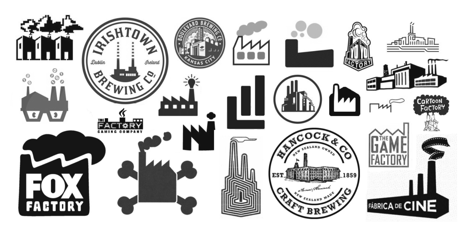
The popularity of these new smoky logos appears to be explainable in two ways. First, many of these marks use detailed, realistic depictions of factories to convey a sense of nostalgic authenticity, particularly for businesses with a hipster appeal, such as craft breweries. This attempt to invoke “old-timeyness” can also be seen in the use of logo design elements such as crossed objects, mustaches, and establishment dates.
Second, many of these new logos depict the factory in an abstract way, one that is figurative rather than literal. These logos often represent companies that don’t actually have factories; it’s just that the idea that their particular product (movies, games, cartoons) might be manufactured in a factory is whimsical and amusing.
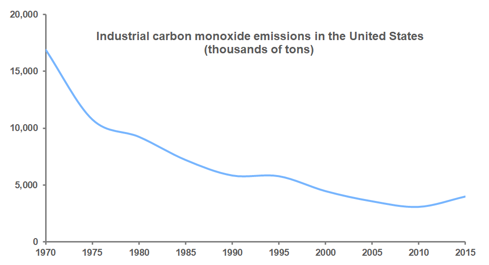
But why would companies take the risk of offending the environmentally-sensitive public with these factory and smokestack images? As the Environmental Protection Agency data in the graph below shows, industrial emissions of carbon monoxide, a major greenhouse gas, have declined dramatically in the U.S. since 1970 as stricter environmental regulations have been put in place and industrial manufacturing has moved overseas.
There are simply fewer smoky factories in the U.S. than there used to be. It may be that to many younger Americans, a factory spewing smoke is just not something that they ever encounter in their lives, and so the image of the factory functions more as a metaphor, a symbol of productivity or of historical sentimentality, rather than as a literal threat to their environment, making these logos acceptable in a way that they would not have been a few decades ago.